Paula Scher X The Public Theatre: Knockout & stars in this year's campaign design
Another season, another Paula Scher design for New York’s Public Theater, new Shakespeare in the Park 2022 campaign.
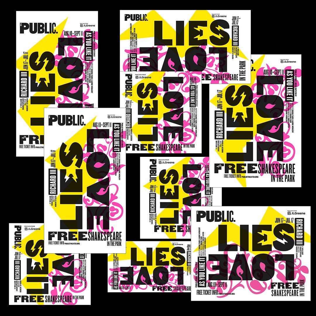
Designed by Scher with Public Theater’s in-house team to celebrate the festival’s 60th anniversary, the season design "changes in the spirit and use of Knockout, the font of the Public identity, and the summer Shakespeare campaign introduces the look for the full season to follow."
"Variations have included typography that is slashed, slanted, skewed, stretched and stenciled" writes Pentagram.
War, lust, type! How Paula Scher’s typographic affair with The Public Theater redefined our culture
This year’s campaign -the 27th in a row- customizes Knockout "with stars, flames, eyes, arrows and other illustrated symbols that fill the counter-spaces of the letterforms and are inspired by the themes of each show."
"The designers created 10 alphabets (in two weights), one for each of the Public plays over the 2022-2023 season. The 2022 Shakespeare poster design contrasts the two plays with LIES (with type with lightning bolts) and LOVE (with a blooming flourish)" reads the Instagram post.
More here.
Tags/ typography, graphic design, typeface, new york, poster, pentagram, paula scher, knockout
