TDC68: Pentagram, Apple, Isometric, Parachute & more winners of typographic excellence to know
What a league! TDC68, now in its 68th year, is all about how letterforms are used, recognizing typographic excellence and innovation along with the art and craft of typography and design.
Type Directors Club has announced the projects that received this year's annual “Certificate of Typographic Excellence” and once again, it’s personal!
Amongst the selected projects is Parachute’s brand new website, a web presence that expands the Athens-based type foundry’s typographic universe of eclectic type systems -FYI Typeroom is a Parachute project.
As always the awarded projects will be included in the Annual of the Type Directors Club, The World’s Best Typography, and will also be shown at the 68th Awards Exhibition in New York City.
So without further ado, following are the winners in this year’s Communication Design Digital Media category.
Congratulations to all!
Hey Barista Publishing Platform by Isometric Studio for Oatly
The visual identity and web design for Hey Barista invokes the quirky, lighthearted feeling of the Oatly brand but also features poignant stories with intimacy and dignity. It reformulates powerful elements from print magazines—crisp typography, hand-drawn marks, and unconventional compositional techniques—for the web, drawing readers into a more localized and sustainable way of looking at the world. The stories have an intimacy to them because they deal with personal obsessions and routines that are deeply situated in a sense of place and the design Isometric created reflects this through the attentiveness to each detail. Whether short talks, city guides, photo essays, and long-form stories, the combination of multiple types in an unexpected manner, bursts of color, unconventional layouts, and custom layouts makes it clear these stories are special.
Plastic Air by Pentagram for Google Arts & Culture
“Plastic Air” allows viewers to imagine these particles as objects and see what we usually don’t see. The experience consists of a speculative “window” onto a data-driven approximation of plastic particles that exist all around us, but remain hidden to the naked eye. Users can drop identifiable objects like housewares and apparel to “pollute” the sky, and then see the items break down into the air. They can also adjust factors like location (cities vs. rural areas) and weather conditions like wind, rain and snow to see how these affect dispersal patterns. The designers wanted the experience to be highly engaging, to encourage users to spend some time with it and share it with their friends. The project utilizes the principles of “data humanism”––using data to uncover a relatable human element behind the numbers and statistics, to help make the issue more accessible.
The New Parachute Website by Typical Organization + Parachute for Parachute Typefoundry
The new website brings the full spectrum of the brand's work into the limelight. Structured around highly-responsive layouts and grids, it invites the user to browse the variety of typefaces via an elaborated font tester. Parachute's exclusive Test Drive mode lets you discover the many styles and supported scripts of each typeface in any writing direction whilst making pairing variable with non-variable fonts an easy task. In black or white, the website features other built-in colour themes as well in order to elevate each type system's different mood and context, whilst its mobile version offers a comparative user experience by including tester and buying options. With the needs of branding and design professionals in mind, it lets the user explore and buy fonts effortlessly via a non-complicated ultra-fast buying procedure. Overall, Parachute's highly-configurable and dynamic new online presence engages the visitor with a real type-heavy narrative in an authentic manner.
Galeria Index Website by Twoo® for Galeria Index
Beginning online before expanding into a physical space in Brasília, Index is a digital and physical gallery that serves as a showcase of Brazil’s modern and contemporary art scene. Both garish and graceful, our solution combines a distinctly digital green colour in reference to the gallery’s beginnings with a delightful serving of Brazilian flair and character. Heading to Brazil, we chose Rio de Janeiro-based foundry Plau’s rhythmic type family Vinila to lead the project; finding it to represent both the solidity of Brasília and the modernity of its upcoming artists. The typeface is characterised by the ink-traps found across its diverse range of weights, be it bolder styles for commanding headlines or its elegant lighter weights for body copy and supporting information.
Contour Watch Face by Apple Design Team for Apple
Inspired by the passage of time, the Contour face gradually changes throughout the day to highlight the current hour. The numerals are a custom font designed to fit into the edge of the display and move seamlessly from one hour to the next. When the user raises their wrist, the numerals dynamically grow into focus - illuminating the display - and recede into a quiet, uniform composition when returning to rest. Turning the crown navigates through the variable weight axis offering a glimpse into the past and future before resolving to the current hour. The watch face offers two type styles: Regular and Rounded. The color of both the numerals and dial can be personalized to complement the colors of Apple Watch bands.
Hello Screen Saver by Apple Design Team for Apple
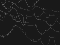
The Hello screensaver pays homage to the 1984 Macintosh with a remastered interpretation of the iconic typographic greeting. Skeletal, b-spline letterforms are dynamically joined to create fluid connections between characters. These dynamically joined paths are then fleshed out in volume forming singular, cursive words. These three-dimensional forms follow the stroke order of handwriting and gracefully animate between 28 unique greetings. The screensaver is configurable in three unique themes: Soft Tones, Spectrum and Minimal, each with a corresponding color palette.
Khoj Studios Website by Novel + Thoughtput for Khoj
As the international artists' association, Khoj, turned 25, it needed a refresh of its clunky and dated website. The new website is clean and contemporary, pairing the crisp Roobert with the warm countenance of Cooper BT. The typography-forward site sticks to strict grid systems to bring order to the sprawling body of work that Khoj has amassed in a quarter-century. The variable typeface Roobert is often tied to the user's scrolling behaviour—with thematics, post titles, and pull quotes getting thinner and thicker as one scrolls. Cooper appears in circular badges that punctuate the site, rotating as one scrolls.
Science Stack: Tools Within Reach by Pentagram for Wilson Center
The module presents a series of 24 “cards,” each featuring a different tool and highlighting a specific feature to show the ways the tools can impact science and society. The cards are organized in categories such as sensors, 3D printers, robots, drones, microcontrollers and more, allowing makers, scientists and artists to explore the full range of devices. Low cost and open source tools are transforming the field of science, encouraging new users and generating data that will make a broader impact with new discoveries. These physical tools are significantly less expensive and expand participation to a larger community of makers. The design of open source tools is made publicly available so that anyone can study, modify, distribute, make, and sell hardware based on that design. The infographic demonstrates the diversity of tools in regards to research topic, cost, “openness,” and beyond, while highlighting how these tools are changing science and
SIFF Website Design by MNP for Syros International Film Festival (SIFF)
SIFF is a multidisciplinary festival and this versatility is reflected in the website design where the identity, the various events and projects are at the epicentre.
Explore more projects here.
Tags/ parachute, apple, pentagram, type directors club, tdc, typical organization, isometric, mnp

