Typo-Passage X David Einwaller: a must-visit in Austria's imperial capital
A space dedicated to the beauty of typography in Vienna, Typo-Passage is open 24/7, with no restrictions and free for all ages.
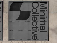
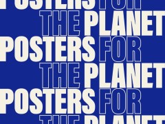
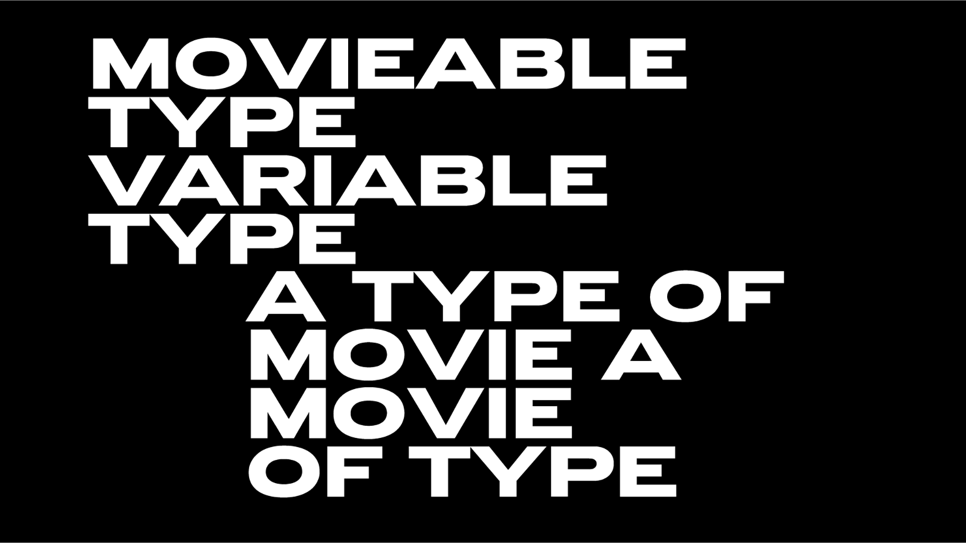
Located right inside MuseumsQuartier Wien, Typo-Passage now features a series of posters designed by David Einwaller with an insightful text fragment by political scientist Oliver Marchart.
On display until March 2022, the posters are set in three upcoming styles of Bull5.
Einwaller works between applying and designing typography. Since his time at Studio Es, he has been realising projects on his own, mainly in the cultural field.
For about eight years now, parallel to his graphic practice, Einwaller has been devoting himself to his own typeface designs and research approaches in the field of typography.
His design process is usually based on historical models that find new meaning in a contemporary context.
The typeface family designed by Einwaller, called Bull-5, goes back to a particular style of typewriter fonts that originated in the 1960s and was probably introduced by Olivetti.
The project began with the digitisation of printed labels discovered on photographic prints from the 1980s, that were acquired via the closure of an American newspaper archive.
To preserve the raw and mechanical character of the typeface, the mono cut was drawn in accordance with the source material, including all its peculiarities and irregular proportions.
All weights are connected by prominent, strong punctuation marks and various open type features. The typeface family is being prepared for sale and will be available from Tighttype from early 2022.
"I had seen a sample of this typeface a few years back when I was researching typewriter-designs, but was never able to track down a good source" notes Einwaller.
"In 2019 a friend purchased photographic prints from a closure of a newspaper archive and who’d believe it, all the images were labeled with this exact typeface. I digitized it instantly, keeping it very straightforward with all its quirks, irregular proportions and curves. Its raw mechanic character is emphasized by bold punctuation and optional double-widths for the letters /M, /m, /W and /w."
Einwaller created a folding-poster available as takeaway from the Typo-Passage recent installation.
Explore more here.
Tags/ typography, typeface, type design, posters, museum, austria



.png)

