Tim Tijink X Minimal Collective: a dynamic visual identity to the max
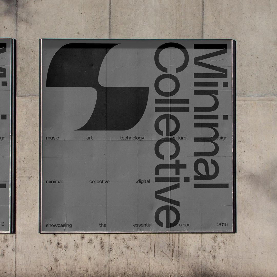
In close collab with the Minimal Collective crew, Dutch designer Tim Tijink developed a design system that "evolves and connects, forming the visual base for an interconnected network of music professionals, (audio-)visual artists and designers" for the Amsterdam-based electronic music collective.
Together with MC's co-founder, creative director and curator Brent van den Elshout, Tijink delivered a versatile visual identity that is contemporary and eclectic to the max.
The unconventional visual system is based on "an oval grid, rather than a squared one" notes The Brand Identity.
"Each circle represents a different 'spectrum' in which the collective is operating in and across" said Tijink.
With a minimal palette the "techy, progressive and somewhat brutalist feeling" of the new Minimal Collective branding uses Gradient Type’s PolySans as its hero typeface.
As Minimal Collective operates on the intersection of music, art and technology to initiate a variety of collaborative projects, events and formats, Tijink's well balanced design approach delivers the goods.
Tim Tijink is a multidisciplinary designer and freelancer running a personal studio for graphic design and art direction (TT/S) from Groningen, the Netherlands.
Explore more go his work here.
Tags/ graphic design, visual identity, brand identity, tim tijink
