UDL X Mega Suen: Gen Z masculinity set in Neue Haas Grotesk for a bold fashion branding
The multi-awarded United Design Lab (UDL) design and innovation studio delivered a bold and refined masculine branding identity for Mega Suen, a young menswear brand established in Beijing, back in 2016.
"Men themselves present a quite different air of sensitivity and vulnerability by making friendship or intimacy with different people in different scenes" notes UDL on the core idea behind the type-heavy branding.
"Mega Suen aims to describe this kind of interesting story about gender makings words, which is constructed by these ‘true relationships’. The brand takes the quote ‘Friendship as a way of life’ (Michel Foucault, 1981, published in Le Gai Pied) as the heart of the visual matters, hence the project comes with the keywords ‘Natural’,’Friendship’ and ‘Relationship’."
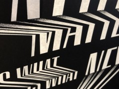
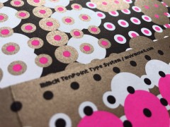
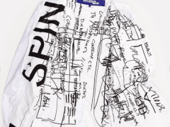
Therefore, the branding for Mega Suen navigates around these three pillars, these words that define what the fashion brand is all about, presenting an informal, friendly and highly informative rework of the brand, "where return forms, care labels and the company's logo type is presented in an approachable and eye-catching manner."
"We always spend a lot of time explaining something to others, like when describing a situation or making a point of view, however, we find that the design concept for Mega Suen comes from the brand itself; the information is the expression" adds the studio.
UDL's neutral typographic identity for MS avoids the oh-so-irrelevant gender stereotypes of the past is set in sans-serif Neue Haas Grotesk.
The modernist typeface is the real star in this bold yet calm and minimal identity that avoids any gender connotation whatsoever.
The first weights of Neue Haas Grotesk were designed in 1957-1958 by Max Miedinger for the Haas Type Foundry (Haas'sche Schriftgiesserei), a Swiss manufacturer of foundry type with art direction by the company's principal, Eduard Hoffmann as the answer to the British and German grotesques that had become hugely popular thanks to the success of functionalist Swiss typography. The typeface was soon revised and released as Helvetica by Linotype AG.
Christian Schwartz was commissioned to design a digital revival of Neue Haas Grotesk by Mark Porter for the redesign of The Guardian, but not used. Schwartz completed the family in 2010 for Richard Turley at Bloomberg Businessweek. Its thinnest weight was designed by Berton Hasebe.
Co-founded by Fang Jianping and Ding Fan back in 2012, UDL has expanded with offices in London and Beijing to deliver the goods.
Explore more here.
Tags/ typography, typeface, visual identity, china, neue haas grotesk, udl

