The Suicide Squad: Team Sarofsky brings custom type to the field
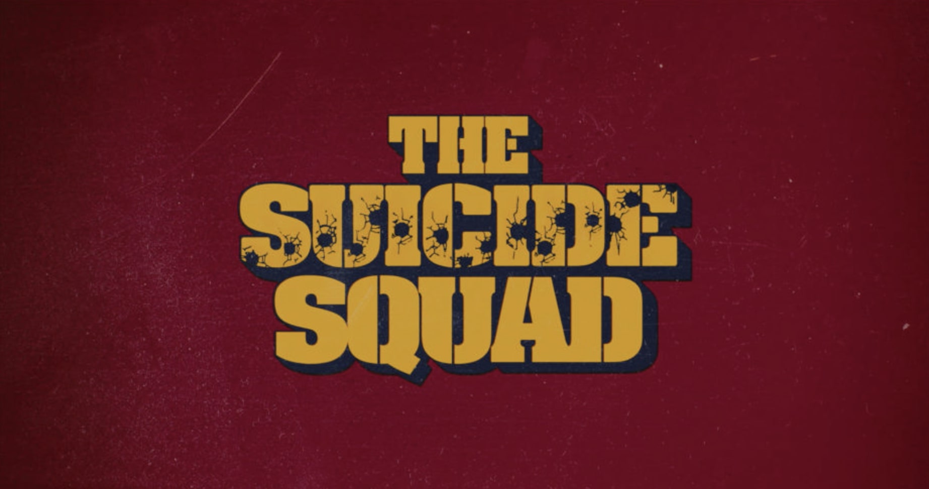
"The Suicide Squad" aka James Gunn's best superhero action movie ever, has many elements to adore. Typography is one of them.
The best DC Universe film for many has an ace up its sleeve, Erin Sarofksy and her team of creatives. The recent Suicide Squad movie presented "atypical challenges for Sarofsky's expertise in typography, motion design, blockbuster VFX, and storytelling on a colossal scale" notes Reel Chicago.
Gunn recruited executive creative director Sarofsky and creative director Duarte Elvas to bring the visual elements of this blockbuster to a whole new level.
"Our discussion focused on creating titles that were bold, colorful, and worked with the dynamic underlying footage," notes Sarofsky of Squad's retro yet modern visual language which aimed to the extremely popular "nostalgic sensibility" Hollywood craves for.
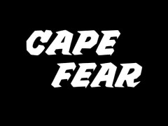
"James was clearly looking for treatments that were evocative of 1960s caper war films," Elvas added. "So, we looked at titling made for films like 'The Dirty Dozen,' 'The Great Escape,' and 'The Guns of Navarone,' and this really informed our exploration."
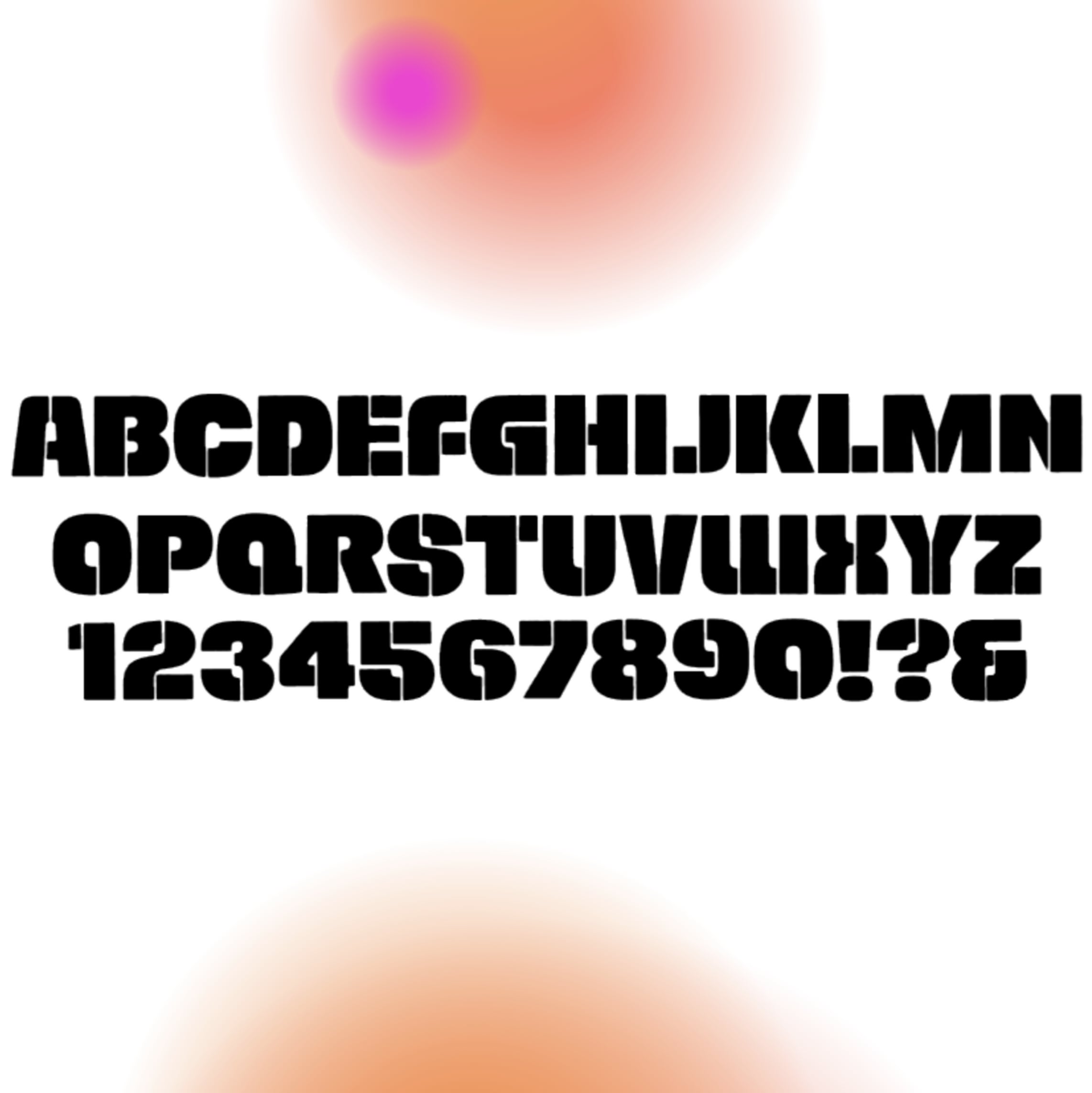
From "The Suicide Squad" title card's bold stencil typeface to the custom type featured across the film, typography takes center stage in the movie. To create the final product Team Sarofsky "dove deep into 1960s films, printed ads, album covers, vintage fonts, and everything else they could find. "
"For this job, the best tool we had was our years of typography expertise and our ability to problem solve legibility on a busy background in an intentional way," Sarofsky explained. "After a few rounds of exploration with the filmmakers, we landed on Alpha Midnight, a 1969 typeface designed by Hiroshi Yamashita, for inspiration. We ultimately modified it so heavily, it could be its own unique font."
"The steps we took to make the titles appear as though optically printed on actual film were key to making this look like a 1960s film," Elvas said. "To get them looking just right, each graphic took at least a dozen Adobe After Effects layers, including textures, grain, glows, bevels, and drop shadows. There is also a very subtle gate weave to all the graphics that further emulates the film effect."
With Adobe Illustrator used for type design and setting, After Effects served the team for look development, layouts, and animation.
Sarofsky's approved end-crawl designs were provided to Scarlet Letters, which set the typography and animated the scroll.
Enter Sarofsky's explosive typographic universe here.
Tags/ typography, movies, custom type
