Hellvetica: revisiting the worst spaced viral font ever
Back in 2019, Monotype updated its classic Helvetica typeface for the 21st century. The company redrew almost 40,000 of Helvetica's characters as part of the Helvetica Now revamp in an attempt to make the typeface feel nicer to read and to work better at smaller sizes. Yet, not in hell.
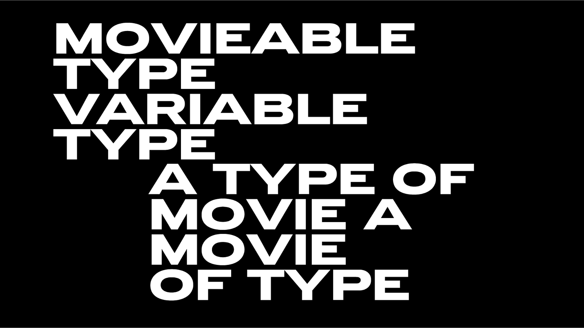
Enter Hellvetica, a comic take on the popular font created by New York-based creative directors Zack Roif and Matthew Woodward.
Their take of Helvetica is hard to look at, especially when you are a designer, its kerning even worse than THAT Comic Sans one. What a brilliant idea!
Introducing : HELLvetica. Like helvetica, but with like, much shittier kerning for Halloween. Download it at https://t.co/BXlLnOI7EG ! pic.twitter.com/qCXvEdjzYD
— Zack Roif (@zckrf) October 28, 2019
The devilish project by Roif and Woodward aka the associate creative directors at R/GA New York was a viral hit.
Meant as a Halloween-themed take on the traditionally pleasing Helvetica, the terrible typeface is the world's worst kerning nightmares coming true. "We wanted people to see this in the wild and be like, What the HELL is wrong with my computer?" told the typeface’s creator, Matthew Woodward.
"Flipping what is widely considered to be the most iconic 'good design' font of all time on its head is about as evil as it gets in the design world" Roif added.
Definitely cringe-worthy the hilarious Hellvetica is "an exercise in going against the ‘designer instincts’ to fix up that awful kerning... Don’t listen to your gut. Forget your training . . . and make that logo kern in hell!"
"Kern in hell" the website states. The site also featured a fake quote from the Swiss creator of Helvetica, Max Miedinger. "What have you done?" he supposedly asked. "I don’t hate it", the master of hell himself, Satan, replied.
Helvetica, this ubiquitous sans-serif typeface developed by Miedinger in 1957 and an all-time classic Swiss design darling turned to Hellvetica with a simple trick.
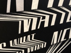
Designed by analyzing the most common letter pairings, and making the kerning as jarring as possible between them the font unleashed a typographic pandemonium that took Internet by storm.
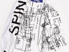
"Brands, agencies, and even Burger King CMO, Fernando Machado got involved. Hellvetica burned designs of anything in its path. Developers set it as their system fonts, agencies re-made their websites, and brands changed their logos" notes Roif.
The project was a viral sensation. Hellvetica resulted in 7.3K font downloads, 540K unique visitors, 76K designs ruined, reached 210M impressions
with a budget of $0 during its run.
Type purgatory is eternal. You welcome.
Tags/ typeface, helvetica, monotype, kerning, typedesign, halloween, zack roif, matthew woodward, hellvetica

