BBC upgraded: new logo and an all in custom font rebranding
The globally-recognized brand BBC (British Broadcasting Corporation) aka the national broadcaster of the United Kingdom and the world's leading public service broadcaster updated its longtime logo design adding a series of distinctive sub-brands for each of its major services.
The redesign that was launched on the 20th of October, 2021, is not a new affair. In fact, the rebranding has its roots going back to 2017 when BBC commissioned Dalton Maag to create its own bespoke font, enter the Red Dot awarded BBC Reith.
The famous BBC logo has had a makeover after audiences told the corporation its services looked "old-fashioned" and "out of date".
Now the distinctive three blocks incorporating the letters BBC are slightly wider apart and feature the corporation's own Reith font.
Named after the corporation’s first Director-General Lord Reith, the font replaced the previous geometric humanist typeface Gill Sans, that has conveyed trustworthiness for many British institutions since its release in 1928, since 1997.
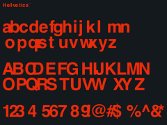
Yet "limitations of the design, specific technical needs, and its reproduction on screen would make Gill Sans unsuitable for many applications, so alongside it the BBC also used Helvetica, Arial, Tiresias, Avenir, and others."
"While this was a sensible compromise in 1997, technology, type, and the sophistication of users and audiences have advanced since then" writes Dalton Maag that was commissioned to design BBC's bespoke font.
"The advent of digital broadcasting, the web, and apps, with more and more people reading on mobile devices, have all brought the BBC closer to its users and viewers but, as they could not use the same typeface across all media, they struggled to communicate a coherent identity and to maintain a consistent voice."
BBC News and BBC Weather have "new symbols made up of three blocks placed at different angles for each service." The same applies to BBC Sounds, iPlayer, BBC Sport and BBC Bitesize with similar icons in various different colours.
"As we update our digital services, it makes sense to modernise how we present them too," said the BBC's chief customer officer Kerris Bright. "Updated, recognisable colours, logos and graphics will identify each service and help improve navigation between them."
As noted many more changes "will be brought in gradually over the coming months."
The BBC said it wanted to modernise "all aspects of our services so the experience feels coherent wherever you access our content" adding that it wanted to "join the dots" between the different BBC services "through simplified layouts and graphics."
Eventually many felt the new version "wasn't significantly different to the old one and questioned the cost involved."
Yet, as the BBC told The Sun earlier this year the use of its own bespoke font that BBC owns the intellectual rights to is a cost effective solution. "It would be wrong to suggest the costs of the design of the blocks was significant" notes BBC.
The BBC blocks logo was first introduced in 1958 and has gone through various updates over the years, the most recent in 1997.
Going "all in" with Reith, the scale of the letters is being adjusted down slightly, making them "fit" better within the squares.
Sibling Rivalry X TCM: rebranding the new classic
BBC Reith "meets the demands of 21st century usage, where corporate fonts must efficiently carry an identity and a message across any medium, from billboard to mobile. The family consists of coordinated weights in both sans and serif, plus matching italics for each, giving a coherent tone of voice with appropriate sensitivity to any message."
"The humanist sans and serif are designed to work together and share many common features: an elegant calligraphic construction, open counters and apertures, ascenders which overshoot cap height, regularized proportions, and sharp connections between bowl and stem" notes Dalton Maag.
"These elements work together to embody an iconic brand, with a tone that is anchored in tradition but with a progressive outlook, and a practicality which promotes maximum legibility for reading on small screens."
BBC Reith made its debut across BBC Sport output in August 2017, with a staged rollout across the rest of the BBC following.
The bespoke design and its implementation are owned by the BBC, allowing the Corporation ultimate flexibility "as they continue their mission to inform, educate, and entertain."
Tags/ typeface, branding, tv, bbc, dalton maag, bespoke











.jpeg)
.jpeg)
.jpeg)


