Camden redesigns the Alphabet
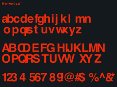
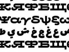
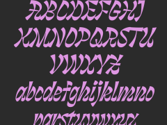
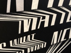
Camden aka the indie advertising agency driven by over 60 creatives at offices in Montreal, Lyon (France), Hong Kong and Toronto, is going back to basics with a creative exercise made of custom letterforms.
The network's creative forces were commissioned to design their alphabet version, one letter at a time.
Eventually, typography, illustration and digital means provide a fresh take on the modern English alphabet aka the Latin alphabet consisting of 26 letters, via Camden.
Erté's Alphabet Series is sublime typography from A to Z
The alphabet originated around the 7th century from Latin script and since then, letters have been added or removed to give the current Modern English alphabet of 26 letters with no diacritics, digraphs, nor special characters.
The word alphabet is a compound of the first two letters of the Greek alphabet, alpha and beta.
"Gathering the designers of an international network for a simple typography exercice... back to basics" Camden Toronto's Thomas Magny Anagny said.
"Across three continents, Camden’s growing network is creating constant design internal projects to give creative freedom to its many talents."
Explore more projects here.
Tags/ typography, alphabet, advertising agency, camden toronto


