Stockholm Design Lab X Sana Labs: a clean & fresh brand identity for a massive change
Sana Labs, a leader in the development and application of artificial intelligence to learning, partners with the world’s leading organisations to transform learning outcomes with personalised learning. Therefore, a brand strategy and brand identity "to disrupt the traditional E-learning sector and create awareness amongst users and companies" was elemental.
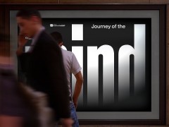
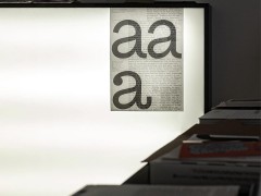
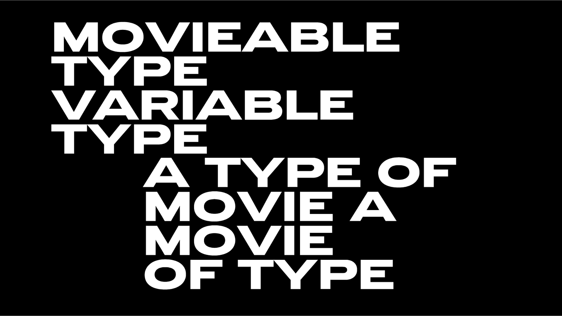
Stockholm Design Lab collaborated closely with the internal Sana design and product team, marketing and management to create this clean and fresh project with typography in collaboration with type foundry Letters from Sweden to create this fresh and clean visual playbook for Sana Labs that elevates the learning experience via Machine Learning.
"The colour palette has been designed to allow for a variety of needs and communications. Specific colours are also pin-pointed for optimised digital appearance and usage" notes SDL.
SDL created a social media system "designed for brand building and driving referrals to other touch-points, such as the website, podcasts, events and campaigns" aiming to create engagement and awareness within the very traditional E-learning segment.
SDL was founded back in 1998 when an art director, an architect and a strategist joined forces to tackle a corporate identity programme "of a scale and complexity that would have stretched the skills and resources of Europe’s most established brand agencies."
Today a multidisciplinary team of designers, strategists, art directors, developers and servicing people that share the belief "in design as a powerful tool to transform businesses and the society we live in," SDL says focused on "design that endures and makes a difference."
Explore more SDL here.
Tags/ typography, graphic design, visual identity, branding, letters from sweden, stockholm design lab


