Chirp for tweets! Sharp or small, Twitter's bespoke typeface debate goes on
Custom typeface is s a key to branding, fact-checked by Twitter. Revealed in August 2021, Chirp is Twitter’s bespoke typeface, replacing type systems such as SF Pro, Roboto, or Helvetica Neue.
“Type, in 280 character doses, is the foundation of Twitter” Derrit DeRouen, the company’s Creative Director of Global Brand explained in a lengthy tweet.
“Our key objective with this brand refresh is to improve how we convey emotion and imperfection. Regardless of whether you’re pro or anti-Helvetica, I think we can all agree that it’s not up for the job. So, that brings us to Chirp, our first ever proprietary typeface. Sharp and legible (with good density), but with personality and distinctiveness” the typeface bears a “beautiful balance between American Gothics and European Grotesques.”
“Research into early hand cut examples gave us the quirkiness that amplified the display set. Rounded titles and punctuation introduce a humanist character. The result is a versatile, contemporary family (82 styles across Standard and Display!) with international sensibilities. It accomplishes exactly what we need and it has made itself the hero of our refresh” added DeRouen on Grilli Type’s bespoke design.
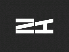
Fabien Baron redesigned Zara’s serif logo and a new typographic debate has begun
“Do we eventually see Chirp as the typeface for the product? It’s my personal desire, and the work on legibility, density, and weight has already begun. There is more refining to do, more languages to build, but the hard work will be worth the benefit of having a holistic brand.”
Eventually, the typeface sparked a debate. Is it a bespoke design or a slightly altered version of GT America? What about its rendering?
“The typeface is too official and jarring to try to quickly read. Using a premade and common font was a good thing; familiarity plays into how people feel when reading things. This change is a step down for accessibility” one user wrote.
Another said: “Hi, I’m a person with migraines, poor vision, and a neurological condition that affects my ability to read text. This font is really inaccessible. I wish you had tested it with people with visual & cognitive disabilities before pushing it live, or gave us an option to change back.”
“The only bad thing I think about Twitter’s new font, Chirp, is that its language support is poor. It doesn’t even support Cyrillic! One of the designers/consultants/something, Derrit De Rouen, said back in January that the reason tweets weren’t in it then was language support. That was clearly not true” tweeted Fredrick Brennan, the founder—and later the antagonist—of 8chan.
Speaking to Slate on Twitter’s campaigning that the font is more accessible, Brennan said:
“I don’t think so. And as I said, I view the entire field of those studies that try to say one font is more readable than another as extremely suspect. There’s just a total lack of repeatable results. There’ve been studies that have been designed and shown that Comic Sans is better for dyslexic children. And then another one will come out in favor of OpenDyslexic, and then another one will overturn those results. I don’t know that a designer can mess up a font so badly, if they’re trying not to, that they can create an unreadable font by doing that — certainly with a font like this that is based on Franklin Gothic, which people have been reading for over 100 years. With the absence of printed materials, we’re not seeing it as often, but I do think that people will get used to it. I don’t necessarily think that Franklin Gothic is an especially unreadable font.“
As BBC reported, Twitter aims to “improve content consumption,” clean up any “visual clutter” and will “go through everyone’s feedback on the font.”
Another redesign, another backlash. To be continued.
Tags/ typeface, twitter, bespoke typeface, grilli type, elon musk

