Hot in rebranding: Three new identities for three fresh companies
As designers and typography lovers we are always excited with a good, fresh rebrand that will spark conversations and debates - online and offline. Typeroom is here for you with three new rebranding projects that caught our attention and will for sure be discussed.
1. Brompton House
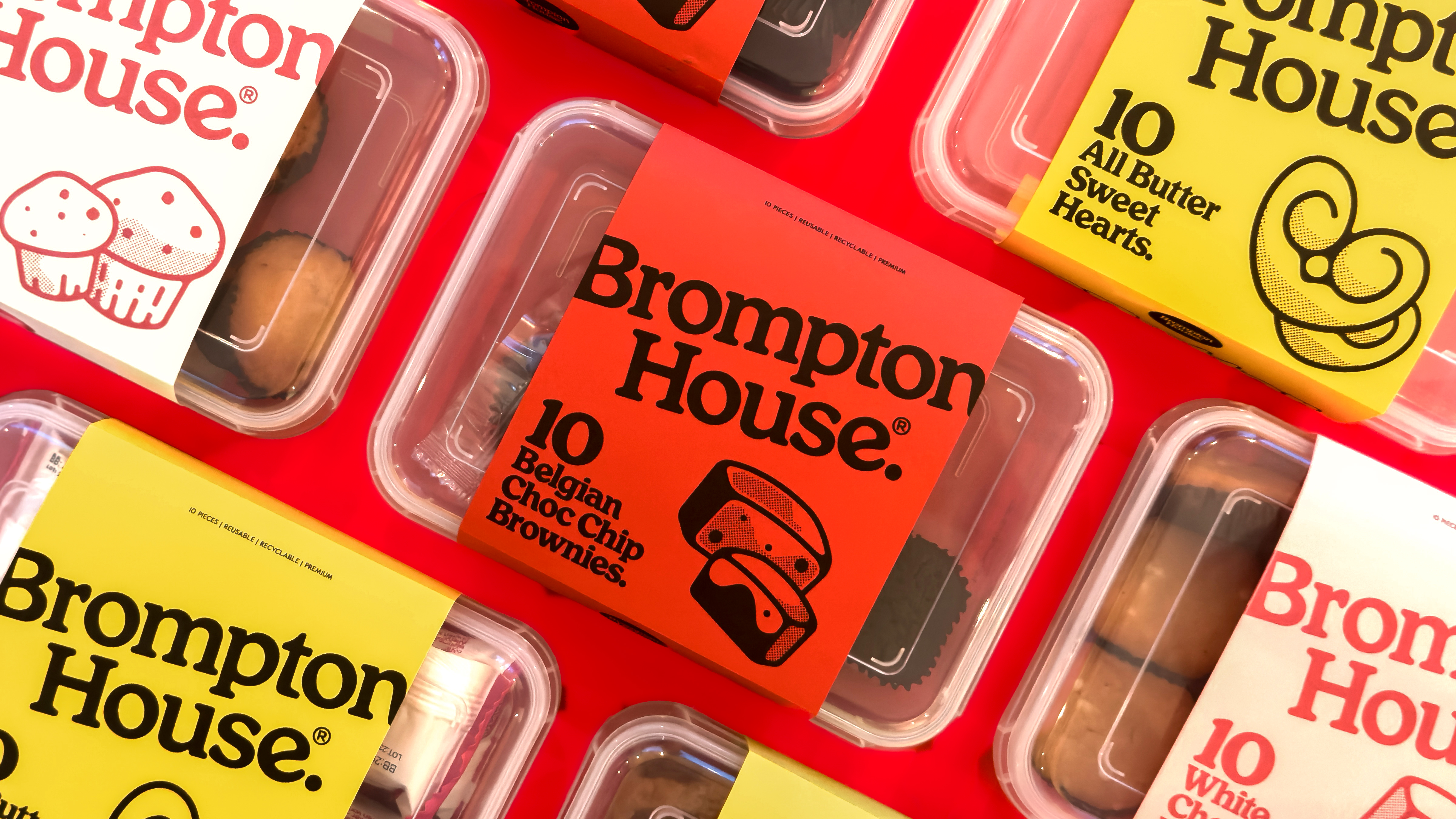
UnitedUs was in the driver’s seat of Brompton House’s rebrand. The studio crafted a new packaging design for the sweet treats company that transports you in their world of joy and authenticity. Aiming to increase brand awareness and claiming a bigger share of the market, Brompton House got a whole new refreshed brand identity that is distinctive, consistent, clear and most of all fun.
The tagline, "the home of sweet treats," establishes the tone of the rebrand and highlights the company's values - quality, reliability, and family. The whole new identity is communicated via a new streamlined logo, playful illustrations and the strategic use of the iconic red color as their signature one, online and in stores.
2. Banco Itaú
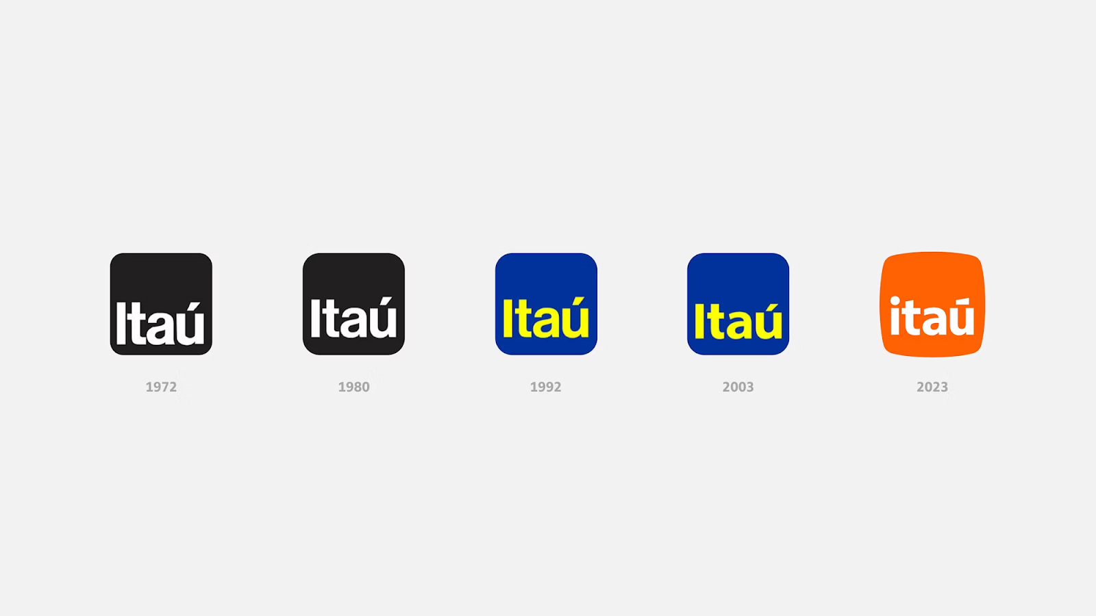
As Banco Itaú, the biggest bank in Brazil, approaches its centennial, Pentagram has revealed its new visual identity and creative rebranding strategy. The new dynamic logo - inspired by the Portuguese word “pedra” that means stone - symbolizes endurance and reliability, reflecting Itaú's deep-rooted Brazilian heritage.
The rebrand is also accompanied by a new colour scheme that includes warm, brilliant orange tones and is heavily based on the use of typography, where improved readability and broader geometry contribute to the brand's approachability and distinctiveness. It seems like Banco Itaú is starting the next century with a fresh focus on innovation and the needs of its customers.
3. Mubi Go
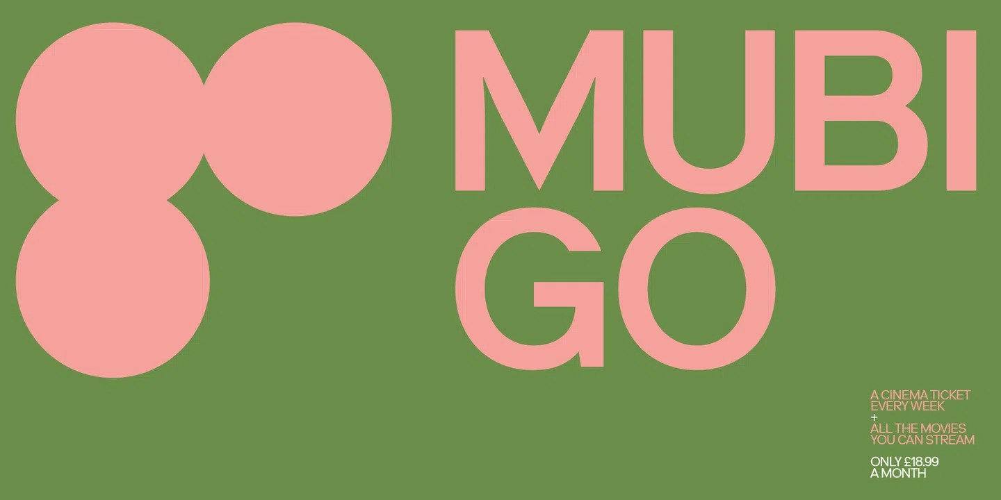
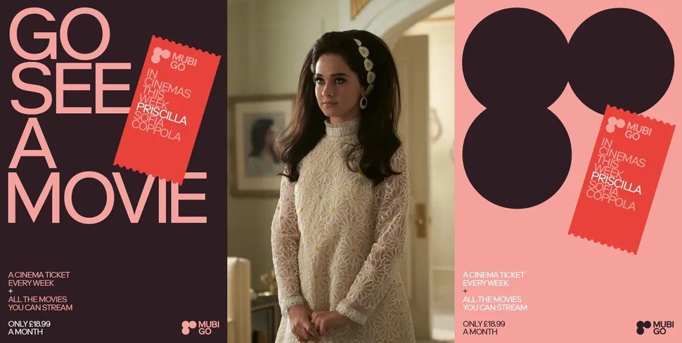
Spin breathed new life into Mubi GO’s visual identity by streamlining the iconic seven-dot symbol into a three dot one that spells out ‘Go’. With a more expansive colour palette and a graphic solution that is simplified and evocative, while also raising awareness of its expanded membership offering - Mubi Go effectively captures the essence of a cinematic experience.
The revised logo took inspiration from ticket stubs, like a wink to the physical act of going to the movies, inviting viewers to engage on weekly cinematic adventures. The company's dedication to fresh thinking and constant development is apparent and pivotal in the rebranding of Mubi Go, which has excited cinephiles all over the world.
Tags/ typography, graphic design, rebranding



.jpg)



.jpg)
.png)
