Typography’s uncharted territories: Rozi Zhu is here to push design boundaries forward
Rozi Zhu is a multidisciplinary designer based in New York City. With a strong curiosity in creative coding and physical computing, she creates experimental visuals and interactive designs. Despite her young age she already has received an array of respectable awards, including the TDC Ascenders Award for 2023. Lately, she managed to sweep us away with her unique and very interesting presentation at the Inscript festival 2023 and we decided to get to know her better. Here is our chat with the extraordinary Rozi Zhu!
Typeroom: Hey Rozi! Tell us something about yourself to get to know you better as a designer. Do you enjoy the journey so far?
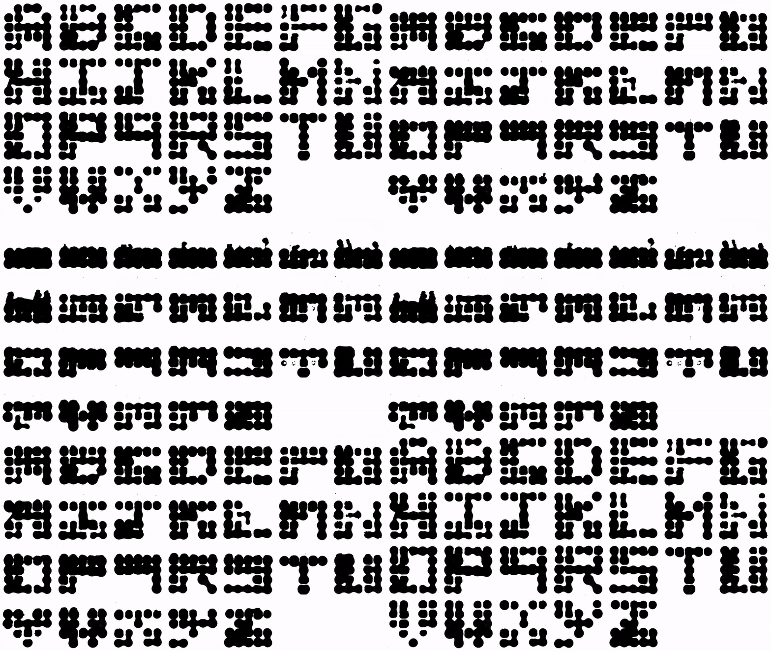
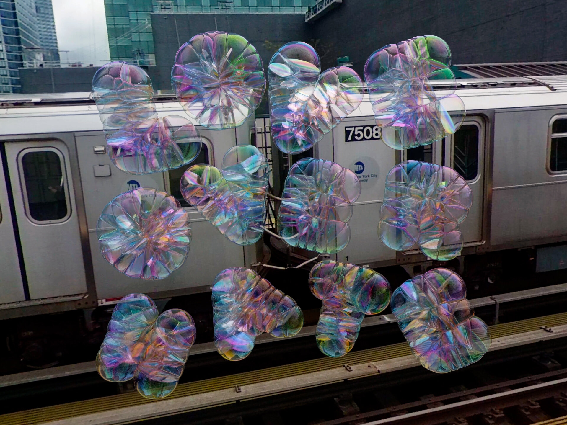
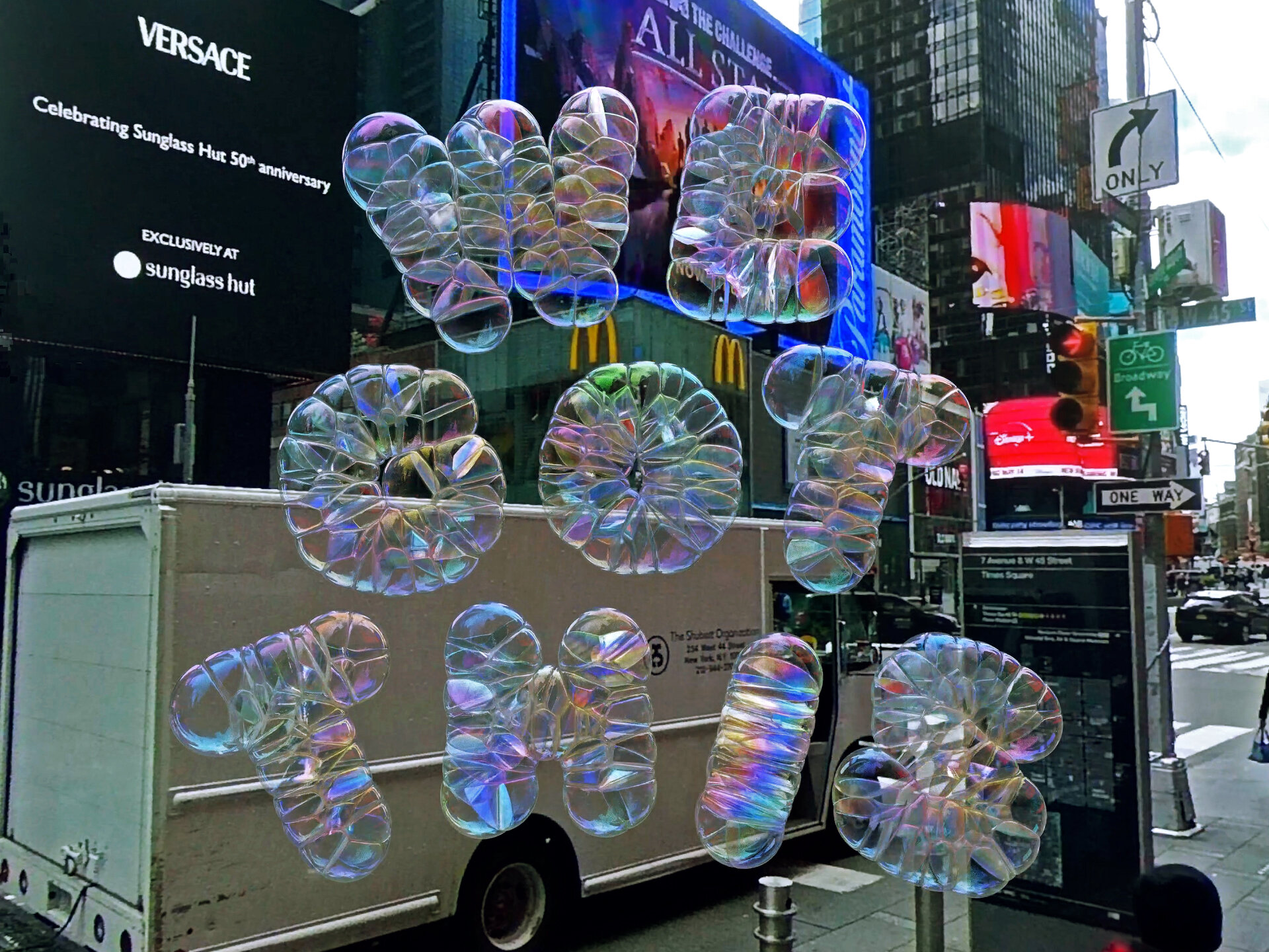
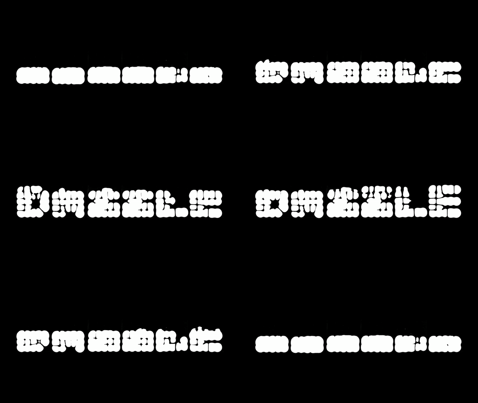
Rozi Zhu: I was very lucky to have worked with some impressive studios in the past, including Studio TheGreenEyle, Dazzle Studio, and BUCK. I've contributed to lots of exciting projects such as the Dream in Dior Campaign, Art and Ideals Exhibition, MTV VMA's Art Exhibitions, and more. Besides that, I enjoy creating experimental designs on my own, exploring different materials and media. For example, I've researched the physical properties for projects like Bubble Type and Ferrofluid Type, creating installations to present the typography in a novel way.
TR: What inspired your fascination with design and especially typography?
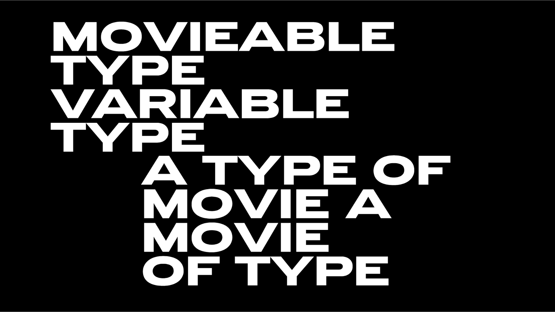
RZ: While typography has been around for a while, exploration has mostly been in the realm of two-dimensional design. The evolution of fonts is intricately linked with technology and societal demand. When paper was invented, it gave rise to calligraphy, handwriting, and the creation of books. As the demand for books increased, Movable Type emerged. And with the emergence of the internet, digital fonts and variable fonts came into existence to meet the demands of the time.
I aim to stand out by creating something original and novel for this contemporary era. Coupled with the rapid advancements in technology, including AI, I believe in pushing the boundaries of typography to keep it in sync with the times and ensure its continuous evolution. My goal is to integrate various technologies to make typography progressive and relevant in the ever-changing landscape. You see, fonts have always been evolving. In this present era, I aspire to create unique typefaces that capture the essence of our time. Embracing technological advancements, I incorporate various techniques, including AI, to ensure that my typography keeps pace with the ever-changing landscape.
TR: What is the most challenging aspect of working as a designer?
RZ: The biggest challenge is to avoid getting too comfortable. It’s understandable that clients often lean towards established and promising design solutions which are already prevalent in the market. The advancement of the design industry relies on those who are willing to venture into uncharted territories and explore innovative approaches. As a designer, it's essential to continually experiment with novel techniques and push the boundaries of current design standards. So, in short, the key is to always keep pushing the limitations of the current design.
TR: Tell us about your creative process. How do you start a new project? What is your method for making design decisions?
RZ: It really depends on what kind of project it is. For my own projects, I usually start with a rough concept in my mind, with a bunch of guessing and questions. I would do a bunch of researching and prototyping to seek confirmation for my speculation. As I spend more time on the subject, I gain more knowledge and experience, and lead the project further.
For example, in my Bubble Type project. I started with researching the property of bubbles, the proportion of bubble solution, and the physical property. But as I understand more and explore more on the existing projects, I changed my direction several times from physical installations, to interactive experience, and finally to digital animations.
TR: You have also done a lot of commercial work for Dior, Google, Adobe. How do you insert your personal POV and lessons learned from Material Type to these projects?
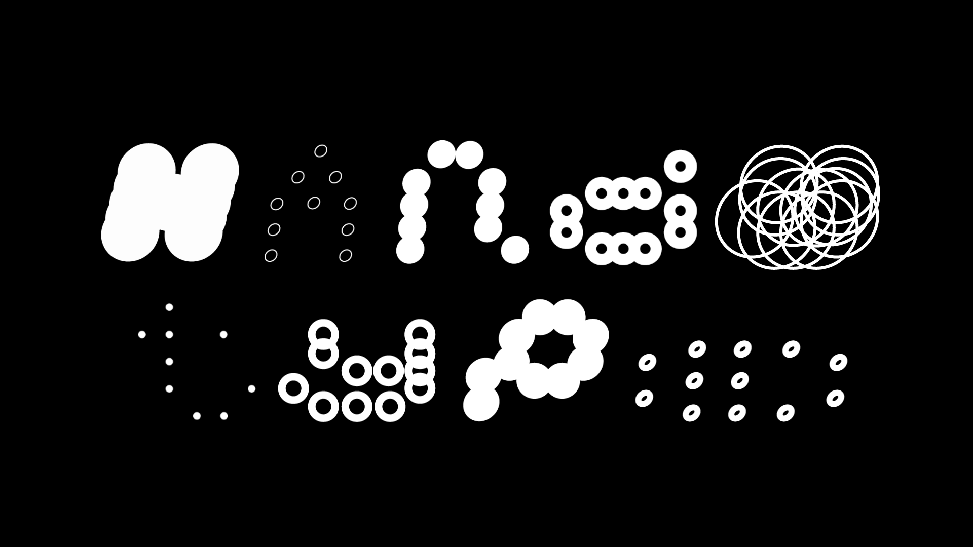
RZ: In my own projects, I use lots of creative coding and physical computing which pushes the boundary of typography design through using different mediums. For example, in the Ferrofluid Type, the installation is fully hand-made and strictly controlled by the code, so the animation and movement can be precise. And in my latest project Handy Type, we used artificial intelligence and machine learning techniques to create a customized system, which allows users to craft personalized fonts through their hand motions.
For client projects, my primary focus revolves around bridging my interdisciplinary approaches between graphic and interactive design. For example, I worked as both a designer and a creative technologist in the ‘Dream In Dior’ Campaign to develop the AR experience, which includes four site-specific experiences in Seoul and Paris, an at-home experience, and a point-of-sale experience across hundreds of locations. Showcasing the campaign's success for the brand, the #DreaminDior hashtag amassed over 84,000 posts on Instagram.
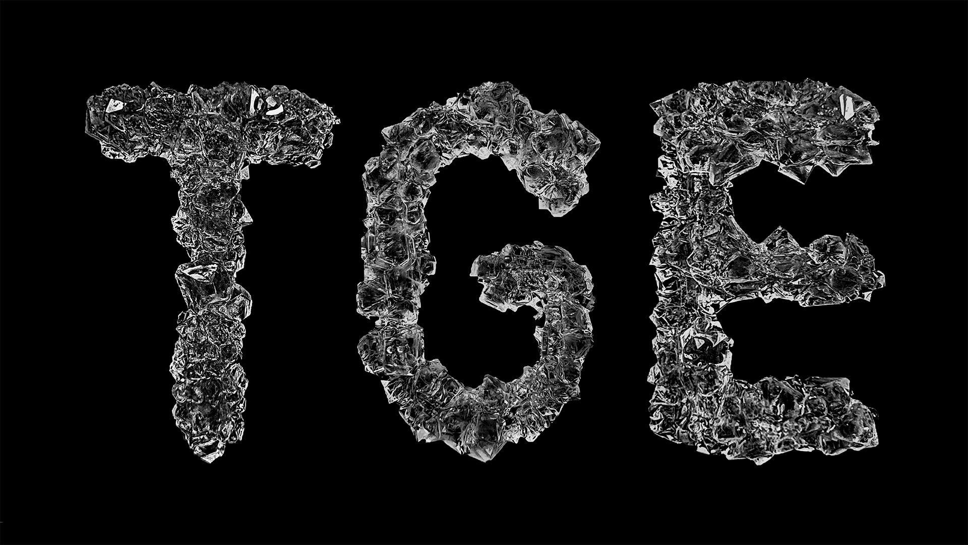
TR: Your Material Type project is characterized by experimentation with unconventional materials. How did you come up with this idea and can you tell us more about the challenges and lessons learned from this process?
RZ: A typeface is a collection of distinct shapes—purely artificial, created by human hands for the purpose of human reading. Type designers invest years refining every nuanced detail, striving for perfection. This led me to ponder: what if there were an 'imperfect' type, where letterforms aren't 'fully shaped by human hands'? And this is how I started the Material Type series. There were so many challenges but the main purpose was to combine fun with aesthetics through novelty. To me, the design experience is as important as the outcome. I wanted to make something people had never seen before and also make myself proud.
TR: Your type designs seem to be a conversation between nature and A.I. - are nature and A.I. connected or opposed? How do you balance them in your work?
RZ: I don’t think they are opposed at all. To me, AI is just another tool, it's the same as pencil, photoshop and JavaScript. Design, much like problem-solving, requires different approaches for various proposals and goals. Designers should employ the most suitable tools in the appropriate context.
TR: What are you working on now?
RZ: I’ll be joining the Instagram Team in January 2024 as a designer. Although I am not at liberty to discuss the details of the project that I will be working on at Instagram, I am certain you all will be very excited about it.
TR: Can you share with us some sources of inspiration, artists, designers and/or projects that shaped your approach and aesthetic as a designer?
RZ: One of my most memorable experiences was working with Zipeng Zhu, the founder of Dazzle Studio in New York City. Zipeng encouraged me to develop different skill sets and applied them to various projects, including graphic design, branding, packaging, motion, 3D, Face Filter, and typography. As I see Zipeng as a mentor, I have been inspired by both his strong design style and personal character.
Find more about Rozi and her work, here.
Tags/ typography, type design, interview, interviews, artificial intelligence, acid graphics, rozi zhu
.jpg)


