Challenges, lessons and the finest type design from Southeast Asia
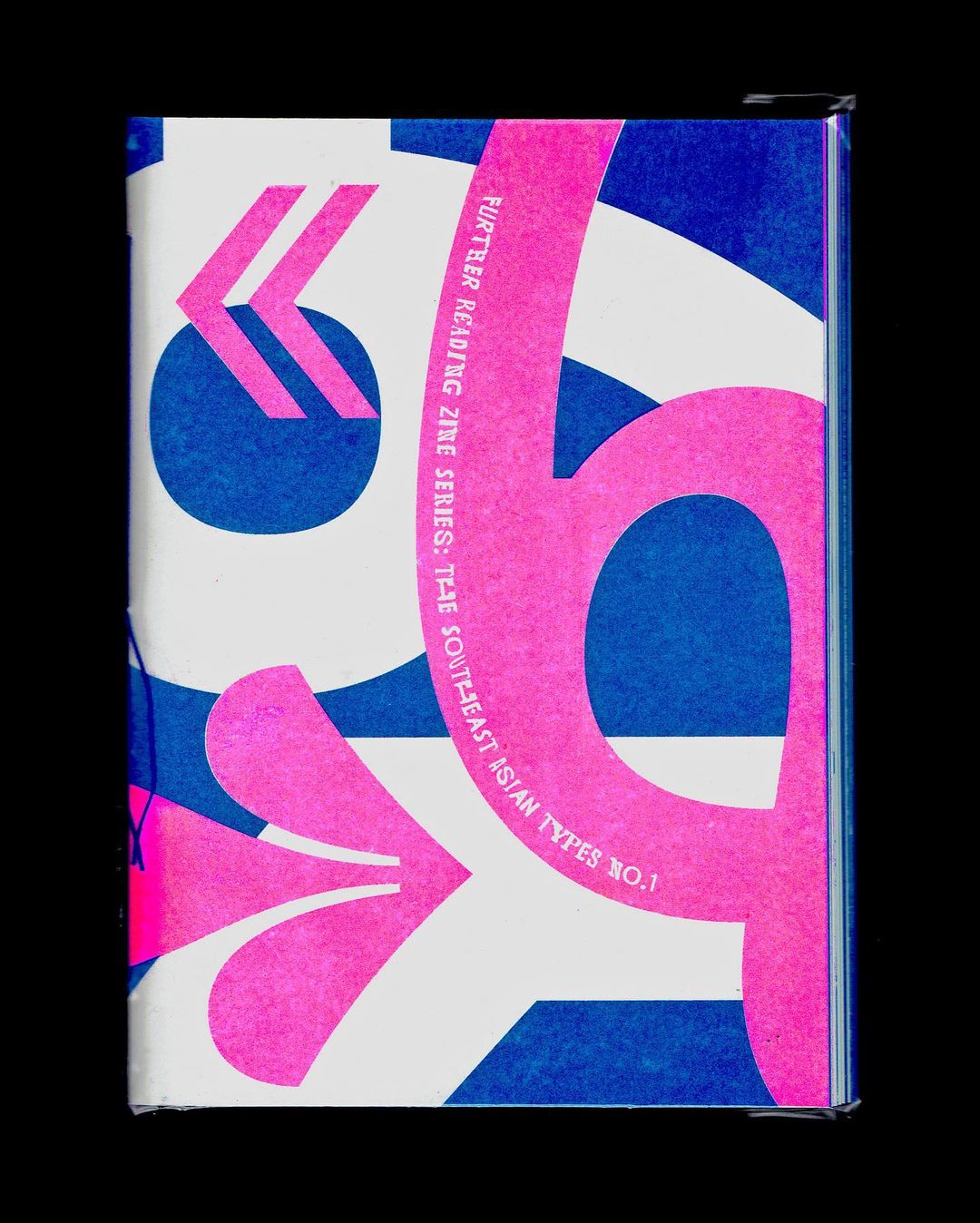
For years, decades and centuries, all conversations about design were focused only on the western world. Fortunately, lately this narrative has changed. There have been active and powerful initiatives that strive to offer visibility, space and voice to diverse communities, indigenous cultures and developing nations that have suffered from colonialism, wars and socio-economic turmoil. The Southeast Asian Types No.1 by Further Reading is a publication that does exactly that. We do not often read about typography and type design in Southeast Asia and it is about time that we do.
“Prior to—and even during—the era of colonialism, countries in Southeast Asia, which are currently home to 8–9 per cent of the world’s total population, have consistently served as open trade hubs where influences from various cultures, such as China, Arabia, and India, converged. The confluence of these historical factors ultimately shaped the present-day regional identity of Southeast Asia, encompassing the languages spoken, scripts used, religious practices, and the realm of arts and culture”, writes the Editor’s note.
It is evident that these countries carry a vast and multifaceted treasure trove of histories, influences and experiences and while in the past creatives have been looking towards the West in order to align their aesthetic, lately they are starting to look back and towards their own culture, heritage and creative past. This zine is the perfect gateway for us to know the type design scene in Southeast Asia and start a cross-cultural dialogue and fruitful exchange.
The first essay, 'Improving Typographic Options in Southeast Asia', starts by touching on a practical but super important issue: incorporating native Southeast Asian scripts into the online environment. The author, Ben Mitchel, explains that although it is a given for anyone to use their computer for the Latin alphabet, this was not a reality for Southeast Asia until recently, as various texts, like the Burmese text, could not be rendered on browsers.
On 'Mistakes Acknowledged, Notes Taken, and Lessons Learned', Mint Tantisuwanna takes us on a type design journey, writing about her project ‘Arabika’ and explaining the nitty-gritty details. ‘ABC of Roxy’ presents the Each Other Company/Aditya Wiraatmaja initiative, which designed a distinctive collection of fonts by converting several vernacular types in Jakarta's Roxy neighbourhood into letterforms.
Moreover, in this zine you can get to know creatives and typefoundries from Southeast Asia through thorough and interesting interviews - from Singapore’s Fable Type Foundry and type collective ‘Death of Typography’ , to Thailand and Cadson Demak’s Anuthin Wongsunkakon and Indonesia with Leonard Tanuwijaya. Of course, a zine would not be complete without strong visuals and that is why you can browse through exquisite examples of type design, crafted by designers from Southeast Asian countries.
All in all, this zine is an entertaining and at the same time educational resource for designers, creatives, educators and anyone interested in the creative industry. By offering insightful knowledge and bringing so many talented and hard-working designers to the spotlight, this zine manages to present a holistic and comprehensive overview of the type design culture, scene and reality in Southest Asia. At the same time, it manages to touch on severe problems, issues and difficulties that these communities face without losing its positive attitude and hope for an inclusive, creative future.
It is for sure a must have for any typophile that does not want to remain stuck in the same stereotypical, western rules and aesthetics.
Tags/ typography, typeface, type design, publication, zine, review, southeast asia


