5 Up-and-Coming Women Share their Insights on Typography, Technology, and Innovation
The typography aficionados all around the world must be quite excited, as the Inscript Festival is going to start soon, offering an array of interesting and thought provoking presentations to all, from the 4th to the 8th of October.
Before attending this festival of typography, technology and design, we wanted to invite 5 special Inscript guests to our Typeroom platform. These 5 guests are all women that thrive in the design field - a world that has been dominated by men for such a long time - and that is why it is super important to celebrate them, bring them to the spotlight and admire their work. Let’s meet them.
Tra Giang Nguyen (Gydient)
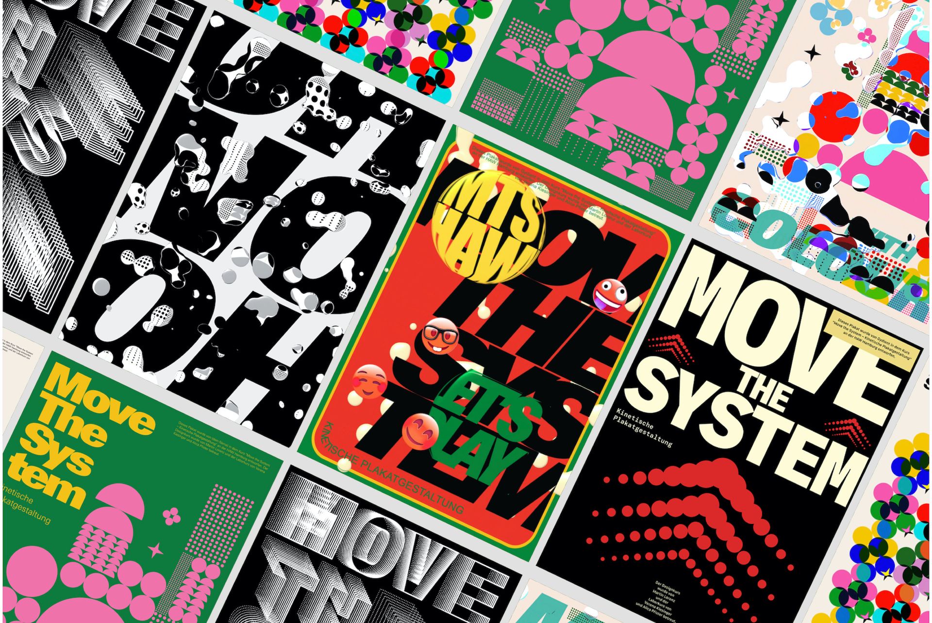
Gydient is a forward-thinking creative, based in Vietnam & Germany, driven by a passion for collaboration and integrating new tech into art & design.
Typeroom: What motivated you to participate and what should we expect from your presentation for Inscript?
Gydient: Absolutely! I attended Inscript last year and was genuinely excited by the work of other designers, which had a significant influence on my graduation project at Design Department HAW Hamburg. So when I received an invitation to speak at my favorite event, I immediately said yes.
TR: Inscript is all about experimental typography and technology. How do you see typography and design evolving for the next few years?
G: AI, VR/AR, and Mixed Reality are the keywords that will have a growing impact in the coming years. Typography is a means of communication, and our methods of communication will adapt to evolving technology.
TR: Share with us one of your projects that you think represents your work and style the most.
G: I don't have a specific style, but I aim to infuse my work with courage to convey the stories I want to tell. EVA (Exposed Virtual Anonymity) is a long-term project that began as my graduation work. It had its first exhibition in May 2023, drawing over 6,000 attendees in just four days. And it's about virtual identity & privacy.
Monica Losada
Monica Losada is a graphic design graduate from Barcelona, Spain. Her work revolves around communication, print and experimental design with a deep understanding of narratives.
Typeroom: What motivated you to participate and what should we expect from your presentation for Inscript?
Monica Losada: As a recent graduate, It’s very nice to have the chance to participate in something alongside professionals I admire. I will go through a series of experiments that ended up shaping my final degree project, “Desde el estándar”, a book that explores the role of tools and digital interfaces in shaping formal languages.
TR: Inscript is all about experimental typography and technology. How do you see typography and design evolving for the next few years?
ML: Like in most fields, technology plays a big role in graphic design practice. I believe the tools we use shape our practice, so as a designer I feel with the compromise to explore the limits of what this means. We’ve been seeing a lot of AI experimentation and interactive exercises in the field lately. These trends come from the will to experiment with new mediums and technologies. However, I also believe that innovation doesn't always come when using a new tool, but also using a conventional one in a different way. It's more about how we approach and think about them.
TR: Share with us one of your projects that you think represents your work and style the most.
ML: I'd say “Desde el estándar” sums up most of what I've been doing lately. It is somehow a continuation of this exercise I made in a workshop tutored by Studio Dumbar, and “Open Works”, a project I did together with my friend Josu Larrea. The challenge was to create a visual universe via pushing the boundaries of an alternative toolkit: letting cross-stitch pattern makers, ASCII art generators, and various online random tools I stumbled across with guide my formal exploration. It's not just a project about “tools”, but also about exploring limitations, possibilities, and an excuse to talk about what is our role as designers and how we navigate our craft.
Khyati Trehan
Khyati Trehan is an Indian graphic designer and 3D visual artist, living and working in NYC. Khyati’s career has seen her work across disciplines, drawing inspiration from the context of the work and often exploring the edges of all things visual.
Typeroom: What motivated you to participate and what should we expect from your presentation for Inscript?
Khyati Trehan: I attended the first ever Inscript last year and there really is nothing like it. Inscript has platformed a new space for type and tech. There aren't that many conferences that champion the tinkerers at the edges. I'm happy I was considered this year. I'll be sharing some experiments that throw type in the mix. I've been expanding my toolset and repurposing tools to do the things they weren't built for for a bit now, but it's the new workflows between them that's exciting me lately. When do you move from one tool to the other? What tools help you relinquish some control and when's the right time to bring the work back into your hands? Where does generative AI fit into all of this? How can it feel like a tool you use rather than a button you press to find whatever shows up at the other end? I don't have the answers but you'll see me try. I call this back and forth the ping ping process. It's a way for me to feel a certain kind of ownership over randomness, and to take a piece to new places.
TR: Inscript is all about experimental typography and technology. How do you see typography and design evolving for the next few years?
KH: It only takes comparing what kind of imagery the same prompt, only a few weeks apart, yields to consider months vs. years as a metric for advances in generative AI. Type specific outputs currently slot better under the category of expressive typography because it's tricky to get it to do exactly what you want; diffusion models are unpredictable and hard to control. I expect models to get better at taking on some of the more practical tasks involving typography, like making iterative layout options, or scaling character systems. In the same way new UI typesetting paradigms emerged from the rise of app populated smartphones, I see LLM formatting rules and best practices becoming the next place for typography to serve. Will we see a need for exaggerated hierarchy in a world where we consume information in the form of a mass of text on chatGPT instead of distinguishable websites? I'm speculating for kicks.
TR: Share with us one of your projects that you think represents your work and style the most.
KH:I can't pick an isolated project so I'm going to have to cheat and pick the collection of my more editorial illustration work for publications like NYT, New Yorker and WIRED. It feels like a rough average of the kind of work I enjoy doing often. The piece has a job to do and something to clearly communicate, but still has space for my visual expression and interpretation in it. The style skews towards 'organic' as a result of illustrating articles about the human body and the physical world, which in turn come to me because of my biomorphic style. It's a cycle I'm happily caught in.
Lena Weber
Lena Weber is a graphic system designer and creative coder, focusing on the development of design tools and typographic systems.
Typeroom: What motivated you to participate and what should we expect from your presentation for Inscript?
Lena Weber: Of course, I’m excited, I was super stoked to be invited alongside so many designers I admire. My variable gradient typeface, Gradial, is one of the longest projects that I ever worked on and I’m very happy to be able to present it at a festival that specializes in experimental type. I always felt drawn to the intersection of type and graphics and most of my independent projects are somehow related to the field. Can’t wait to hear everybody’s talks.
TR: Inscript is all about experimental typography and technology. How do you see typography and design evolving for the next few years?
LW: I think typography is one of the most fascinating fields of design for other topics to merge with, so I think exploration and interest in this intersection is only going to grow stronger in the future. There is infinitely more to be discovered and I’m honestly just excited for the ride. I don't know if I can say that much about the future or how it looks in my eyes in terms of typography.
I'm extremely inspired most of the time by "simple" technologies, systems and dependencies. I’m still very taken by variable font technology as a concept: Interpolating between different states, simply amazing.I see design heading in a systematic direction. Generation, Automation and Flexibility are ever growing topics in my opinion. Typefaces are the ultimate design systems; I have always been fascinated with creating typefaces that are an ultimate modular toolbox to experiment with and to find new inspiration within their limited scope of rules.
TR: Share with us one of your projects that you think represents your work and style the most.
LW: As I said before, I am very fascinated by systematic and grid-based designs in typography/graphic design. I've been working on a modular form archive for several years now, which started as a "secret typeface" and is now becoming more and more of a form generation machine. Every readable typeface I've started after that has more or less evolved from similar ideas. I love mono- (in my case zero-space typefaces). The idea of tiling an entire surface with typography is very satisfying to me.
Rozi Zhu
Rozi Zhu is a multidisciplinary designer based in New York City. With a strong curiosity in creative coding and physical computing, she creates experimental visuals and interactive designs.
Typeroom: What motivated you to participate and what should we expect from your presentation for Inscript?
Rozi Zhu: A lot of designers and studios I admire have participated in 2022 or will be presenting in 2023, like Richard The, Kiel Danger, Mutschelknaus, Schultzschultz, Studio Dumbar, Sanchit Sawaria, OKOK… It's such an honor to be presenting alongside them. During my presentation, I will share some design thinking and working processes of my work Material Type.
TR: Inscript is all about experimental typography and technology. How do you see typography and design evolving for the next few years?
RZ: It's not just design, the evolution of most of the fields in human society is closely related to technology, which is counting on the top engineers, developers, and scientists of this era. Most designers, in fact, are just users and beneficiaries of these technologies. And technology also changes societal demands. From prints to digital social media. As the demand is changing, typography and design also evolve accordingly. Right now, Artificial Intelligence is very popular, and there are many AI-related typography and design projects out there. I believe AI will continue to drive innovation in typography and design. However, it does not mean that traditional typography will be obsolete. In fact I believe they can never be replaced.
TR: Share with us one of your projects that you think represents your work and style the most.
RZ: The Material Type series is a strong representation of my work and style. Within this series, Crystal Type and Ferrofluid Type, stand out as they represent different aspects of me. Crystal Type involves utilizing the crystallization process to create letters from thin to bold, which includes the material test, digital simulation and numerous experiments. On the other hand, Ferrofluid Type delves into exploring the magnetic property of ferrofluid and programming its motion with electromagnets.
What’s similar between these two projects is my innate curiosity for the materials, the creative approach to typography design in different situations and my methodology of exploration - a process of continuously learning and solving different problems with the most appropriate solutions. The difference lies in the personal aspect. For projects like Crystal Type, I was having a difficult time in my life and my emotion became an integral part of the project, which makes it more personal, while Ferrofluid remained more of an objective statement. I think this is the charm of passion projects - there’s no right or wrong answer.
Tags/ design, typography, technology, interview, women, inscript
