Kleos: A new expressive variable typeface with dual personality by Parachute®
The latest Parachute Typefoundry release - PF Kleos - is one for the books! This is really a high-quality and sophisticated typeface that can effortlessly add a luxurious, elegant, high-end character to your design. It is an expressive variable typeface that embodies a captivating texture with a dual Sans or Serif personality.
Kleos (klé•os) is Greek for fame and glory, so it is the right name for a typeface that strikes the perfect balance between opulence and versatility, complexity and practicality, style and timelessness. But let’s start from the beginning. Kleos was originally designed for an esteemed publication, the Interni Megalogue. Parachute® was commissioned to design and overlook the production of the Interni Magalogue, and create a design that could express the Interni aesthetic, its values and distinct Moda Bagno brand. To achieve this, Parachute developed PF Kleos, a bespoke typeface that seamlessly blends minimalism with intricate elements to cultivate an ambiance of refined luxury. Later on, Kleos underwent some crucial enhancements and is now commercially available.
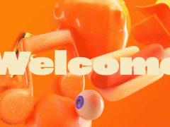
Drawing inspiration from the typography of the Vienna Secession art movement in the late 19th-century and A.M. Cassandre’s iconic Art Deco designs of the roaring 20s, as well as from 70s typefaces like Busorama, it effortlessly blends a sleek modern aesthetic with timeless allure. Kleos boasts an extensive design spectrum, showcasing a wealth of graceful, stylized, and geometric shapes that offer endless possibilities for expression and personality. Its uppercase letterforms exude a monolinear, curvaceous elegance, while the lowercase letters introduce intricate geometries with high-waisted versions, adding a touch of uniqueness.
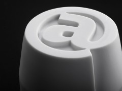
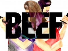
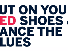
To further elevate its visual impact, the typeface features a collection of distinctive alternate glyphs and discretionary ligatures, enhancing its sophisticated and classy aesthetic. This makes Kleos an excellent choice for creating standout brand identities, captivating posters, visually striking magazines, impactful advertisements, and enticing book covers. What sets Kleos apart is its incorporation of variable design axes, allowing for seamless customization of its visual characteristics. By adjusting the weight axis, users can effortlessly fine-tune the typeface, ranging from the delicate Light variation to the intense Extra Black. Furthermore, the serif axis introduces subtle and elegant serifs, elevating Kleos to the realm of high-profile typefaces”.
In an era of information overload, indulgence and chasing impressions over high quality, Kleos is designed to offer elevated aesthetics, outstanding details, distinctive character and poised composure without being superfluous, rampant or simply try-hard. Such a typeface is a powerful tool for every designer as it can be used in multifaceted and diverse projects, always offering dynamic, exciting and meaningful results.
You can find more about the expressive Kleos here.
Tags/ custom typography, bespoke typeface, fonts in use, variable, variable font, new release


.gif)
.jpg)


.jpg)


.jpg)


