Rebranding report: NOKIA, 7Up & HOMA
Brand new week, brand new logos! Typeroom recaps all the latest rebranding projects to know this week with NOKIA, 7Up & HOMA.
-
Case 1: NOKIA
Finnish telecoms firm Nokia revealed its first major redesign of the firm’s logo in nearly 60 years on the eve of Mobile World Congress 2023. With its brand-new logo, the company is severing ties with its consumer facing past (enter the smartphones era) whilst presenting a new one that focuses on its current B2B agenda.
“In most people’s minds, we are still a successful mobile phone brand, but this is not what Nokia is about,” Nokia CEO Pekka Lundmark told Bloomberg. “We want to launch a new brand that is focusing very much on the networks and industrial digitalization, which is a completely different thing from the legacy mobile phones.”
“Now is Nokia’s time to unlock its next stage of growth. First, Nokia needed to gain recognition for the B2B technology innovation leader it already is. One that enables customer and partner ecosystems to create the digital services and applications of the future, demonstrating what’s possible when the world acts together” notes Lippincott, a longtime partner to Nokia through every major step in its brand journey for the past 15+ years.
“We were tasked with driving re-appraisal for Nokia as a B2B brand, and help the company accelerate its next phase of growth. Working closely with the organization, we started by distilling the company’s ambition into a brand positioning that reflects the valuable role Nokia plays: pioneering the future where networks meet cloud to accelerate the impact of digital in every industry. We further articulated Nokia as a strategic collaborator and a distinctly human brand with a new purpose” adds the global creative consultancy.
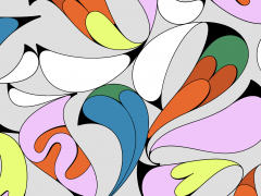
“This purpose comes alive in a fresh new logo and visual identity, designed to signal change and help existing and prospective customers see Nokia in a new light. We built the identity to echo Nokia’s rich heritage as the inventor of essential technologies, while giving it a fresh, contemporary, dynamic feel to represent the Nokia of today. This meant simplifying the geometry of the original logo and striking the right degree of visual evolution so the iconic logo, unchanged for more than half a century, was still instantly recognizable. And, to visually represent Nokia’s purpose, the logo’s individual letters were abstracted so they only read as ‘Nokia’ when they act together. We also designed a new logo for Nokia Bell Labs—the iconic technology innovator– to highlight Nokia’s ownership of Bell Labs and, bringing it visually closer to the Nokia brand.”
“The new digital-first identity goes further with a kaleidoscopic color palette and bold imagery that cuts through the industry’s sea of sameness. The logo’s N, O and K letterforms have been repurposed as bold graphics to use across all content, so every communication from the brand is distinctively Nokia.”
The company has come a long way since its founding as a single paper mill operation in 1865. Its original logo featured a salmon head — a reference to the Nokianvirta river by which the mill was established and which gave the company its name reports The Verge.
-
Case 2: 7Up
A favorite across the social media platforms is 7Up’s first “major” brand overhaul in over seven years. The fresh identity that aims to “better capture the brand essence” follows the ever-growing trend of simple, flat packaging visuals.
The rebranding has been carried out by the PepsiCo Design and Innovation Team who aim to visualize the “essence” of 7Up and 7Up Zero starting March 2023.
With “zesty citrus tones” added to the 7Up’s green palette, the logo gets a 3D treatment with “high-contrast lines” for a refreshed, dynamic positioning.
“Our new visual identity for 7Up was inspired first and foremost by the brand’s creation of moments of UPliftment throughout its history. The PepsiCo Design and Innovation Team created a bright and confident visual identity system that will echo across cultures, regions and languages” wrote Mauro Porcini, SVP and chief design officer of PepsiCo as green is all the rage and we are all up for it!
-
Case 3: HOMA
London-based agency Ragged Edge was commissioned to come up with a new identity for HOMA, a platform that aims “to revolutionise mobile gaming, giving independent developers the firepower to take on the incumbents.”
“With 200 people from 34 countries, 1 billion downloads of their games, and a total of $165m in funding, Homa came to us at an inflection point. They wanted to step up their mission to redefine the gaming industry. To succeed they needed to position themselves as an ally for independent game developers. To build a talent brand that would attract the world’s best engineers. And to transform millions of gamers from fans of HOMA’s games, to fans of HOMA itself” notes RE who developed an identity that “re-engineer[s] the brand from the inside out.”
Immersive 3D backgrounds, created by Visual Citizens with artistic direction from the Ragged Edge team, provide a surreal “data-fueled wonderland” while the new HOMA logo opts for symmetry based on a strict grid system “as if it was created by an algorithm.”
“This rebrand was crucial for the next phase of our mission as we look to democratise the industry. We knew we had to be bold, and Ragged Edge has done something truly amazing. The feedback we’re receiving is just insane” said Daniel Hathan,HOMA’s founder & CEO about this pretty in pink collab.
Tags/ typography, typeface, branding, rebranding, pepsi, nokia, game industry

.jpg)
.jpg)

.jpg)
