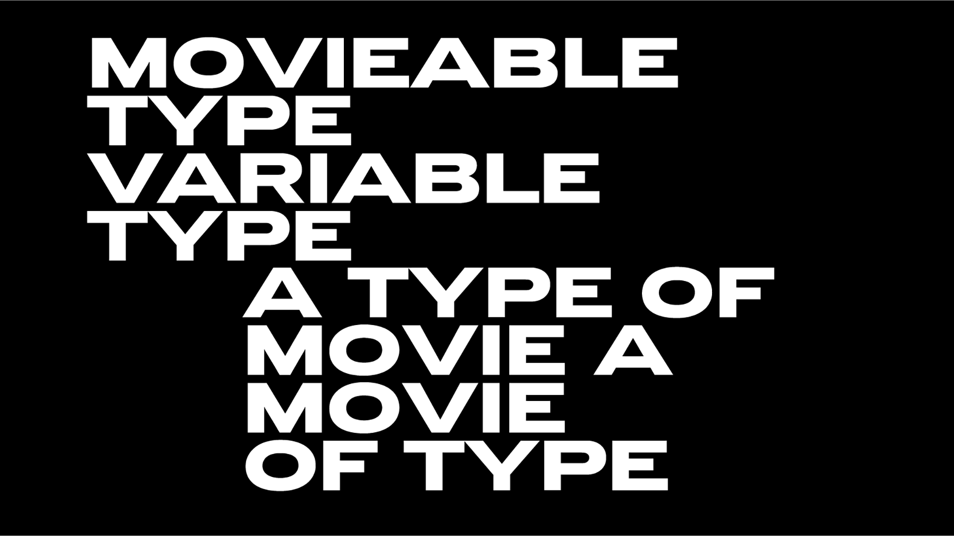
Muy Caliente! Brightscout’s rebranding is as cohesive as it should
Digital design and development studio Brightscout aims to “transform the world’s most innovative businesses through a powerful mix of exquisite design, development, and strategy solutions.” To further push this bold agenda whilst celebrating the company’s expansion with offices in in Serbia, India, Argentina, and the United States, Brightshout went for a whole brand-new ambitious rebranding.
The “polished and innovative” appearance provided the company with a “unique opportunity to test its own process” on itself. “We think the outcomes look Muy Caliente if we may so ourselves” notes Charles Haggas.
The logotype is full-on UPPERCASE “because it’s (like us) bold and on the lookout. It feels strong and sturdy. Someone you can rely on. Some might even say tall and good-looking” he explains.
“The mark itself is a cleaner and more efficient version of our previous shape. It represents the winding path companies take in their journey to serve their customers and our scout's expertise to guide them along this path.”
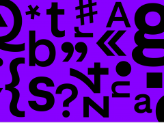
Incorporating a bright and easy to use palette -one that reminisces of space travel “in a psychedelic ’80s movie about time travel, and you got a little too close to the sun” the visual identity is set in a super clean sans serif enter Inter –a type system hailed as one of the highest quality open-source sans-serifs available– coupled with Acid Grotesk by Folch.
Brightshout’s rebranding is a prime example of a successful visual identity overhaul to match the company’s new vision, modernize its image and appeal to a wider audience. The result is a sleek and cohesive case in study that effectively conveys the studio’s values and mission.
The process of creating the new brand identity involved extensive market research to understand the company's target audience and competition. Based on these findings, the design team created a number of branding concepts that were then refined through a series of iterations and feedback sessions.
The final brand identity includes a new logo, color palette, typography, and visual style. The new logo is a modern and minimalist symbol that represents the company’s focus on innovation and progress. The color palette is bright and energetic, conveying a sense of positivity and optimism whilst the typography is clean and modern, further reinforcing the brand's forward-thinking approach.
Consistent across all touchpoints, the visual style of the brand identity is spread across the company’s website and social media channels to its promotional materials, a consistency that reinforces the brand’s image and make it easily recognizable to consumers. The company has also introduced a library of sound bites and some cool icons. Digital swag such as t-shirts, beanies, stickers, and notebooks are also available.
In conclusion, Brightscout 2.0 is an innovative rebranding appearance achieved through a thoughtful and well-executed process therefore a winner.
Tags/ typography, visual identity, logo, branding, rebranding
.jpg)







.jpg)
.jpg)
.jpg)
.jpg)
.jpg)
.jpg)
.jpg)
.jpg)
.jpg)
.jpg)
.jpg)

