Sociotype Journal 2: challenging the type specimen format, one typeface at a time
Sociotype Jounal 1 was a hit — and a TDC awarded one! Now the team behind the magazine/type specimen hybrid returns with “Makeshift.”
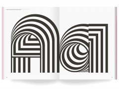
Challenging the type industry and the type specimen format once again, the second issue of Sociotype Journal is filled with thoughts, essays, and more all set in the type foundry’s Rework typeface.
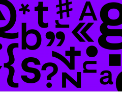
A sans serif superfamily and “contemporary workhorse” the type design created by Joe Leadbeater is inspired by the 19th-century descendants of a foundational sans serif model.
“Rework is a historical hybrid; a descendant of a style of a robust, geometric sans that stretches from Ancient Greek stone inscriptions to the modern era by way of 19th-century architectural lettering, the earliest printed grotesques, copperplate engraving, and 20th-century phototypesetting” explains Sociotype about its new type release, available in 48 styles and four optical sizes and designed to perform impeccably at any scale, from monumental to miniscule.
“Rework carries the accumulated influence of multiple eras and processes. From the stately, square proportions of ancient monumental Greco-Roman inscription, to its 19th-century revivals, as commercial architectural lettering, or as William Caslon IV’s Two Lines English Egyptian, the very first printed sans. While the influence of copperplate engraved type and its later phototypeset counterparts (such as Gary Sackers’ eponymous Gothic) is evident in Rework’s uppercase, the lowercase draws from the idiosyncratic character of Stephenson Blake’s 19th-century Grotesques” notes the team.
“Rework’s personality is defined by its contrasting industrial and humanistic qualities. The processes that shaped its ancestors – stone carving, metal type, copperplate engraving, phototypesetting – each leave their mark, giving Rework a decidedly pre-digital feel and a sense of robust physicality. Rework’s more overtly mechanical traits – its perpendicular terminals, and the slightly squared ovals of its rounded characters – are tempered by the humanistic proportions of its uppercase, and moments of irregularity and unexpected contrast in the lowercase letterforms. It’s this combination of qualities that lends Rework the feel of a thing shaped over time; revised, rebuilt, and reconditioned. Like a perpetual work-in-progress for a world that’s always changing.”
Eventually, the second Sociotype Journal issue showcases Rework’s versatility and performance at any scale.
With a diverse typographic design at its core, the magazine titled “Makeshift” reveals the diversity of the typeface with a series of essays, spreads, and thoughts that reveal an inspiring landscape made of type through a creative endeavor that investigates “old things made new and new things made weird” as the Sociotype team celebrates “ingenuity on the hoof and ad hoc creativity under extraordinary circumstances.”
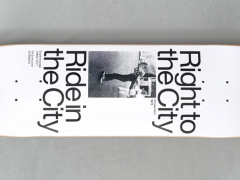
“We’ll go vert skating with Alvar Aalto, explore the improvised landscapes of civil unrest, and the free-floating façades of the modern city. We’ll dig deep into the world of hobby tunnelling with the Mole Man of Hackney and Elon Musk, wander cowpaths of desire, scavenger lanes, and shotcrete-encrusted mountainscapes. We’ll unearth a collection of abandoned artworks at the V&A and murderabilia at the Unabomber’s cabin. With a little Gorpcore upcycling, kintsugi-style vehicle repair, amateur conservation, and serial art vandalism, we’ll look for life in the wreckage and new meaning amid the rubble” adds the team.
Showcasing Rework’s personality and uses across a range of styles, Sociotype Journal Issue Two is a project with attitude. “I particularly loved breaking the rules – doing things like using the micro weights at a larger size so the ink traps become a visible and intentional part of the design” designer Alicia Mundy says.
“Rework is not classically beautiful in the way that Gestura’s calligraphic letterforms are but it does have a surprising ability to be quiet and more contemplative too, particularly in the lighter weights. Not only did the typeface change but so did the content – in this issue we explore some gritty subject matter which informed the layouts of each article. Across both issues, the type’s character and theme work in tandem to give each a distinct personality, which will continue to evolve in the future.”
With each article featuring its own typographic identity, SJ2 feels and looks more ambitious than its inaugural issue for good reason. “The positive reaction we received after publishing Issue One gave us the confidence to be more ambitious both editorially and with design” creative & editorial director Nic Carter adds.
“I guess we saw what was possible, and then tried our best to improve on it. The content is more in-depth, with a couple of longer essays and longer introductions to the image-led articles, a couple of which have almost become short essays in their own right. The editorial approach and basic production format have remained the same, as have some of the more structural elements, like the cover, contents, and divider pages, but otherwise, most aspects of the design have changed, simply because we’re designing the issue around a very different type family” explains the team.
With the third issue already in the making — typeset in the soon to be unveiled as a full commercial release grotesk Onsite which is also Sociotype’s in-house typeface and is featured on the studio’s website and technical specimen of each Journal — this ongoing experiment that partners typography with forward-thinking content deserves your attention.
Support and buy your copy here.
Tags/ typography, type, typeface, magazine, sans serif, type specimen, sociotype journal

