Keita Takemura X Ishimura+Neichi: typeset in pixel-perfect Japanese and English, this practical visual system honors the global power of type
On the occasion of Ishimura+Neichi participation in the “Make Do With Now: New Directions in Japanese Architecture” exhibition that runs through 12.03.2023 at Basel’s S AM Swiss Architecture Museum, the emerging architectural practice commissioned Keita Takemura and his team to develop a web design-based identity and design system. Eventually, typography played a pivotal role in delivering the goods.
“Given that they are exhibiting in Switzerland, Ishimura+Neichi needed to create a website with a global appeal. In discussions with them, we realized that we also needed to create a logotype and business card design based on the web design system that formed the visual identity of Ishimura+Neichi. As young architects in the industry, Ishimura+Neichi saw this as an opportunity to gain global recognition, and they needed to take on the challenge of combining an unprecedented combination of outstanding visuals with a practical design system” explains Takemura.
“The first priority for Ishimura+Neichi was to make their presence, information, and branding recognizable and memorable. As a result, the first view has a high-impact logotype and lists all of their information. The use of fluid animation enabled the design to be both dynamic and informative” adds the London-based creative who appreciates the power of type.
“The typeface is pivotal to the adoption of this typographic design system. The English typeface is Noi Grotesk by Studio Feixen, and the Japanese typeface is Tazugane Info by Monotype. The logotype is also composed of Noi Grotesk, whose typeface is described as ‘the traditional Swiss model with a new sense of playful friendliness.’ We also needed a Japanese typeface to complement Noi Grotesk, so we went with Tazugane Info” he adds.
“The Japanese language has a history of being used vertically as well as horizontally, and many Japanese typefaces are designed for both horizontal and vertical writing. Tazugane Info, however, specializes in horizontal letterforms in response to modern digital design culture, making it the perfect typeface for digital expression. We were successful in selecting the best typefaces that complement Noi Grotesk” elaborates the design director & designer with a background in graphic and editorial design with a focus on typography.
Designed by Robin Eberwein and Felix Pfäffli, Noi Grotesk is a modern sans family that approaches the traditional Swiss model with a new sense of playful friendliness. Optimized for either print or web environments the typeface features a wealth of crafted details and glyphs.
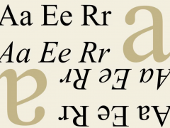
Coupled with Tazugane Info, the screen-ready Japanese font family, that follows on the debut of Monotype’s first original Japanese typeface – Tazugane Gothic, the visual outcome of Takemura’s project is balanced and clear. Tazugane Info offers a more restrained personality, with calligraphic design details pared back to create a geometric letterform – a good alternative for designers looking for a matter-of-fact alternative to the warmer Tazugane Gothic tone of voice explains the studio.
“While Tazugane Gothic fits perfectly when your job requires an organic and friendly tone of voice, Tazugane Info provides a more solid look,” said TDC Medalist 2022 Akira Kobayashi who designed the type family with Kazuhiro Yamada, Ryota Doi and Monotype Design Studio Japan. “I hope that having two options will make it easier to choose an appropriate tone of voice to convey information or brand messaginghe added” of the type design optimized to “create a smooth uninterrupted flow that’s designed for use on-screen.”
“Japanese typography has an even more interesting cultural heritage, with a long-standing culture of ‘Japanese-English mixed typesetting.’ By using English typefaces for the alphabet and Japanese typefaces for the Japanese language, we pay tribute to the typeface designers who grew up in each of these cultures” explains Takemura on the challenge to pixel-perfect Japanese-English typesetting in a digital context for the identity.
“In doing so, it is necessary to adjust the font size, kerning, etc. for each language. While this culture is commonplace in the field of print design, it is not yet recognized in the field of digital design, and this project is a challenge to create Japanese-English mixed typesetting in digital design. By using the Japanese text as a base, scaling up the English text by 10%, and adjusting the spacing of each English word, we were able to lay out the English and Japanese text on the same page in a clean and consistent manner” he adds.
“Another challenge was shifting from an existing portfolio-type web gallery to a next-generation Instagram-based website. Nowadays, brands actively use Instagram to communicate with their audiences, and Ishimura+Neichi is no exception, claiming that reaching out through Instagram has triggered many of their projects. With so many resources spent on Instagram, the hassle of updating their website was a waste of time for them, and they needed a solution. So, with the ultimate goal of driving users to Instagram, they designed a system that only displays the Instagram gallery on the website, daring not to include detailed project details and stimulating users' intellectual curiosity. As a result of a dynamic and informative visual design with beautiful typography and directing users to Instagram, we were able to realize a sophisticated visual communication design in a practical way that had never been seen before” explains Takemura.
Ishimura+Neichi is a Tokyo-based architectural practice founded in 2017 by Daisuke Ishimura and Taku Neichi. The studio has been working on a wide range of residential, interior, exhibition, product, and furniture designs. Interested in “honest design, materials, and structures that arise from the accumulation of craftsmen's wisdom and technology” Ishimura and Neiki are engaged in the practice of urban compost and activities to improve city life in recent years.
Keita Takemura is a London–based Design Director & Designer. He has been working on brand identities, books, magazines and websites for cultural institutions, publishers, and corporations. Communication Arts and Creative Review have recognized his work. He and his team received the ADC Awards Bronze Cube in 2022. After studying visual communication in Japan, he started his career in Tokyo. Takemura is currently based in London, where he continues to explore visual communication further.
Explore more of his work here.
Tags/ typography, typeface, visual identity, logotype, logo, monotype, japan, web design, studio feixen, digital design, tdc medalist, akira kobayashi, keita takemura, noi grotesk


