Neville Brody X Nike: stencil for the win in England women’s football kit & more type news to know
It’s a long-lasting affair. Neville Brody of Brody Associates design studio collaborates once again with Nike and its design director of global football graphics Lee Murphy to create a custom typeface for the new England women’s football kit.
Featuring a “modular, shape-driven aesthetic” the new typeface mimics the “stencil feel” of its predecessor -enter the men’s 2014 World Cup fonts.
“Creating something that will sit comfortably and naturally on a global stage, yet bring dynamic and an appropriate narrative is always daunting, especially with so many stakeholders”, said Brody.
The brand-new type design reflects “the difference in kit form and the kit pattern” with the new typeface being “slightly lighter, taller.”
Aiming to combine “a sense of creativity with surprise” the typeface bears that stencil feeling that was kickstarted by the original.
Introducing “a more modular, shape-driven aesthetic” the Lionesses’ new kit and typeface debuted on the 6th of April 2023 in the first ever Women’s Finalissima and we approve.
-
In other news:
- Musician/actor Ice-T tweeted that he “does not give a flying FUCK about Fonts.”
- Coca-Cola’s global design team has collaborated with Jones Knowles Ritchie (JKR) to create Fanta’s first global identity, that features a new logo, custom typography and illustrations.
- Monotype and Shopify announced a collaboration that aims to modernize access to typography for creative and retail professionals globally, and
- New York City’s Official Destination Marketing Organisation and Convention and Visitors Bureau introduced a new name for NYC & Company.
NYC-based global design consultancy 2x4 acted as the creative partner through the process of determining the new name and brand strategy.
The new identity includes a new logo, colour standards, typography, art direction, and graphic elements.
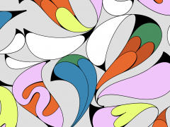
The brand's visual identity system draws inspiration from the graphic heritage of the city and also references works by different artists and designers, that hold the essence of the five boroughs—Manhattan, Brooklyn, Queens, The Bronx, and Staten Island.
To translate the city’s energy into the visuals, the brand used irregular shapes and intersections traced from the horizontal streets and vertical buildings of NYC.
“When creating the visual identity system, we wanted to reflect the fabric of New York City, and the rhythm and energy that locals and tourists alike love most about it. In collaboration with our creative partners at 2x4, we created a system that reflects New York City itself, a place of unmatched diversity and culture that draws in and welcomes people from all over the world. Our new system represents this vibrancy and the abundance of experiences in neighbourhoods throughout the five boroughs,” explained Elan Cole, executive vice president, co-lead, creative/content for New York City Tourism + Conventions.
The debut of the new name and brand system was launched in conjunction with a social campaign, #WHATSGOODNYC.
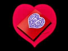
Yet we can’t get stop admiring the iconic I love NY logo designed by graphic designer Milton Glaser in 1976. Love 4 ever!
Tags/ typography, typeface, type design, branding, packaging, nike, stencil, milton glaser, neville brody, coca-cola, brody associates, new york city, football, custom type, fanta



.jpg)
.jpg)

.jpg)

