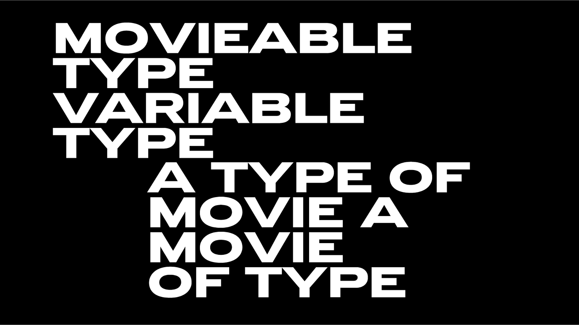
HBO goes Max, typography shapes behaviors study confirms & Bershka rebrands
A recent study suggests a universal truth, the concept of “typography as image” and its applications can be effective in shaping user behavior.
“Park and wild land stewards should familiarize themselves with the concept of 'typography as image' and apply it in their practice” notes the study that investigated the impact of trailside signs on users' behavior and concluded that incorporating typography as an image in these natural settings.
“The design strategy of utilizing typography as an image is particularly effective in conveying messages such as 'leash your dog' or 'wipe your feet to prevent invasive plants spreading.' By grabbing the attention of users, this approach provides an opportunity for communicators to offer further information to address the 'why' question through related text and images. This combination of attention-grabbing typography as an image and supplementary information can enhance the effectiveness of park and wild land signage in influencing user behavior.”
“The concepts of 'attention capture' and 'elaboration' were examined in a recent paper set to be published in the June edition of the Journal of Outdoor Recreation and Tourism. A pre-publication version of the paper became available online in January. These factors were identified as crucial in the study's analysis of how typography as image can effectively convey messages in park and wild land signage, influencing user behavior.”
“The forthcoming article, 'The impact of graphic design on attention capture and behavior among outdoor recreationists: Results from an exploratory persuasive signage experiment,' is authored by Jeremy Shellhorn, an associate professor in the University of Kansas School of Architecture & Design, and William Rice, assistant professor of Outdoor Recreation and Wildland Management in the Parks, Tourism and Recreation Program and Department of Society and Conservation at the University of Montana. The study was conducted in collaboration with 18 students who assisted in carrying out the experiment during the summer of 2022.”
“To evaluate the effectiveness of the messaging, the designers created six different signs for each of the two topics - dogs and plants. These signs were placed in semi-permanent frames with slots for posters, and then rotated periodically to gather data on trail users' responses. Additionally, the sign related to plants included an accompanying boot-scraping brush, encouraging hikers to use it. This systematic approach allowed the researchers to observe and compare how different designs and messages were received and responded to by trail users, providing valuable insights into the impact of graphic design on behavior in an outdoor recreation setting.”
Per the study “the right balance in messaging was crucial, as park visitors typically seek a natural escape without being overwhelmed by signage. It was essential to prompt their attention without overburdening them. Considerations such as typeface, size, and imagery were carefully weighed to create signage that would effectively capture attention and engage park visitors. The challenge was to strike the right balance between prompting action and avoiding excessive messaging that may detract from the overall experience of being in a natural outdoor setting.”
“It's a good strategy because people are reading the words, but they're also reading the image at the same time,' he explained. “If you can integrate the text and image in a meaningful way, it makes the messaging more effective. If I have to look at a picture, and then I have to read the text, that's two separate cognitive processes. But if I can make the word 'dog' look like a leash, or 'native plants' look like the actual plants, then suddenly the message becomes more powerful. You don't have to explicitly state 'native plants' in the text; you can convey the same information through the image and use the text to communicate something else.”
“That strategy works particularly well when you're aiming for a quick read on a poster or a trailhead sign. In situations where people are on the move or there's a lot of activity around, and you're trying to capture their attention, integrating text and image in a visually engaging way can be very effective. If you can successfully engage someone to read that first message in a creative or interesting way, then you're more likely to prompt them to engage in elaboration - to delve deeper into the information or message being conveyed.”
Read more on “typography as image” approach here.
-
In other news:
- Robert P Crease, author and chair of the Department of Philosophy, Stony Brook University, US explains how typography influences your understanding.
- Bershka marks 25th anniversary by unveiling new logo, updated corporate identity reports The Fashion Network.
“Inditex is continuing to revamp its brands under the leadership of heiress Marta Ortega. After Pull&Bear unveiled a new logo and store concept just a few days ago, the youth-oriented brand Bershka is now getting a makeover to celebrate its 25th anniversary.”
“Bershka has changed its logo for the first time in its history, in a project developed in collaboration with Dinamo Typefaces, a Berlin-based company specializing in typography and branding design. The evolution is reflected in a change to bold uppercase letters, similar to what Pull&Bear recently did by abandoning its well-known lowercase handwriting. The typography chosen by the brand is ABC Whyte.”
After the aforementioned rebranding of Pull&Bear and Stradivarius last year, the Galician group's chains are progressively aligning themselves with Inditex's new corporate identity, which was updated last July and is becoming increasingly consolidated under the leadership of Marta Ortega. The group's flagship brand, Zara, changed its logo in 2019, marking only the second time it had changed its image in 44 years.”
- HBO Max is now simply MAX. Unveiled by Warner Bros, the platform that now combines the offerings of Discovery+ and the original HBO Max unveiled a new logo and brand identity and Twitter objects.
Oh well…
hbo max dropping hbo // people who watch hbo pic.twitter.com/5NDLZQFuJ7
— alex (@alex_abads) April 12, 2023
Here are the fast facts you need to know about Max per The Daily Beast.
Max will cost the same as HBO Max—with one exception.
The user experience will be a lot better.
On May 23, HBO Max is becoming Max — The One To Watch for all of HBO, hit series, movies, reality, and more. #StreamOnMax pic.twitter.com/GYJ4yJtkhG
— HBO Max (@hbomax) April 12, 2023
HBO isn’t going anywhere.
Discovery+ isn’t going anywhere, either.
Max debuts May 23.
Tags/ typography, type, visual identity, branding, rebranding, fonts, journal, study

.jpg)


.jpg)
.jpg)

.jpg)
