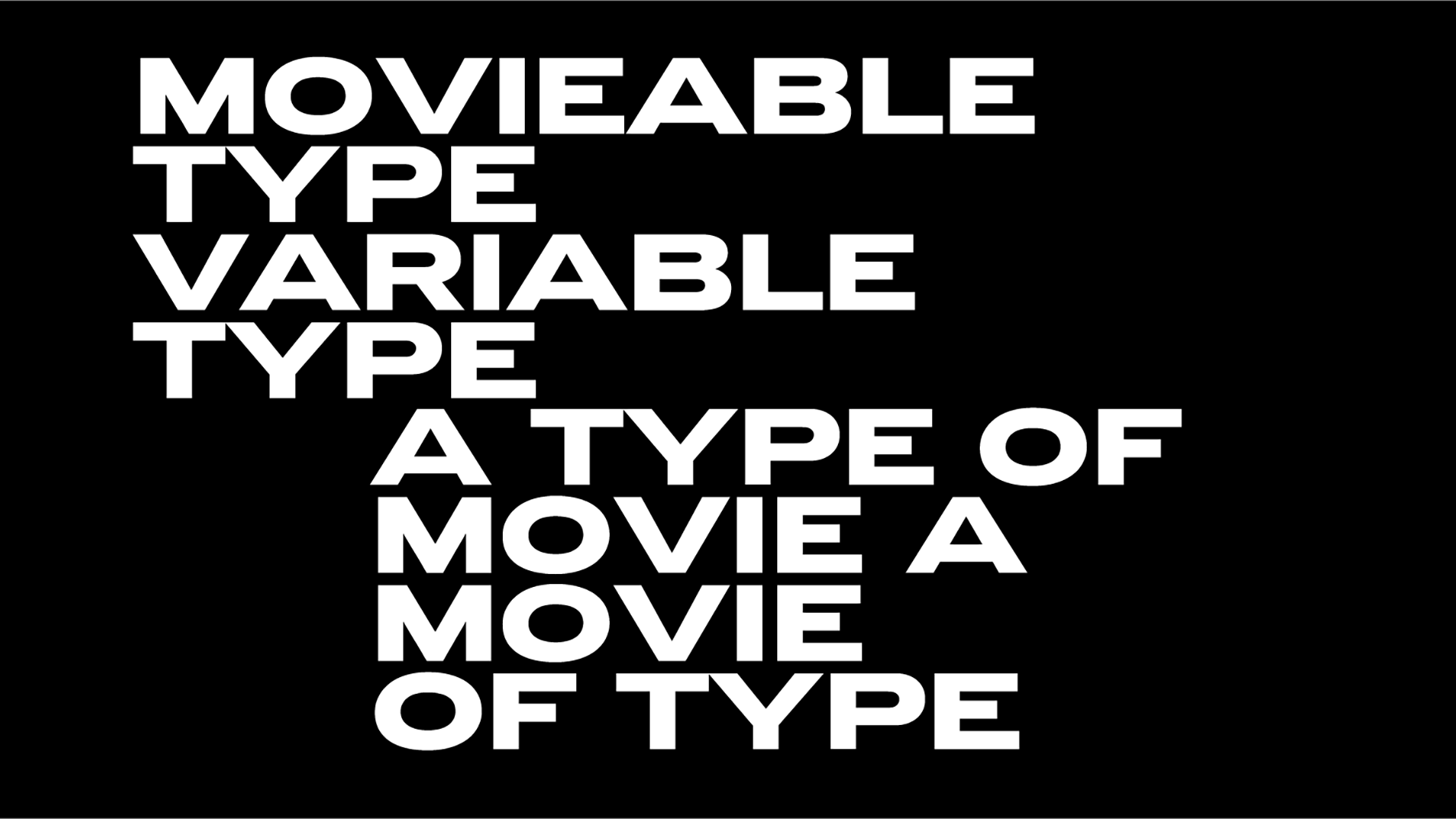
Typography unites! Only’s branding for East London's new venue The Beams enlightens our spirits
The award-winning Manchester-based branding agency Only believes in the transformative powers of simplicity, clarity and communication via design.
Only’s latest project aka The Beams embraces these pillars whilst incorporating elements of ambiance and architecture with the help of the ultra-versatile Neue Haas Grotesk.
"The Beams is an expansive new venue and event space on the Royal Docks in the heart of East London. Once part of the iconic Tate & Lyle sugar factory on the banks of Thames, the former warehouse has been transformed into a sprawling 55,000 sq ft event space, reimagined as a testbed for new culture, undiscovered talent, unique experiences and experimental creativity" explains the design practice.
With a noble aim "to foster new culture and test boundaries for those who crave the newest and most imaginative experiences" The Beams is a space for experimentation and creativity and a venue that "aims to revive the city’s cultural scene and offer hope for its future."
"The venue's name speaks to the factory-style light wells in the roof that flood the main space with natural light and signifies its role in supporting and showcasing new talent, activations, productions and experiences" adds Only.
And it is exactly this spirit of experimentation that inspired the studio’s visual identity for The Beams, with a dynamic typographic treatment to "mirror the repetition seen throughout the building’s architecture and to establish a connection with the use of light in many of the venue’s cultural offerings" notes Only.
Eventually it's up to the clarity of the brilliant Neue Haas Grotesk typeface to unite the venue’s diverse offering.
Completed for Richard Turley’s 2010 redesign of Bloomberg Businessweek, Commercial Type’s type design is first and foremost "a restoration project" that brings Max Miedinger’s original Neue Haas Grotesk "back to life with as much fidelity to his original shapes and spacing as possible, rather than trying to rethink Helvetica or improve on current digital versions" notes the type foundry. "Miedinger’s original Neue Haas Grotesk included a number of interesting alternates, including a cedilla that looked more like a flattened comma (apparently preferred in Switzerland at the time), but the most striking was a straight-legged R, available in each of his handful of original weights by special order only, but now easy to access in digital form."
Back to the Beams, the venue’s visual identity assets "can be generated dynamically to suit the format, message and intended audience" explains Only.
East London’s new, expansive event space for London aka The Beams opened to a sold-out series of eclectic day-to-night events and over the coming months, it will be home to Thin Air, an exhibition featuring a programme of artists working at the intersections of art and technology.
Explore more here.
Tags/ typography, type design, visual identity, max miedinger, neue haas grotesk, only studio
.jpg)

.jpg)


.jpg)
.jpg)

.jpg)
.jpg)
.jpg)
.jpg)
.jpg)
.jpg)
.jpg)
.jpg)
.jpg)
.jpg)
.jpg)

