A.I., typography and storytelling: Analyzing the new visual identity of Inscript Festival with Kacper Pietrzykowski
Inscript Festival is just around the corner! The virtual-only and accessible-to-all event, dedicated to experimental typography and technology will take place from the 4th to the 8th of October, featuring presentations from some of the most fresh and innovative artists, designers, researchers and tech experts of our time.
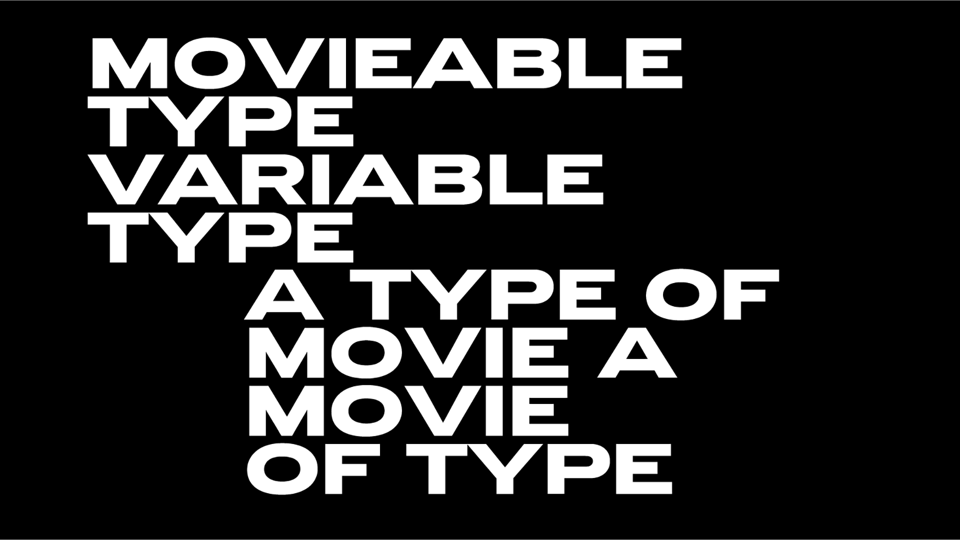
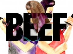
Inscript’s new visual identity, a moving piece of type-art combined with a fun tool called ‘generator’, was designed by creative director and consultant Gianpaolo Tucci and designer-engineer Kacper Pietrzykowski. “To represent the plurality of speakers coming together for the event, and reflect every individual’s unique tone of voice, Tucci and Pietrzykowski developed a tool that responds to audible input, serving as a visual echo that translates one form of communication into another”.
We talked with Kacper Pietrzykowski about the exciting new Inscript visual identity, multidisciplinary approaches, typography, technology and of course artificial intelligence and its impact on the design world.
Typeroom: Could you share some inside information on your creative process for designing Inscript’s visual identity?
Kacper Pietrzykowski: Sure thing! So, the whole thing kicked off with this cool idea from Gianpaolo about dynamic branding using voice reactivity. Imagine a visual identity that keeps changing, but still feels like the same brand. We wanted it to be real-time and interactive, so we went with the web.
This meant we had to get the voice stuff and the visuals working right in the browser. We played around with the sound frequency and pitch to turn voice into something our visual system could work with. After messing around with some fancy tech like AI style transfers and shaders, we landed on a simpler approach. We also whipped up this configurator where people could play around and customize the look and feel. We’ve used it during the creative process too to share our presets.
TR: Can you tell us more about the “generator” and its connection and significance for the festival?
KP: Absolutely! The generator is this fun tool on the Inscript website. You can play with the visual system using your voice or any sound you make. You can also share your camera or desktop to add your own visuals.
We made it for two groups: the festival speakers, who can make these cool little promo videos, and everyone else who wants to get creative and share their experiences. We really wanted the generator to be a fun way for people to spread the word about the festival and show off their unique takes.
TR: Could you explain the choice to use audible input? What were your inspiration sources for this project?
KP: Gianpaolo had this awesome idea to use voice as input. Think about it: everyone's voice is unique, just like fingerprints. It felt right for capturing the vibe of our audience and speakers.
I've dabbled with similar stuff in the past, and while using voice for visuals isn't groundbreaking, there's still a lot we can explore. I've tried out some AI stuff to detect emotions in voice, but it wasn't the right fit for this project. But who knows? The tech's always evolving, and I'm excited to see where it goes.
TR: What was your experience collaborating with another creative and can you tell us more about the importance of multidisciplinary approaches when it comes to design?
KP: Working with Gianpaolo is always an eye-opener. He's got this unique way of seeing things that really added depth to our project. When you bring different people with their own creative twists, you get something richer and more layered.
But, it's not always smooth sailing. Imagine trying to explain 4D stuff to someone living in a 3D world—it's tricky! But finding that common ground and understanding each other's vibes? That's where the magic happens.
TR: Your background is also multidisciplinary in a way. How did you move from industrial engineering to design to creative coding? Is there a common mindset between these diverse fields?
KP: My journey has been a bit of a winding road, to be honest. I kicked things off in industrial engineering, then pivoted to industrial design and design engineering. Eventually, I found my groove in interaction and experience design.
What ties all these fields together for me is the sheer joy of creating something and understanding how it impacts people. I've also dabbled in design research, which was more on the speculative side.
I'm all about hands-on experimentation and blending different domains. I believe that when you mix structured research with what might seem like aimless exploration, that's where the good stuff is. This approach naturally led me to creative coding, which is mainly what I'm into these days. I work on everything from embedded electronics to apps and unique experiences.
Typography is a new playground for me, and exploring it through coding has been a blast. I've always had a soft spot for sound and music—I even play an instrument and have worked on generative music systems and voice analysis in the past. The idea of using technology to create human-informed, interpretative, and generative systems for expression is something that's always evolving. It's influenced by new tech and the social changes that come with it. And honestly, that's a space I'm excited to spend more time in.
TR: Visual identity is everything nowadays. Any thoughts on the importance of branding and how you can create something that really stands out?
KP: Very true — visual identity is huge these days. It's not just about looking good; it's about making people see a bit of themselves in your brand. That's how you get them to stick around. AI is a game-changer, no doubt. Have you checked out Gianpaolo's new book? He's doing some wild experiments with AI in design, and it's opening up a ton of possibilities.
At the end of the day, it's still all about storytelling. We've all got stories that are changing day by day, and that's a goldmine of inspiration. You've got to find the story that's buzzing right now and tell it in a way that's true to your brand. That's how you stand out and stay relevant.
TR: Is typography and type design still a powerful tool when it comes to branding? How do you approach typography when creating?
KP: For sure, typography's still a big deal in branding. It's the secret sauce that gives a brand its unique flavor. For me, it's mostly about trusting my gut. Sure, there are best practices to guide you, but when it feels right, you just know. I'm kinda new to making my own typefaces, so for this project, I leaned on Gianpaolo's keen eye, and we used that killer typeface by Universal Thirst that we got from Ksenya.
When it comes to more experimental typography, it's this amazing playground where you can really let your creativity run wild. I'm always blown away by the cool stuff people come up with. And think about AR or AI—that's a whole new beast. The idea that typography is becoming obsolete? Nah, that's just not gonna happen. It's actually getting even cooler and more important as we dive into new tech landscapes.
TR: Which presentations are you looking forward to the most at this year's Inscript?
KP: Oh wow, the lineup for this year's Inscript is so cool! There are so many interesting talks. While I plan to binge-watch the recorded sessions later, I'll definitely try to catch Studio Dunbar, Gianpaolo's talk, and Rozi Zhu's Material Type live—those topics are right up my alley. Oh, and I can't forget Ksawery Komputery! But honestly, that's just scratching the surface; I'll be soaking up as much as I can!
TR: What are your thoughts on the future of type design, especially in relation to technology? How is new tech going to change the design game?
The future of design is buzzing with new possibilities right now, especially with that new tech coming into play. You see how Figma and Miro are getting all cozy with AI? I wouldn't be surprised if typography tools start doing the same. I mean, picture this: type designers just chatting their ideas to life. Sounds like sci-fi, but it could be right around the corner—the tech is there. It seems to me, that being a type designer could get more about curation and use of language rather than handling vector graphics.
TR: Should we be afraid of artificial intelligence?
Ah, the trillion-dollar question. Well, it does feel like flying at near-light speed without brakes... and there are no windows, plus everything's on fire. The key is ethical use and solid regulations, and let's be real, we're in the Middle Ages when it comes to that.
So yeah, it's gonna get messy before it gets sort of crappy, and then maybe it'll be okay. Did you catch that study where they used AI to interpret brain activity during sleep and generated visuals of dreams? At that moment, I thought, "Okay, we're done; 'they' can see what I dream now." But wait a minute—will I be able to watch my dream in the morning? That's wild. My brain can't even compute that.
In the design world, what we should really be wary of is ignoring AI. It's not gonna replace designers overnight, but the new wave of designers who harness its power will definitely have an edge. It's a tool causing a seismic shift in how we work. When the dust settles, those who embrace it will be the ones who stay afloat. Design is still about the human touch, something AI can't replace. This feels like the next revolution, akin to the first Apple Mac, which was a wild ride for creatives back then. Designers have always been on the cutting edge of tech, and here we go again. So, buckle up and enjoy the ride.
Do not forget to register for Inscript, here.
Tags/ festival, visual identity, artificial intelligence, design and typography, inscript, creative coding






.png)

.png)

