Flodesk’s new visual identity combines radical minimalism with a human touch
We all love a good rebrand. Flodesk is a successful, contemporary company that makes intuitive software tools to help us design and send on-brand marketing emails; sell online with beautiful sales pages, online payments, and instant product delivery—all in one place. They say that “Flodesk is more than just nice aesthetics—it’s also about the continuous process of crafting and nurturing a profound connection with your audience”. And that is exactly the spirit they wanted to distill in their new visual identity.
DIA, the design studio behind the rebrand, based in NY with strong ties all over Europe too, crafted a complete new visual identity and design strategy in close collaboration with the Flodesk team. In their own words, “The new Flodesk identity embodies the warmth of their community and the rigor of their intuitive platform in an uncluttered and confident way”.
The rebrand consists of a new logo, website, social media communication and a bespoke typeface, created through a collaboration with the Optimo type foundry. The design system created is also used to transform the Flodesk products themselves and resulted in some special items, like tote bags, stickers and hats too.
The concept of this new identity is inspired by the work of renowned modernist architect Richard Neutra. Neutra designed spaces that could have a positive psychological and emotional impact and improve people’s well-being and Flodesk’s new identity also aims to create a digital place that could uplift, support and influence members in a positive way.
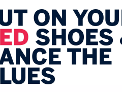
One of the most crucial elements of this rebranding strategy were the two new typefaces. Flodesk Sans and Flodesk Serif were designed by Swiss-based type foundry Optimo and type designer François Rappo. Both typefaces are created in a way that they could work from small prints on stickers to large communication campaigns.
On one hand Flodesk Sans is all about radical minimalism, inspired by late 19th-century grotesks and Richard Neutra's architectural work, combining contemporary, simple lines with tradition and history. On the other hand, Flodesk Serif has more of a human touch. It is an altered version of Jannon by Françios Rappo with adjusted x-height in order to fit perfectly with Flodesk Sans. This small alteration offered an interesting twist to the typeface, making it extra impressive and memorable. Together these two typefaces create a system that also represents Flodesk’s duality, between function and community. “Flodesk Sans reflects our company's design rigor. Flodesk Serif reflects our community’s voice”.
Apart from the typefaces, DIA worked on an intricate motion system with guidelines, color palette, templates and shape libraries to create a holistic Flodesk world, not just separate elements. “The Flodesk identity is all about atmosphere, a comfortable space that supports the Flodesk community through thoughtful and rigorous design”, said DIA’s Mitch Paone.
Find out more about Flodesk’s rebrand here.
Tags/ visual idenity, bespoke typeface, digital design, minimalism, rebrand




.gif)
.jpg)

.jpg)
