10 graphic design and visual communication A' Award winners to inspire you
The A’ Design Award and Competition is one of the most well-known and respected institutions in the world of design. This multinational, juried design award was created to honor, celebrate and highlight excellent designs across the globe. Designers, architects, artists, engineers and all types of creatives submit their projects in order to receive acknowledgement and recognition for their work.
As you know, the A’ Design Awards cover a wide range of categories but the one that we have our eye on every year is the “Graphics and Visual Communication” one. In this category you can find a lot of interesting projects, from symbols and logos to posters, books, 2D Packaging and of course, typography. If this sounds interesting to you, don’t forget to register here, asap! Until then, we are going to go through some of the past winners to get you in the mood.
Stack Glyphs Characters Typography by Te-Yang Tang and Yi-Hsuan Lai
Characters are the carrier of culture. In Chinese culture, a special type of character called Stacked Character refers to the character formed by overlapped glyphs. Stacked characters can be constructed to express the meaning of accumulation and mass of the word. Most of these superimposed characters are uncommon and are gradually replaced by commonly used characters nowadays. So, the team collected these lost Chinese characters and constructed them using graphical symbols.
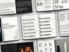
Suprala Font Family Typeface Specimen by Paul Henry Robb
Suprala is a contemporary delicate humanist serif typeface, with balanced forms. Suprala is characterized by its round, elegant design and supports all major Latin-based languages in twelve styles. True italics advance the aesthetics, bringing energy and making it suitable for modern applications.
To Beauty Skincare Brand by Yuta Takahashi
TO is a skincare brand with the concept of "awakening to nature's rhythm". The specially structured screw nozzle of the facial cleanser ejects an ideal dense foam with a single push, which maintains elasticity for a long time and reduces skin irritation from friction. The eyelash beauty serum uses an innovative airless container that is preservative-free and hygienic. Even the fitting inside the cap, which normally receives little attention, is beautifully designed in a crescent shape to enhance the brand.
Bamboo Craft Festival Architectural Narrative Illustration by Wing Sze Wincy Kung
The illustrations explore the festival experience such as the spirit of craftsmanship in the construction process, the dragon dance performances, bamboo wonton noodles, street life, the dismantling process of the temporary bamboo structures at the end of the festival, and the recycling and reuse of bamboo.
Florid Sans Typeface Design by Paul Robb
Florid Sans typeface perfectly balances minimalist quality with a combination of contemporary details and classic styles. The font family is geometric in nature with humanist quality rooted in the Swiss tradition, designed with comfortable, breathable apertures that make it stunningly versatile.
Ancora Brand Identity by Keiichiro Yanagi - Harajuku Design Inc.
The brand follows the basic rituals of writing: filling the pen with ink, scribbling to test it before writing, etc. Using a “for everybody” design, it unites the simplicity of the form with the complexity of customization. The symbol mark shows a handwritten line from the tip of a fountain pen (as a scribble) with an ”A” in the center which is the initial letter of the brand name. The graphic design is characterized by colorful ink drops and handwritten lines.
Chinese Style Coffee Packaging And Posters by Weina Xiao
The illustrations contain elements of traditional Chinese culture, like the characters in Peking Opera, Chinese swordsmen and so on.The key to this design is the ingenious combination of Chinese and Western cultures.
Unajiro Visual Identity by Keisuke Akari
The identity is based on the concept of a delicious rice bowl. The "prosperous business" on the front cover is a wish for the business to go well. The designers tried to highlight the importance of the Japanese style.
Big Dream Visual Design by Alice Zong
This project is distinguished by its focus on Chinese calligraphy and its cultural significance to Asian Pacific American heritage. It blends traditional and modern styles, showcasing the beauty and richness of the art form through nuanced brushstrokes. The fusion of traditional and modern styles creates a timeless and relevant design language, where art and design merge to create a visual language that transcends boundaries and connects us to the beauty of the past while forging a path towards the future. This study exhibits a fine balance of sophistication and cultural richness that is synonymous with Chinese calligraphy, highlighting the art form's cultural importance and relevance to Asian Pacific American heritage.
Animated Koopmans Logo Corporate Identity by Ruud Winder - Rebrandt
Koopmans asked the rebranding agency to communicate the breadth of their range more clearly. The word 'print shop' no longer represents what they do. This new ID is therefore not only an aesthetically appealing design language, but also a strategic marketing instrument that communicates the wide range of products they can offer.
Are you the next A’ Award winner? Register here.
Tags/ graphic design, awards, visual communication, a awards


