How to create a full commercial font in one week
Typeroom is a platform from typophiles, for typophiles. We are always excited and proud to share this platform with designers, researchers and professionals that want to showcase part of their knowledge, experience and process. In this context, we are publishing a series of articles submitted by Typeroom supporters and fellow creatives.
This article is written by design lead, art director and type designer Sasha Denisova.
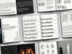
There are plenty of trendy serifs around, but there are challenges when it comes to truly technological and robust ones and sets with Cyrillic support. This is where Kristolit comes into play — a technological serif with a clear historical reference. Kristolit has a bold and impactful character, designed primarily for headlines. Version 1.0 includes both regular and italic styles with a basic set of Latin and Cyrillic characters.
Background
Kristolit began as a challenge. I decided to see if I could design a typeface and make a basic Latin character set in just one week.
Sprinting through historical eras, I was drawn to Scotch Roman typefaces. They are known for their pronounced contrast, enclosed apertures, geometric serifs and beaks. Many Scotch Roman designs and their modern versions are excellent for body text. However, I wanted to create something different. I aimed to craft a typeface that would take center stage in any design.
In a week, I created the basic set, but I certainly didn't intend to stop there. I challenged myself with rather pragmatic goals: not to agonize for weeks about what kind of typeface I wanted to create, not to wander in search of inspiration, but to focus on taking immediate action to create.
The systematic work began immediately afterwards. During the marathon week, many glyph sketches were created, and it was time to review and refine all the options. The ball terminals gradually transformed into serif-like details, adding more robust characteristics to the typeface. Geometric and fractured joints evolved into smooth curves, and I found a growing connection with Scotch Roman serifs as I delved deeper into the historical context.
The italic style also began taking shape. I aimed for a more cursive style to maintain the expressiveness of the regular style while transitioning to a different, more calligraphic and lyrical tone. However, the initial sketches of the geometric italic proved unsatisfactory. Rigid and geometric rectangular arcs didn't achieve the desired effect. The solution was to maintain the construction of true italics, introducing dynamism and expressiveness through an almost extreme slant of 20 degrees.
Working on both the regular and italic styles at the same time had its perks. A lot of the choices in the regular style influenced what I did with the italic, and vice versa. Take, for example, how the italic's influence made the typeface lose some of its stiffness and geometry. On the flip side, the italic's flowing, smooth shapes clashed with the sharp and rational look of the regular style. This is how the typeface's dual nature really started to shine.
Features
Kristolit combines both rigidity and elegance. It's both tech-savvy and timeless at the same time. Its shape designs are carefully thought out to showcase different facets of the typeface. Kristolit has been stripped down to its purest form, both in how it's made and in the finer design details.
Slightly expanded proportions. Wider proportions introduce more air into the type setting. Thanks to this, the closed form of the letters ‘C’, ‘S’, and ‘Э’ does not look heavy.
Originality. The author's approach to reinterpreting historical prototypes distinguishes Kristolit among other fonts of this genre.
Vertical axes. The glyptal principle and geometricity are evident in all of Kristolit's letterforms.
Geometric serifs. In addition to their precision, they reimagine the historical prototypes.
Serif-like terminals. The terminals maintain a sense of refinement, transforming from ball terminals into pure mathematical geometry.
Monoline punctuation. An homage to historical Scotch Roman typefaces.
True Italics. Most italic glyphs have a different, more handwritten skeleton. The proportions of the italic style are narrower, just like in historical prototypes.
Extreme italic slant. The italic maintains a warm sense of calligraphy, with the significant slant adding expressiveness. At the same time, the overall geometricity is preserved.
Cyrillic Set
As a Russian speaker, leaving out Cyrillic characters from my own typeface was never an option. Dealing with fonts that don't support Cyrillic has been a headache in my design career. Even though Cyrillic has lots in common with Latin, it is a very different system. Peculiarities of the Cyrillic script might surprise Latin type designers.
Cyrillic script exhibits a preference for symmetry and fewer ascenders-descenders compared to Latin. Striking the right balance without getting monotonous and still holding onto that bold character was quite a challenge. Also, Cyrillic letterforms are generally wider than Latin ones, making the whole typeface look even more expanded.
The Cyrillic typically employs ball terminals a lot, a feature completely absent in Kristolit, which employs serif-like terminals instead. Additionally, historical Scotch Roman-style typefaces tend to favor ball terminals too. Making Cyrillic 'Л' and 'л' work seamlessly meant adding in some massive geometric terminals, injecting even more distinctive vibrancy and robustness into the entire typeface.
Generally Cyrillic was barely related to the letter shapes that naturally evolved in handwriting through the centuries, lacking a significant calligraphic background. On the other side, Cyrillic Italics borrows heavily from calligraphy, That features was quite useful in Cyrillic for Kristolit, helping to highlight even greater contrast in tonality between the robust regular style and the more humane italics.
Overview
In the current version, Kristolit includes basic sets of Latin and Cyrillic, symbols, punctuation, currency signs, mathematical symbols, and an extension for Serbian Cyrillic in both styles. It's suitable for branding and identity projects due to its distinct character. The typeface will work well in headlines for both print and digital publications, as well as in posters and advertisements. In specific projects and layouts, Kristolit can even handle smaller point sizes. However, for lengthy texts with a lot of information, it's recommended to pair Kristolit with a neutral sans serif font to balance the eccentricity of the primary style. In contrast to its expanded proportions, Kristolit pairs nicely with Neue Haas Unica, Inter, or a similar sans-serif typeface.
Tags/ typography, type design, font, cyrillic alphabet


