New year, new me: Honda, Herman Miller & Gush are getting rejuvenated
It’s 2024 and a lot of major companies came out with their revamped and fresh visual identities. X (or ex-Twitter) has already a lot of opinions about the new logos, typefaces, color palettes and overall styles and we are here to dive into the ones that caught our eye and see why these rebranding news became talk-of-the-town.
Honda: New logo after 22 years
Honda’s new ‘H mark’ logo is a huge deal, as the company has been inextricably linked with the previous, classic Honda logo for over two decades. The redesigned logo will only be seen on their next-generation electric vehicles (EVs) and is set to come out sometime in 2026. This new design drifts off Honda’s glossy, sleek style and goes for a modern take on the angular “H”, that traces back to 1961. One of the most interesting choices was to ‘ditch’ the surrounding border and focus just on the ‘H’ form.
According to Honda, their new emblem symbolizes "two outstretched hands," which stand for the company's dedication to enhancing mobility options. This new logo fits with the company's larger plan to evolve, persistently seek out new challenges and embark on a design makeover that may herald a new era for the brand.
Herman Miller: Back to basics, back to Helvetica
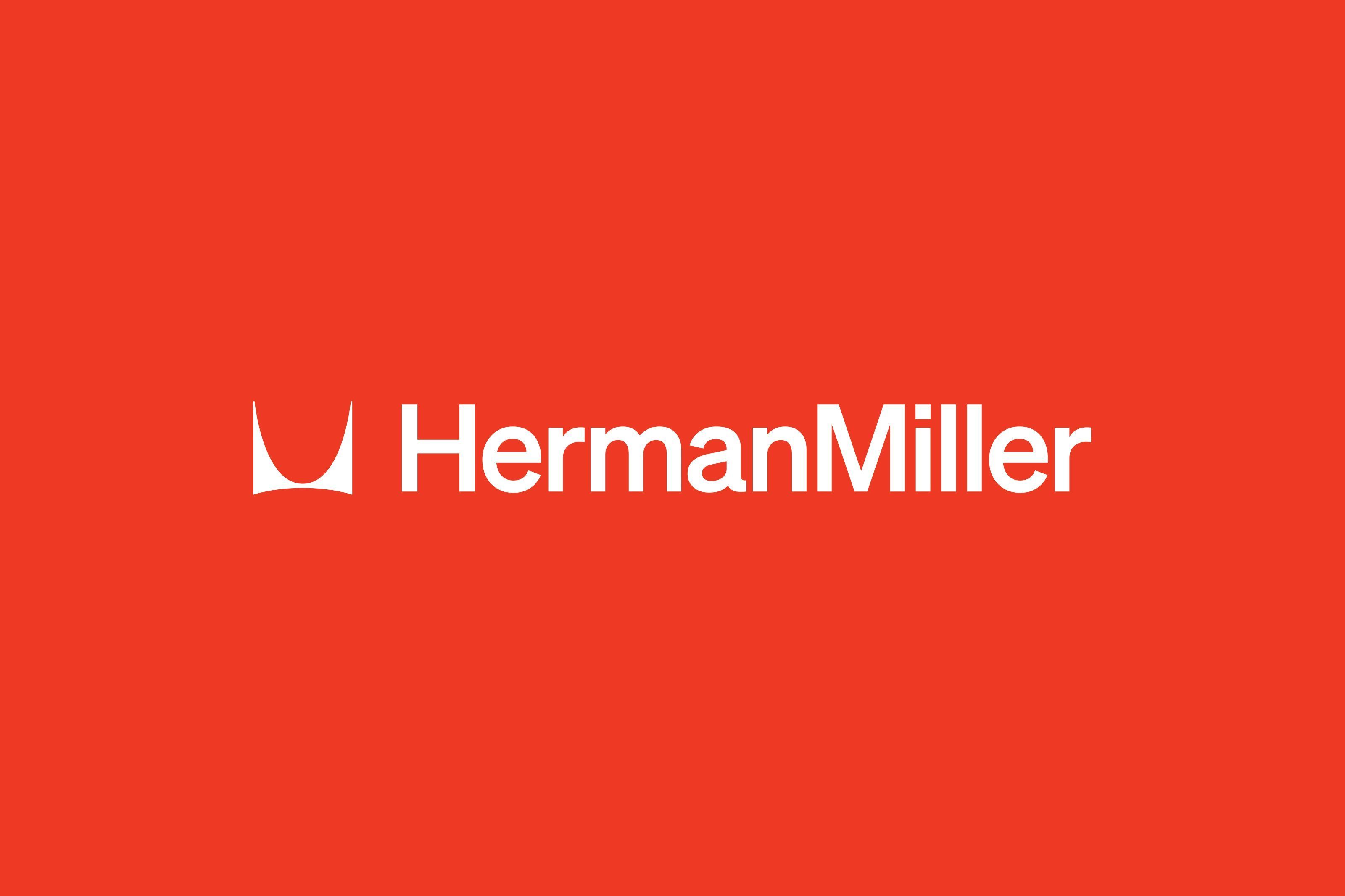
Herman Miller is one of the most respected companies when it comes to production of modern furniture, counting 100 years in the game. To celebrate its 100th anniversary Herman Miller has been fully revitalized by Brooklyn-based design studio Order created a new visual identity for the brand, somewhere between nostalgic and futuristic, always inspired by Herman Miller’s legacy.
The new logo features Söhne typeface, a modern interpretation of Helvetica by Klim Type Foundry, honouring the late 1960s, when the company first used Helvetica. However, the iconic Herman Miller emblem, created by Irving Harper in 1946 remained intact, as the company made it very clear that it was “off-limits”. The overall fresh design system by Order, spanning digital and physical spaces, reflects on the brand’s balance between classic, timeless design and playful, colorful, joyous spirit.
Gush: Sleek design, molecules and neon colours
Gush, a materials company known for its eco-friendly goods and purifying-air paint, just got a revolutionary brand overhaul by Pentagram, expressing the company’s focus to sustainability, innovation and holistic wellbeing. The rebranding is characterized by a recurring circular symbol, like molecules coalescing, that is apparent on both the logo and the brand’s new typeface ABC Camera. One of the most interesting elements of the new visual identity is the hyperreal isometric images by Max Guther, which depict family moments, referencing the domestic usefulness of Gush items. Also, Gush’s packaging was redesigned and moulded paper containers were introduced.
Lester Leong, the CEO of the company, highlights how the brand's redesign manages to embody the ideals of Gush. “Earth is a beautiful place. Vibrant colours in nature signal bloom — thriving regardless of the elements. Our new brand logo and colours represent just that. It takes guts to make mindful choices everyday to positively affect the world at large. We may all be but atoms, but together, we are so much more. Together, we can make a difference — with science by our side”.
Tags/ typography, typeface, visual identity, logo, logo design, rebrand


.jpg)


