Farmers Hen House and Bader Rutter celebrate sustainability with fresh Identity for Natural Eggs
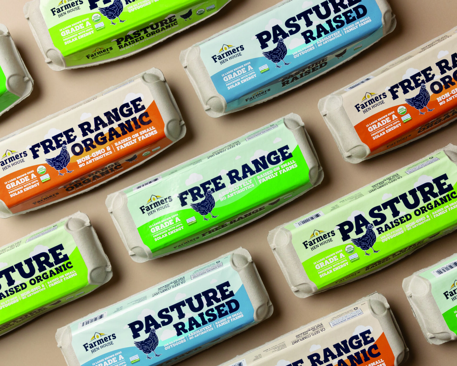
Farmers Hen House revealed a fresh branding for Natural Eggs that elevates their visual identity and possibly appeals to a larger consumer base. In order to really achieve the experience of a premium product and prepare for their expansion into grocery stores nationwide, Farmers Hen House turned to Bader Rutter.
The 2023 B2B Marketing Agency of the Year, Bader Rutter is well-known for their creative branding work and also innovative marketing strategies. The employee-owned agency’s expertise spans multiple industries from agriculture and food and beverage, to pet care, animal health, insurance, financial services, sports entertainment and more.
“We spent a lot of time over the last year connecting with consumers to gain a better understanding of what they are looking for in premium eggs, and proper animal care topped the list,” said Nick Praznowski, director of industry analysis at Bader Rutter. “It’s no secret that consumers care deeply about where their eggs come from, how they’re sourced, and ultimately, how those hens are treated. The Amish and Mennonite egg producers aligned with Farmers Hen House to make sure their hens are given room to roam, raised with the highest standards and fed with nearby grain. Our redesign prioritizes those facts in a way that resonates with consumers.”
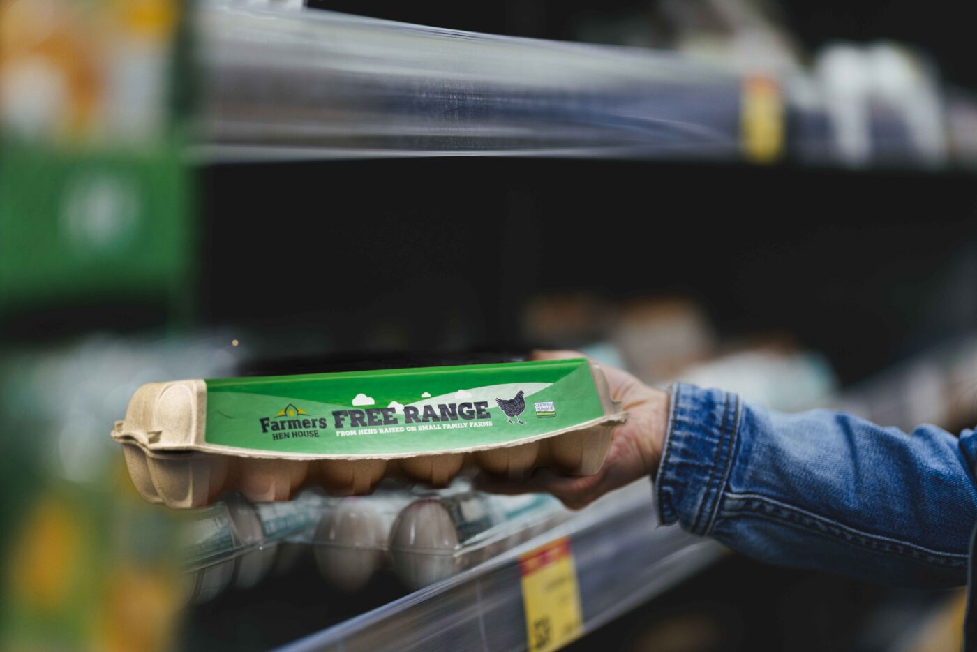
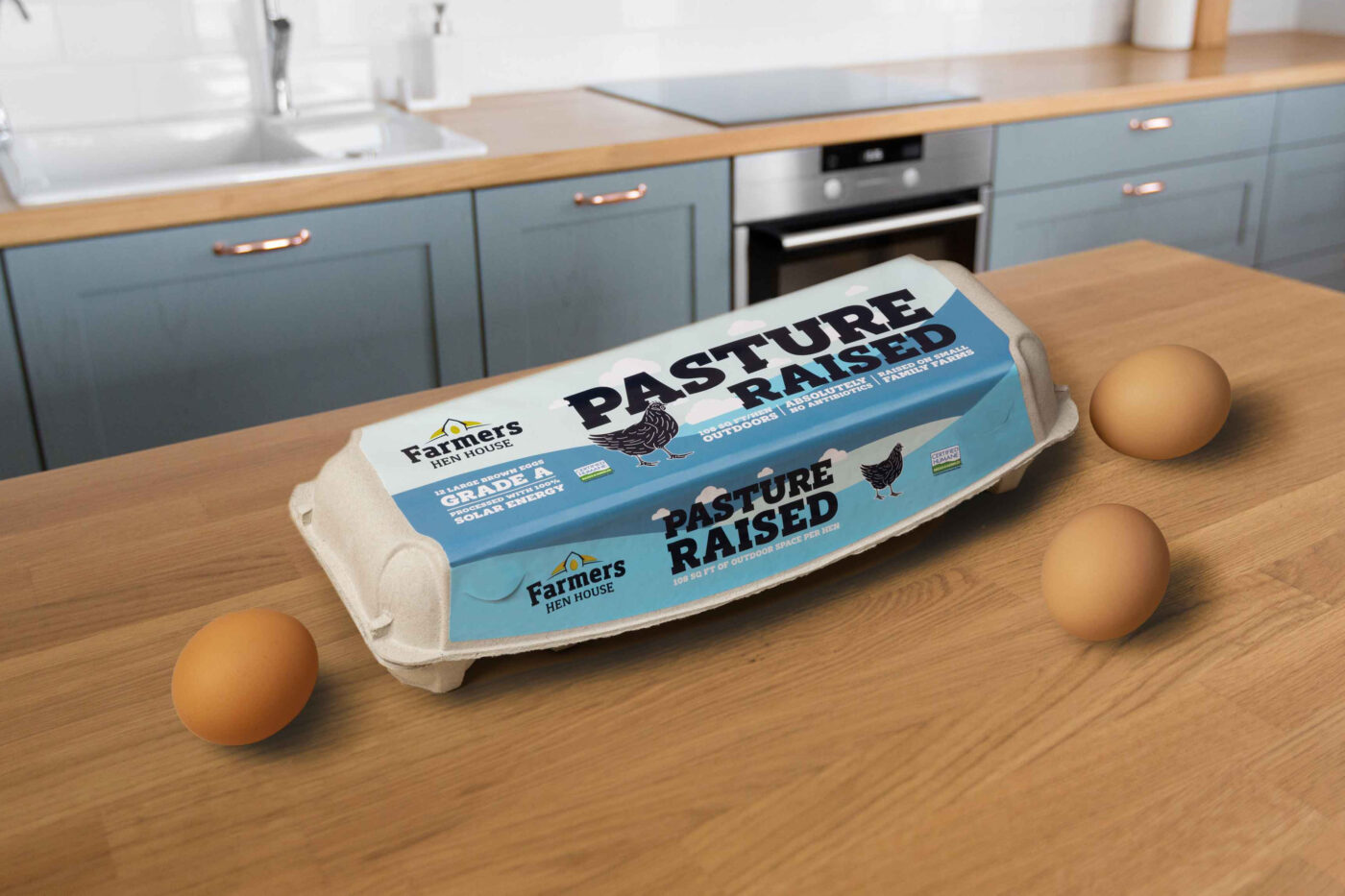
The company's dedication to sustainability and ethical farming practices is highlighted in the new package design, which was introduced in October. This design resonates to consumers who want authenticity and transparency in the products they chose to buy.
“As we explored the brand opportunities, there was such a strong commitment to sustainability at every turn that we needed to recognize,” said Ryan Miller, Farmers Hen House CEO. “Ultimately, the final brand direction celebrates the holistic experience of Farmers Hen House. We tout how these eggs have been tended to at every step and that’s what is reflected to consumers at grocery stores across America.”
The emphasis on differentiation was a key aspect of the design process, according to Ned Brown, chief creative officer at Bader Rutter. “The design exploration was about putting their differentiators forward. To stand out on the shelf, the new identity brand needed to illustrate the incredible and meaningful care that goes into how their hens are treated. We’ve now intentionally put that forward to make it instantly recognizable.”
Find out more about the rebranding, here.
Tags/ graphic design, visual communication, package design, rebrand


.jpg)


