Exploring 'The Complete Commercial Artist': Japan's Journey into Design Innovation
“The Complete Commercial Artist” was a twenty-four-volume compendium of commercial design with a plethora of illustrators and theoretical essays too, published from 1928 to 1930. This publication had huge significance because it included designs of renowned artists, introduced people to design trends, fresh practices and also new materials and techniques. It had great educational value for the subscribers then and is an archival treasure for us now.
We have to consider that back in the early 20th century in Japan design was an ‘artisanal field’ and it took great effort from activists to establish it as an ‘artistic endeavor’, with aesthetic and practical value too. During this era in Europe and America, various movements flourished like Bauhaus, De Stijl and also constructivism, that sought out to bridge artistic expression with productivist perspectives too. The importance of such a publication grows even bigger if we take into consideration the fact that it functioned as a link between local creatives and all these ideas and also styles and technologies that were happening all over the world. This compendium, with the term ‘Commercial Artist’ in it, is in fact proof of the shift that happened during this time in Japan, when design started to be considered a respected profession and creative activity too.
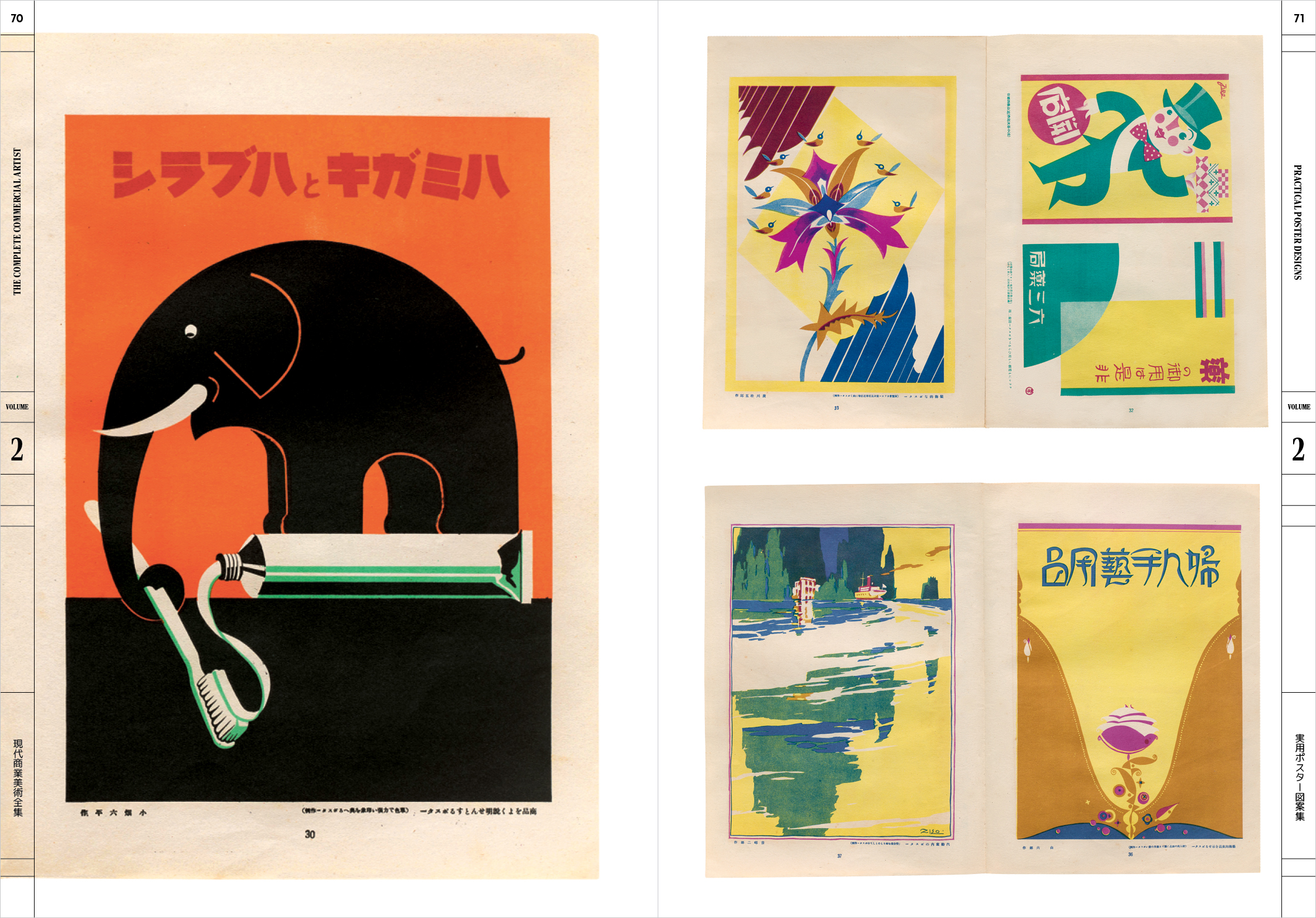
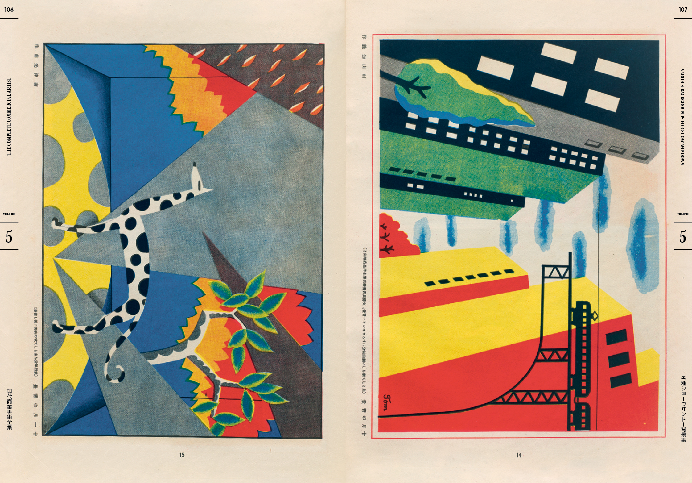
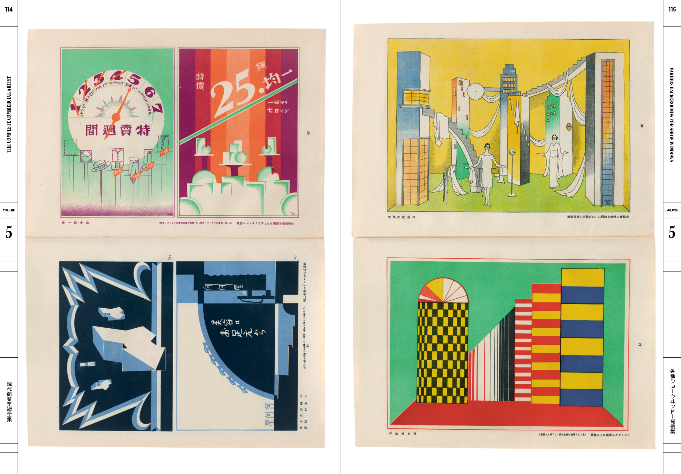
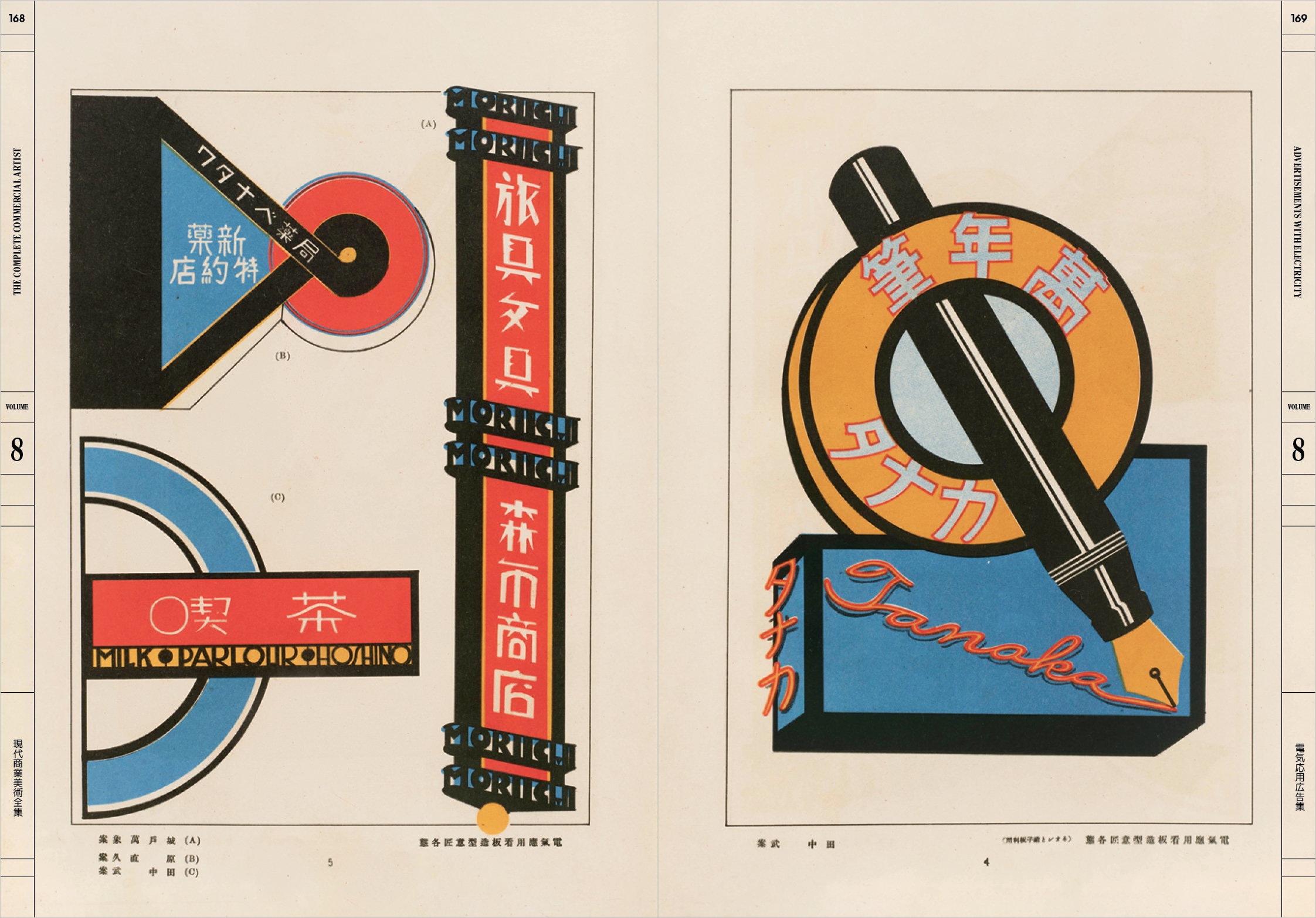
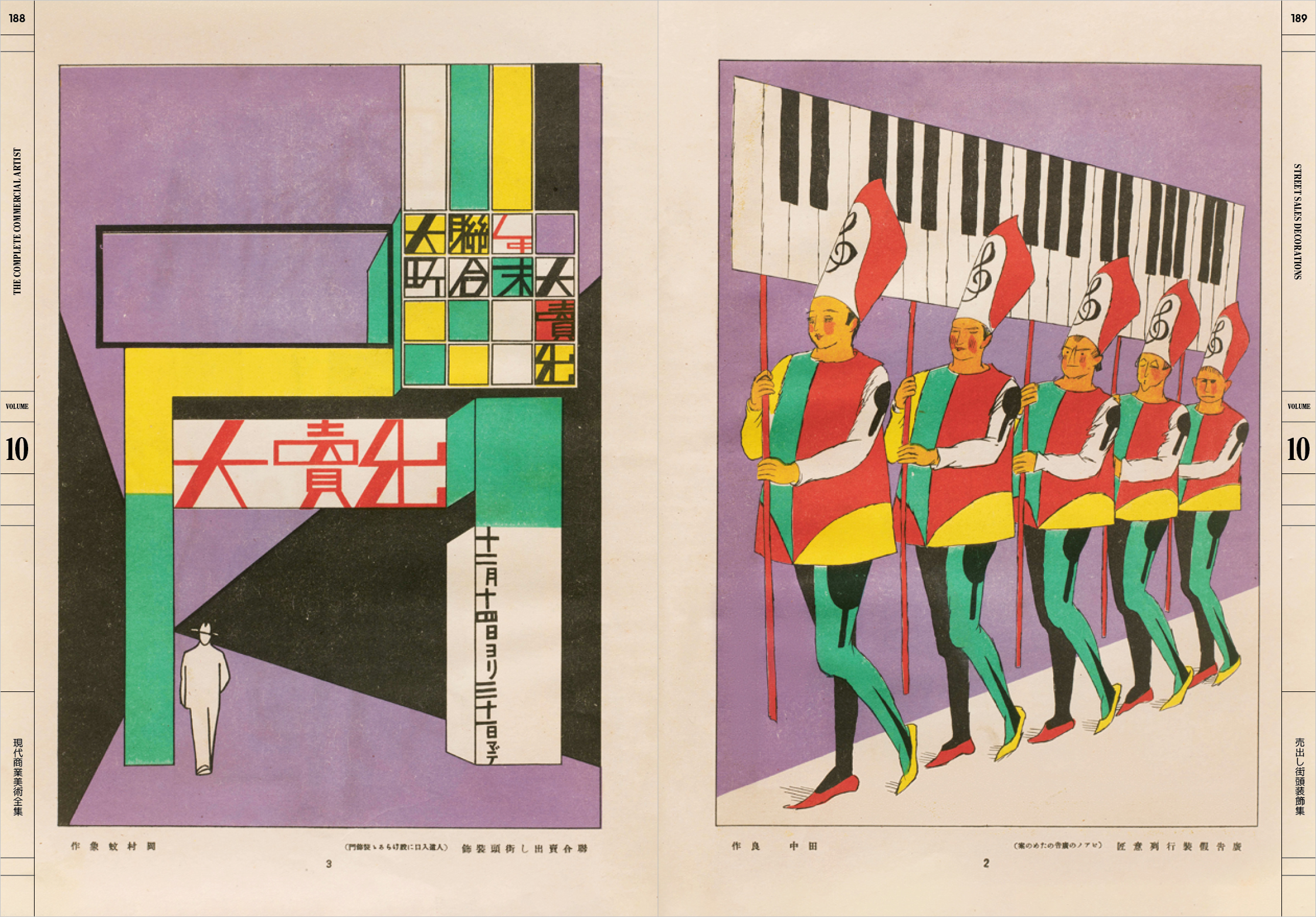
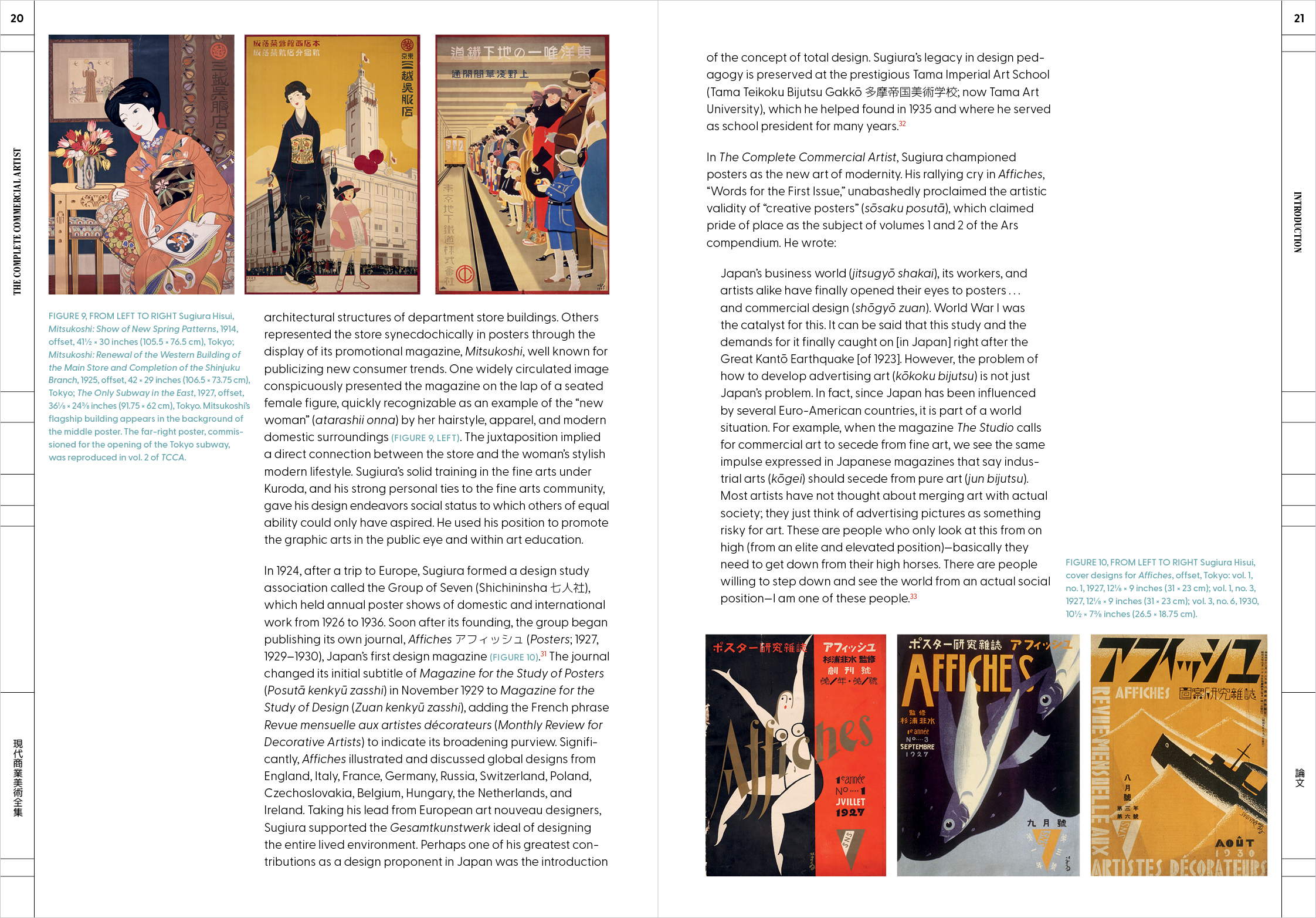
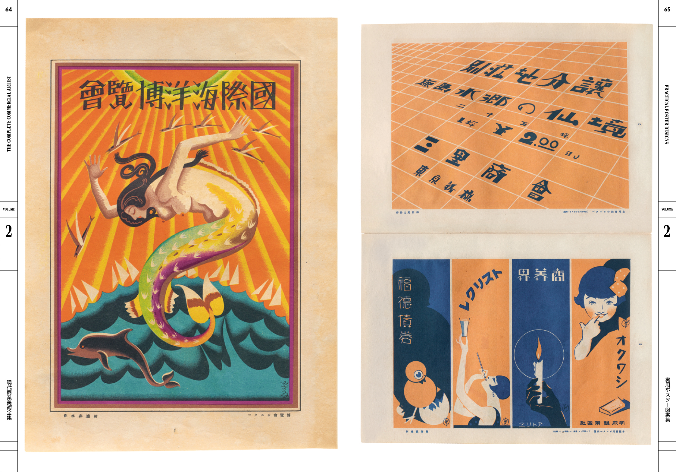
Let’s dive right into it. The Letterform Archive publications and art historian Gennifer Weisenfeld collected all these valuable volumes and created a unique and fascinating book, including hundreds of the original magazine’s pages. It is amazing that while you go through this book you can get a multi-layered overview of the era’s aesthetic and ideology too. This is a priceless treasure of imagery, visual stimuli and inspiration with special details, sketches, designs, isometric drawings and colorful illustrations that function as a piece of art history and could also spark new, fresh creative ideas. ‘Filled with ideas for constructivist storefronts and shop windows, Bauhaus-inspired photo collages, art deco letterforms, manga ads, and startlingly contemporary posters’, this book is an absolute must-have.
Going through the volumes you would be fascinated by the range of design issues and scales that “The Complete Commercial Artist” covered. Starting from the first glimpses of what we today call graphic design you can find an impressive series of posters from all over the world and practical poster designs. Then, you can also learn about larger scale projects with world model show windows, store interiors, exhibition display decorations and many more. Signboards and advertisements were also important, alongside wrapping paper and container design. Under the advertisement umbrella you can also go through examples of newspaper and magazine ads, photography, cartoons, flyers, labels, trademarks, monograms, patterns and illustrations too.
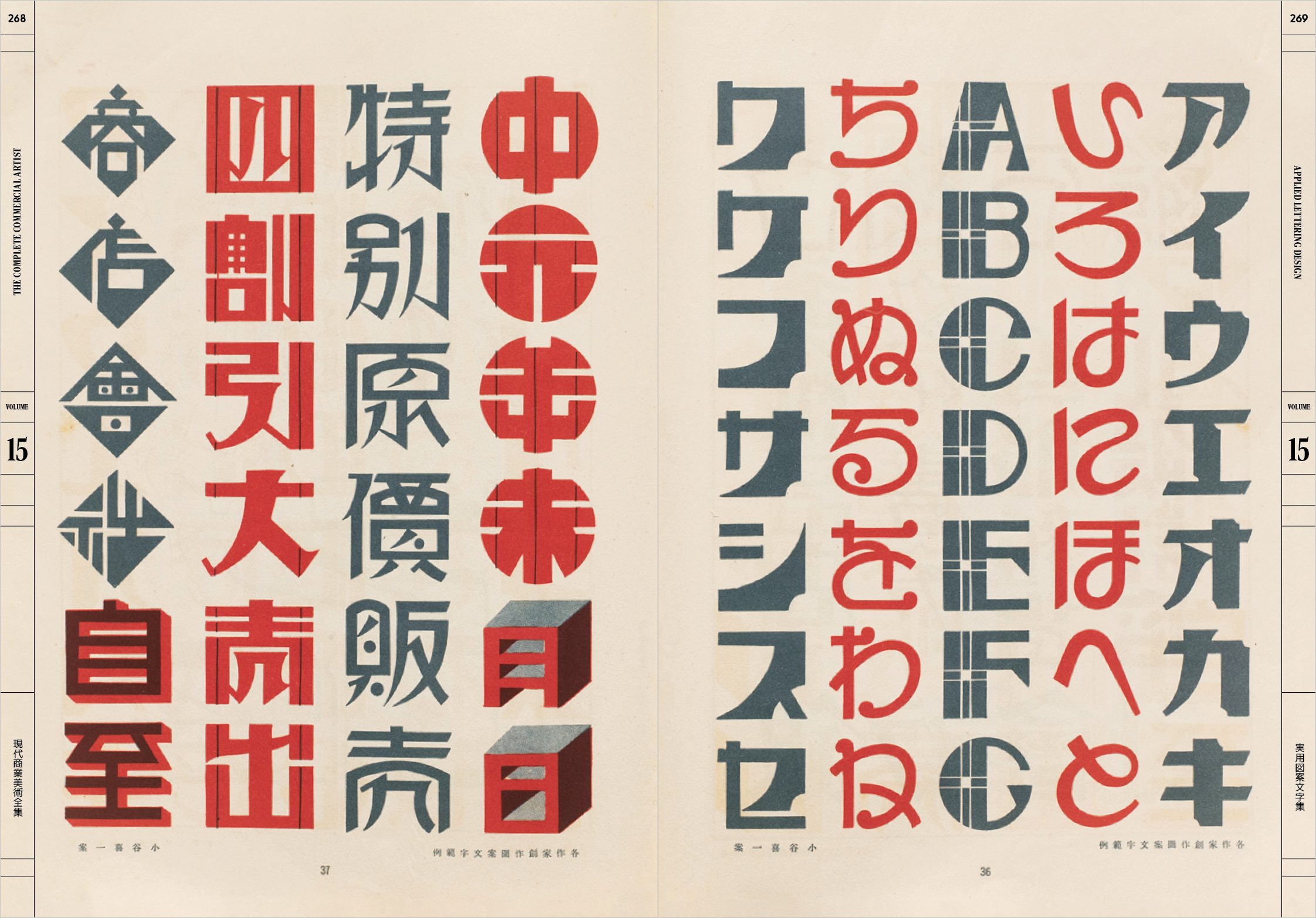
For the typography aficionados, there are two special volumes that deal with “Applied Lettering Design” and “Lettering Layout and Copywriting”. There you can witness the encounter of Japanese tradition and the ‘progressive standardization of kanji characters’ with experimental forms from the Bauhaus movement. You can enjoy calligraphic scripts alongside modern illustrations and see the evolution of styles through time. Moreover, you can also take some valuable lessons about editorial layouts and best placements for advertisements.
All in all, this publication will magnetize you as each volume has its own special meaning and value for the reader. This is an infinite pool of knowledge and inspiration. From Japanese tradition to modernism and European avant-garde, this book covers a whole era of innovation, experimentation and evolution in design and communication techniques too. It is a real gem for designers, historians, creatives and design lovers!
Find it, here.
Tags/ typography, book, advertisement, japan, 2016 graphic design festival scotland, review





.jpg)

