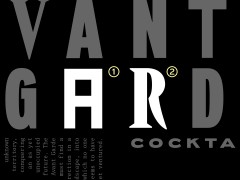
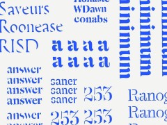
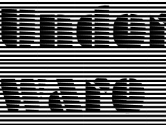
Brik Font: Craig Ward’s inventive typographic endeavor with LEGOs is this year’s 2023 Communication Arts Typography Annual winner
LEGO building blocks have inspired many creatives and artists ever since their creation, back in 1949. Movies, games, competitions, and eight Legoland amusement parks have been developed under the brand and as of July 2015, 600 billion LEGO parts had been produced. With a legacy that keeps expanding, this line of plastic construction toys manufactured by The Lego Group — the largest toy company in the world as of 2021 —, Lego pieces can be assembled and connected in many ways to construct objects, including vehicles, buildings, and working robots. Anything constructed can be taken apart again, and the pieces reused to make new things, so why not type?
Craig Ward, the renowned multidisciplinary designer with an impressive portfolio of work that has been profiled by New York Magazine, WIRED and Fast Company, and author of Popular Lies About Graphic Design (Actar, 2012), an Amazon best-seller translated into four languages has been named as one of the 25 most important designers of all time by Computer Arts Magazine in 2015 decided to put the blocks to another inventive use launching a quest “for the perfect Lego typeface” enter Brik Font.
The ongoing project that has been named a winner in the 2023 Communication Arts Typography Annual premiered online almost two years ago, on the 5th of October 2021.
“Can Lego be an effective medium for typography? Let’s find out” reads the caption of Ward’s Instagram post. “Creativity thrives on restriction, and the Lego building system is a testament to that. Very few things have yet to be created in Lego in some way, but the nuances of type design tend to be compromised” he elaborates.
“The success of the Lego system is that concept writ large, as almost everything imaginable has been created in Lego in some way, but the subtleties and nuance of type design often struggle with the 'resolution' - curves and diagonal strokes in particular. I've always taken pleasure in mixing disciplines and working in unexpected ways and this felt like a nice extension of that area of my work” explains Ward.
“I’ve also enjoyed the rigidity and restriction of modular type design for some time, so Brikfont is kind of a quest to find the perfect modular typeface in Lego. I'm not yet 100% sure what qualifies as a success right now — whether it's something that works well in spite of the medium's restrictions or something that embraces and celebrates those restrictive aspects — but it's fun nerdy stuff and there's a little learning in there to be had as well, I hope” he adds.
Ward began shaping the bricks into ubiquitous typefaces like Helvetica and Garamond “and physical renditions of digital relics, a step that gave birth to a full-scale project involving dozens of typographic studies: a scroll through the Brik Font Instagram reveals single letters, throwback video game logos, and references to anti-aliased words” writes This Is Colossal.
Rooted in the history of the movable type invented by Johannes Gutenberg in yesteryears, an invention that allowed letters to be arranged as a printer’s mind wanted, Ward’s playful typographic endeavor expands the concept in search of answers. Inspired by numerous trailblazers like Susan Kare and her work for Apple or the seminal New Alphabet by Wim Crouwel, Ward explores the art of typography with LEGOs. Not a corporate partnership but a very practical and playful approach to type with insights provided by Ward in short captions, Brik Font’s block-heavy diverse creations are a sight for sore eyes.
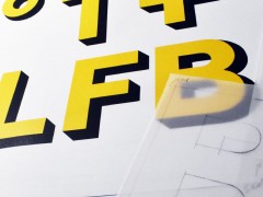
“Part of the idea behind this project is to create new modular typefaces, the templates for which I’ll be selling as downloadable PDFs through an Etsy store for like the price of a coffee or something. this is one of my first: a 5-line condensed stencil alphabet, 55 characters in all: a-z, 0-9, and some punctuation” Ward mentions.
With an option for a book and the release of a full alphabet kit of LEGOs for type, Brikfont prints are available for sale via Etsy and Society6.
The second designer in history (the first being Neville Brody) to create a custom typeface for the England national football team uniform circa 2018, Ward’s work has been acknowledged by D&AD, One Show, ADC, and Cannes Lions and he is a five-time recipient of both the Type Directors Club’s Award for Typographic Excellence and the Communication Arts Award of Excellence.
Play his field here.
Tags/ typography, craig ward, font, gutenberg, movable type, instagram, wim crouwel, communication arts, typedesign, susan kare, legos

