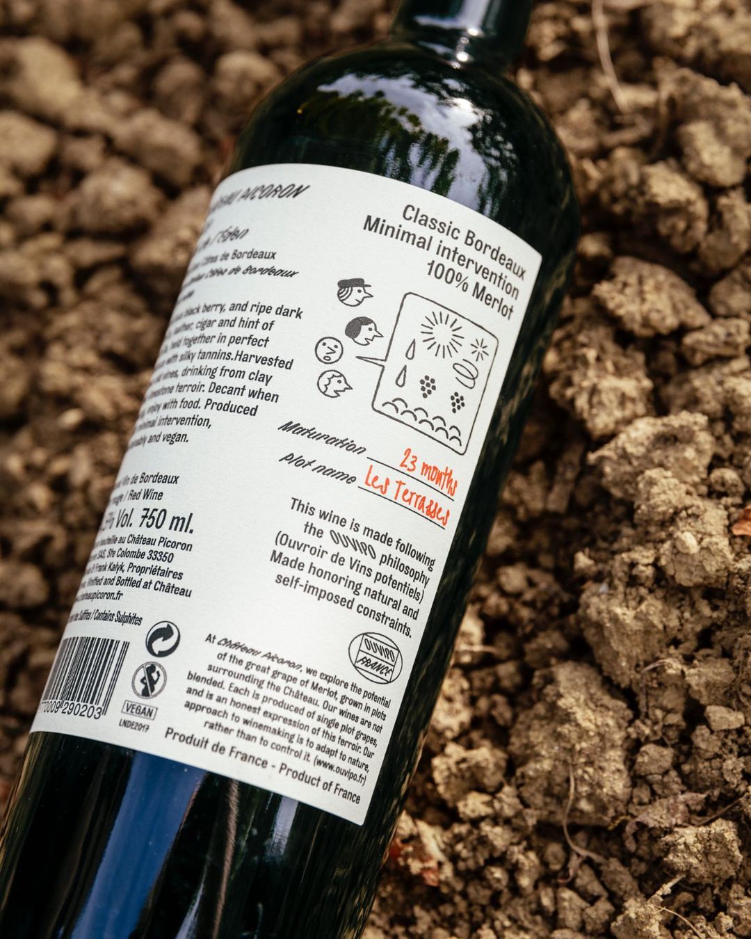
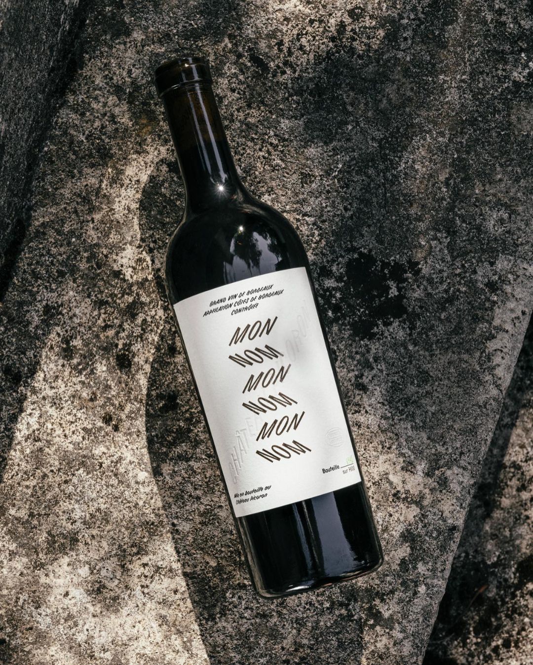
OlssønBarbieri X Château Picoron: a conscious, playful & heavy typographic rebranding to celebrate
Aiming to revitalize a region whilst honoring its history in winemaking the Australian-owned organic vineyard in Bordeaux, France Château Picoron sought to kick start something fresh, enter the “New Bordeaux.”
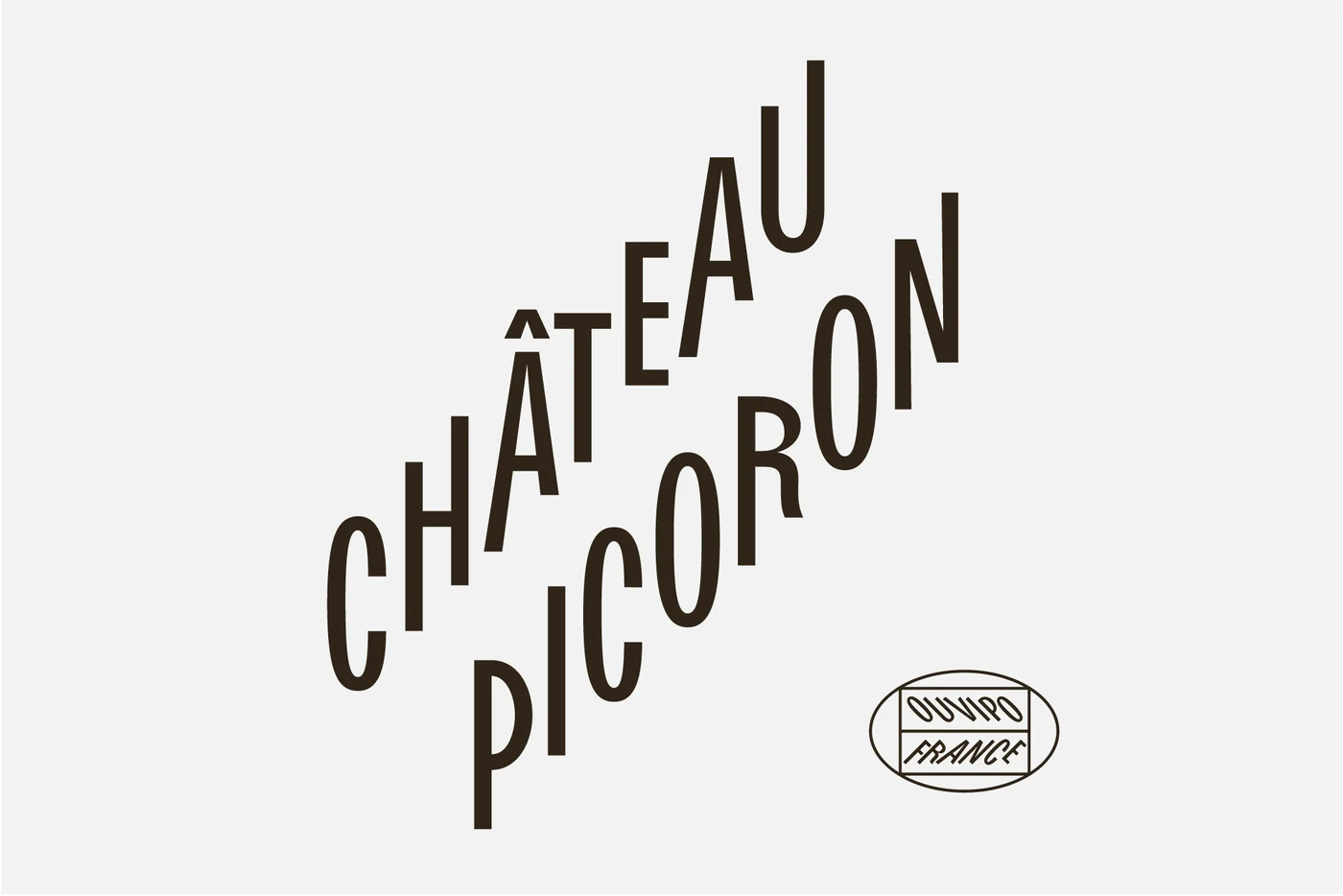
Commissioned with the task to provide a distinct visual identity to this evolution, Henrik Olssøn and Erika Barbieri aka the duo behind the Norwegian studio OlssønBarbieri, opted for a heavy-in-type design approach that delivers.
The multi-awarded rebranding – one of the five projects nominated for the public's vote in this year's Dezeen Awards 2022 Graphic Design category – was a challenge.
“Working alongside Château Picoron, we learned of Bordeaux’s incredibly restrictive winemaking regulations and constraints – many imposed by law – instituted in an attempt to preserve the specificity of the wine; enforcing the vineyards to adhere to their rules in order to qualify for Bordeaux’s appellation. Today, however, the greatest constraints are created by nature itself; with climate change inevitably transforming the way the world produces food. The warm summers in the past years have made it difficult to control the sugar level of the grapes, and as you cannot add water to reduce the alcohol in Bordeaux, this is challenging winemakers to find new ways to work with nature” explains the design practice.
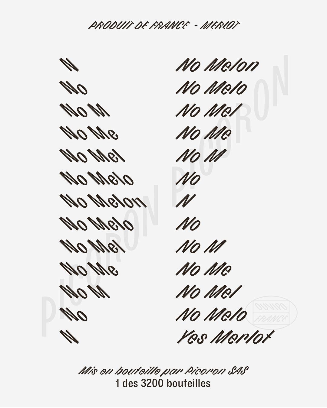
“Finding opportunity and poetry within restriction, we saw these constraints as an exercise in creativity and balance; finding a freedom within the need to adapt and, similarly to the winemakers themselves, crafting something truly unique in the process. Communicating the constraints whilst respecting the craft in a playful and fundamentally approachable way. Offering Château Picoron a platform to initiate the conversations concerning the future of Bordeaux and, on a greater scale, the fate of wine in general. We further advanced the notion of constraint by committing to use one typeface, Bourrasque, in doing so exploring the sans serif’s full potential within our self-imposed restraints.”
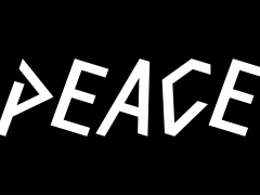
Designed by Yoann Minet in 2014, Bourrasque “finds its origin in a custom work for the opening credit sequence of the short film Un certain regard, directed by students from the Gobelins school” reads the typeface info. Developed and published by the graphic design studio Bureau Brut in 2018, Bourrasque “complimented the animation by following the film set, which featured moving escalators. When used in a regular, horizontal setting, its true structure appears: a combination of rotalic and italic principles, it plays on a 45° rotation of strokes and circular letters while keeping a steady baseline.”
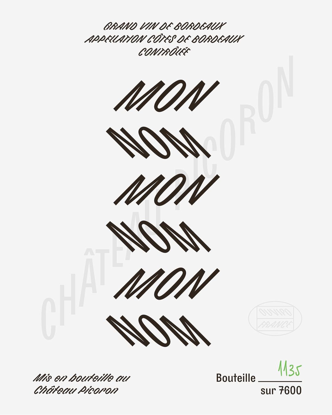
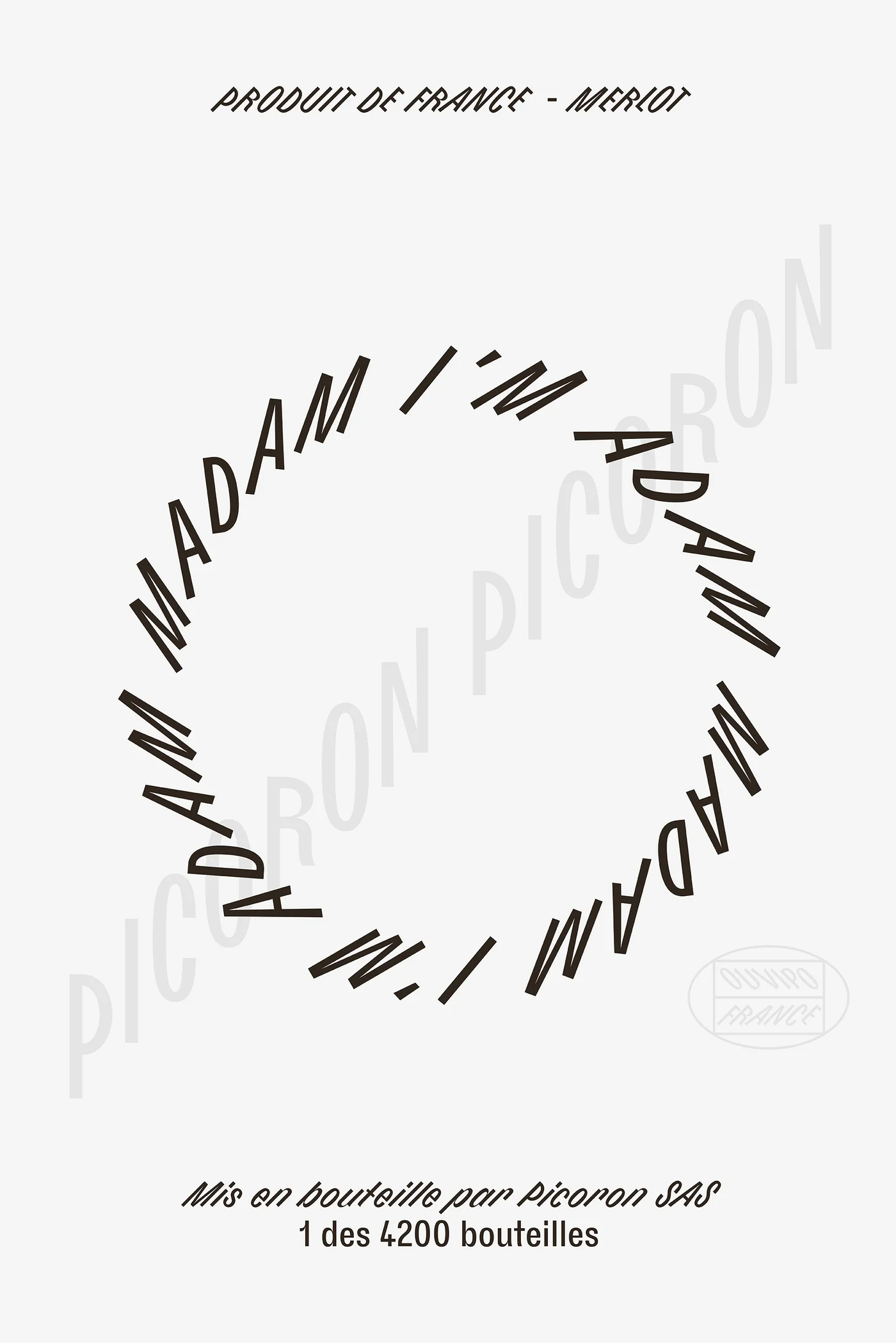
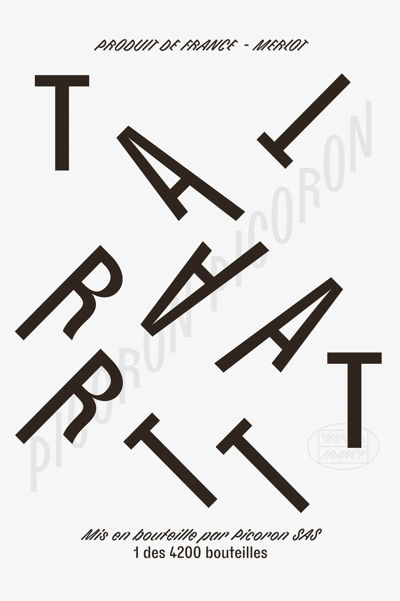
“Investigating the potential for restrictions within the brand’s copy, the product's names are palindromic – able to be read both backward and forwards – providing an innate harmony and infinite symmetry to the identity. Again split between their Bordeaux and non-Bordeaux appellations, the traditional range finds its names within French palindromes; such as Le Bon Nobel, Ne de l’Eden and Mon Nom. Château Picoron’s more avant-garde wine, however, finds inspiration in their titles within the English language, opting for Tattarrattat, Madam I’m Adam and No Lemon, No Melon, to further demonstrate the château’s aim to challenge winemaking convention.”
“All Château Picoron’s wine labels are printed on an extraordinary paper, the debossing of which allows the light to bleed through; giving us the space to scale the brand name at a generous size, whilst allowing each label to be truly unique. This effect, in addition to the black foil, are the same on both ranges, optimizing production cost for tooling while offering premium detailing” notes OlssønBarbieri.
Empowered by the creatives’ sensible approach, the rebranding continues Henrik Olssøn and Erika Barbieri’s quest for good design. “We have evolved by staying true to our belief that there is a better way to make products and empower a world of mindful consumers. Our intention for the future is to question our society of overconsumption and abuse of resources and contribute to a positive shift through beauty and purpose” reads the studio’s manifesto.
“We believe designers have the possibility to affect social and cultural attitudes. We know how to identify opportunities and challenges early on and to turn them into concrete design solutions that deliver beyond the expected. The way we produce and consume food and goods today is a complex discussion with many layers and no black & white answers. We believe our experience brings a nuanced contribution to this discussion. Designers should contribute with new and creative strategies for policymaking and cross-industry dialogue, to create less harmful waste cycles” they add.
“Every project has the potential of reducing its environmental impact, creating better rituals, and making us consumers more aware that we are living in a symbiotic world. This debate is not only about the choice of materials and understanding the entire life cycle of each product, but also about contributing to a shift in consciousness and attitude towards our habitat” the creatives elaborate.
Explore more mindful design via OlssønBarbieri here. We drink to that!
Tags/ design, typography, visual identity, branding, rebranding, awards, france, norway, nordic, olssonbarbieri, wine, bordeaux
