“Radically new!” The Verge opts for a brand new online experience with three new typefaces, a sharp as it gets logo & a Twitter-like feed
The web’s technology news outlets are going through Ch-ch-ch-ch-changes. After CNET’s massive redesign by COLLINS, here comes a brand new Verge experience.
The Verge’s co-founder and editor-in-chief Nilay Patel and publisher Helen Havlak unveiled the ambitious new site and design for the 10-year-old technology brand. “The Verge is a destination that has sustained a loyal and robust community since its founding, and with its new site, the brand will build for the next 10 years by investing in a direct relationship with its audience. Building on a homepage that’s one of the most-visited daily destinations in technology coverage, The Verge’s new homepage will introduce the Storystream news feed, a new Twitter-like feature that will offer readers a comprehensive, curated rundown of the most important tech stories of the day — featuring expert commentary by Verge journalists; links to the best reporting on The Verge and other sites; and direct embeds from TikTok, Reddit, and more” reads Vox Media’s press release. It is the first Vox Media site to run on Duet, a mobile-first audience platform.
Almost eleven years after its premiere online (The Verge launched on November 1, 2011) and six years after its former redesign, The Verge team reevaluated its positioning, its competitors and its aesthetics. “I think that the core realization for us is that our competition is not Wired, our competition is Twitter ... and other aggregators of audience. Sometimes you just have to blow things up and start over” he explains.
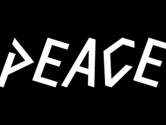
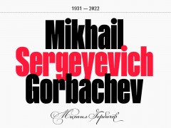
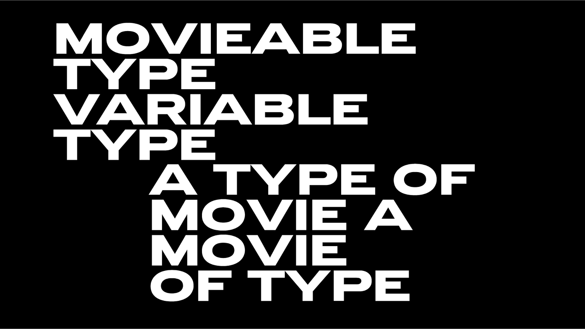
Designed and developed Vox Media’s in-house design team this new “meant to be beautiful and boundary-pushing” Verge redesign is set in three new typefaces. Enter Gradient’s “fresh take on mid-20th century classics” PolySans designed by Milos Mitrovic, Klim Type’s deeply rooted in European wood type Manuka and FK Roman Standard — a neutral serif typeface, inspired by a newspaper typography giant Times New Roman — designed by Květoslav Bartoš. FYI, The Verge’s bespoke Pathways typeface that was unveiled in 2016 on the occasion of the website’s 5th anniversary is gone.
The website has also unveiled a completely different “sharp new logo,” features “a bright new color palette that highlights the team’s work in confident new ways” and aims to “bring the best of old-school blogging to a modern news feed experience” via its Storystream curated news feed. “If that means linking out to Wired or Bloomberg or some other news source, that’s great” notes Patel.
“Patel believes that the simple power of blogging has become more important as social media fatigue intensifies” reports Axios. “I 100% think we can revolutionize the media with blog posts. We're kind of going back to basics moment” building communities around writers said Pattel.
We are relaunching The Verge! @reckless shares a sleek, modern logo, faster load times, beautiful article pages, and a brand-new homepage. Check it out: https://t.co/iopasNv0Da pic.twitter.com/TbJMdNyZOw
— The Verge (@verge) September 13, 2022
“When you embark on a project to totally reboot a giant site that makes a bunch of money, you inevitably get asked questions about conversion metrics and KPIs and other extremely boring vocabulary words. People will pop out of dark corners trying to start interminable conversations about ‘side doors,’ and you will have to run away from them, screaming. But there’s only one real goal here: The Verge should be fun to read, every time you open it. If we get that right, everything else will fall into place” he adds.
As the story goes, the redesign has prompted a rather fierce good/bad debate online, with many Twitter users complaining about the website’s new approach and Patel is very forward in addressing them.
Lots of people love our new design and a few people hate it, but you know, we made everyone talk about a open web redesign in 2022 and that makes us all winners in the platform wars.
— nilay patel (@reckless) September 14, 2022
(Also we had 2x our baseline homepage traffic today. Blogging is back, baby.)
Listen to the latest Vergecast podcast for a thorough exploration of the redesign and its many challenges co-hosted by The Verge’s editor at large David Pierce and Patel with senior product manager Tara Kalmanson and senior engineer Matt Crider, who worked on the project, as guests.
The mobile-first and two years in the making massive and bold redesign is a kind reminder that The Verge is not afraid of changes. It’s after them.
Tags/ typography, typefaces, logo, rebranding, redesign, website, bespoke, cnet, the verge

