Akzidenz-Grotesk & more Berthold typefaces join the Monotype family
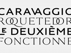
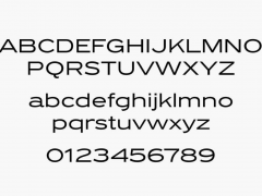
Monotype owns a significant part of type design history with its latest acquisition. As announced on the 25th of August 2022, Monotype has acquired the Berthold inventory of typefaces that bare a “unique historical significance in the type industry.”
Monotype aims to “increase global visibility of Berthold’s inventory, celebrate its legacy, and get these important typefaces in the hands of more creative professionals” notes Monotype’s CEO, Ninan Chacko. “But more than that, this acquisition ensures iconic type families including Akzidenz-Grotesk, Imago, and Formata remain as accessible and relevant as other historic typeface families in the Monotype library such as Helvetica Now, Gotham, and Neue Frutiger” she adds.
Monotype is thrilled to welcome and celebrate #Berthold's historic typefaces as they join the @Monotype family today. Learn more here https://t.co/RkzOLZ30by #TypographyMatters pic.twitter.com/uRaDwz7Kuq
— Monotype. (@Monotype) August 25, 2022
Best known for its celebrated and highly influential sans-serif family of Akzidenz-Grotesk typefaces, the Berthold library is a treasury of seminal type designs.
Founded in Berlin in 1858 by Hermann Berthold, initially to make machined brass printer's rule, H. Berthold AG was one of the largest and most successful type foundries in the world for most of the modern typographic era, making the transition from foundry type to cold type successfully and only coming to dissolution in the digital type era.
Renowned for crafting high-quality typefaces the type foundry had become the largest in the world by 1918 with offices in Stuttgart, St. Petersburg, Leipzig, Riga, Budapest, and Vienna.
Following World War II, Berthold actively developed proprietary typesetting equipment: in the 1950s, Berthold unveiled its first phototypesetting machine, the Diatype; and in the 1960s, Berthold introduced the Diatronic, its first keyboard-controlled phototypesetting for volume production.
The H. Berthold foundry's most celebrated family of typefaces is arguably Akzidenz-Grotesk (released 1898), an early sans-serif that prefigured by half a century the release of enormously popular neo-grotesque faces such as Helvetica. In 1950, type designer Günter Gerhard Lange embarked upon a long affiliation with the company, for which he designed various original typefaces, including Concorde and Imago, and oversaw the foundry's revivals of classic faces such as Garamond, Caslon, Baskerville, and Bodoni.
Regarded as “the best typeface ever designed” per Pentagram’s Domenic Lippa, Akzidenz-Grotesk iconic type design influenced a whole range of other fonts including the infamous Max Miedinger’s Helvetica and Adrian Frutiger’s Univers. The typeface belongs to a tradition of general-purpose, unadorned sans-serif types that had become dominant in German printing during the nineteenth century.
Originally named “Accidenz-Grotesk” Lange regarded Royal-Grotesk as the key source and credited it to Ferdinand Theinhardt but “this has recently been proven untrue” per Dan Reynolds’ insightful article.
Almost half a century after its initial release, in the 1950s Günter Gerhard Lange, then art director at Berthold, began a project to enlarge the typeface family, adding a larger character set, but retaining all of the idiosyncrasies of the 1898 face.
Under Lange’s instrumental direction the AG series evolved and eventually conquered the world. Although relatively little known for a half-century after its introduction, Akzidenz-Grotesk achieved iconic status in the post-war period as the preferred typeface of many Swiss graphic designers in what became called the 'International' or 'Swiss' design style which became popular across the Western world in the 1950s and 1960s.
“It is the work of anonymous typecutters: craftsmen, specialists, whose professional background and experience meant they were familiar with the finest subtleties and principles, and not just those of Grotesque” Karl Gerstner said of the fundamental type design. “They gave Akzidenz-Grotesk the ultimate accolade a typeface can have: a functional, formal rightness, transcending the whims of fashion.”
On the occasion of Monotype’s announcement, renowned type designer Erik Spiekermann tweeted:
Can’t believe @Monotype paid money for non-existing licenses. All they got are registered names. The original Berthold data was stolen, never legally acquired.
— erik spiekermann (@espiekermann) August 26, 2022
In Ulrich Stiehl’s german language article “Who is the legal successor of H. Berthold AG?” the Bertholdgate unfolds.
Tags/ typeface, helvetica, type design, type foundry, grotesque, grotesk, univers, sans serif, swiss style, akzidenz grotesk, international style

