Bureau Borsche X Venezia FC: a bold rebranding that roars
It seems that world-renowned Munich-based design studio Bureau Borsche knows how to score big!
Almost a year after the studio’s rebranding for Inter Milano, Bureau Borsche unveiled its rebranding for Venezia FC with “a bold and thoughtful design that honors tradition while moving forward into a new era.”
The new brand identity is “another step in the club’s evolution” notes the club. “The Lion of Saint Mark, the winged lion that stands as the symbol of the city of Venice, has always been at the heart of the Venezia FC brand, and Bureau Borsche have skillfully designed a strong ‘V’ crest that seamlessly integrates a modern reinterpretation of the historic symbol in a more minimal and abstract form, producing a new lion that feels more sleek, fierce, and stylish than the one it replaces.”
“In a clever flourish, the horizontal lines representing the lion’s wings are a clear reference to the Venetian gondola's traditional iron prow with its protruding blades. The ‘V’ is capped by the club colors, orange and green, which, upon close look, present the appearance of orange and green flags.”
“Moreover, in a significant historical move, Venezia FC’s lion has been returned to gold from the previous white. The club's lion has almost always been in gold throughout its 114-year history, only switching to white in the logo from 1997-2005, then returning again in 2013 and 2015 and remaining through last season.”
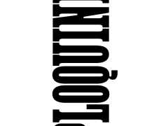
Bureau Borsche boldly takes The Bavarian State Opera into the 3D typographic realm
“Bureau Borsche — famed for their work at the highest levels of art and culture, fashion, sport, and commerce, with clients including the Bavarian State Opera, Balenciaga, Supreme, Nike, and Apple — have made their mark in Venice once before” explains Venezia FC’s blog post.
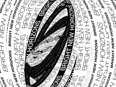
“In 2019, the acclaimed studio created an identity for the Venice Pavilion at the 58th International Art Exhibition of La Biennale di Venezia, which went viral through the city — often being mistaken for the new corporate identity of the Biennale, which was intentional and brilliantly played off the exhibition’s theme that year: fake news. The Biennale project was the first case of Bureau Borsche reimagining the Lion of Saint Mark, an experience that served well in approaching Venezia FC’s identity.”
Bureau Borsche had also previously designed Venezia FC’s website and webshop in 2021.
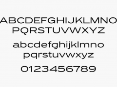
On the launch of the brand new sports identity set in a sans-serif typeface in the neo-grotesque style, Venezia FC also present the 22/23 pre-match shirt, a first tangible expression of the ‘V’ crest, also designed by Bureau Borsche -FYI, it’s already out of stock.
Enjoy Bureau Borsche’s thoughtful take on design and branding here.
Tags/ graphic design, rebranding, italy, bureau borsche, football, venezia fc, inter milano


