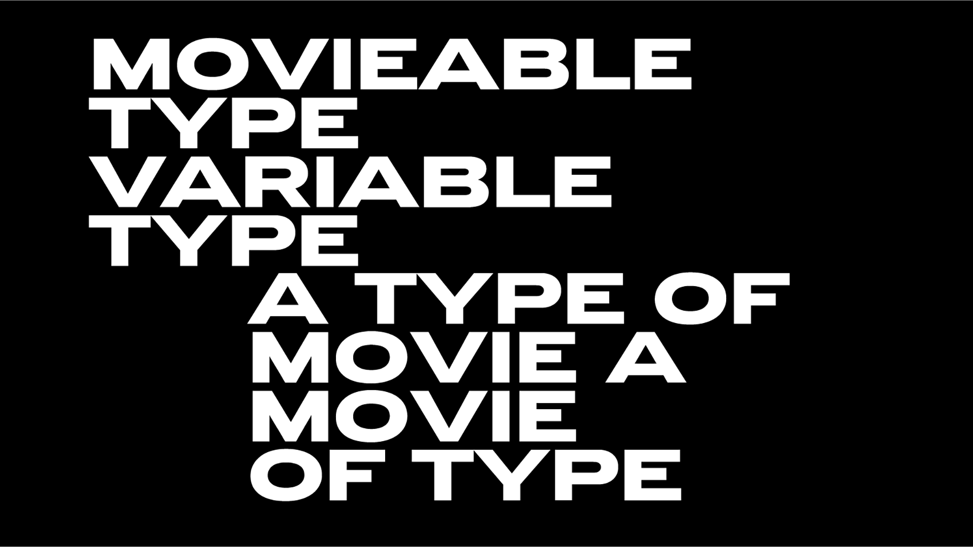
Instagram Sans aka the year’s most talked about bespoke typeface so far
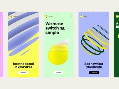
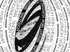
Created by the international, award-winning Colophon Foundry for Meta, Instagram Sans is one of the main elements in the social media platform’s biggest rebranding ever.
The global custom typeface is “a case study in modernizing historical precedent” writes Colophon Foundry.
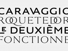
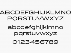
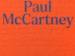
“Instagram Sans (or IG Sans, in abbreviated form) embraces the timelessness of grotesk / grotesque typefaces and pairs this visual language with a contemporary point-of-view. Using the familiar and existing Instagram glyph (ostensibly a square, a circle, and a dot) as a foundation for much of its construction, we designed Instagram Sans to be at once gestural, nuanced, musical, human, expressive, agile, scaleable, organic and unexpected.”
“In seeking out a means of referencing the provenance of Instagram’s legacy script wordmark, we looked to traditional cursive letterforms for inspiration” explains the team.
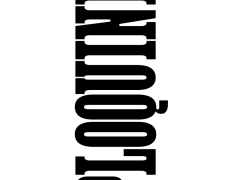
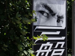
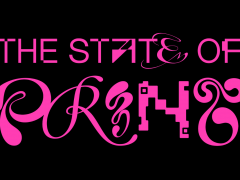
“While part of this calligraphic ‘hand’ influenced even the initial choice to pursue a more distinctly Grotesque sans-serif foundation, it pushed us further still to create a system in which we could include non-connecting, cursive-like letterforms as visual punctuation in a given word. To this end, each letterform — Aa to Zz, 0 to 9 — has a unique ‘Headline’ counterpart that allows for gestural typographic intonation. Not only do these forms reference Instagram’s own visual history, but they also touch on the singular ‘hand’ of an individual user.”
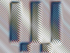
“The proportional weights of Instagram Sans also have several Condensed counterparts, available to users in corresponding Light, Regular, Medium and Bold weights. While the proportional weights of IG Sans are perfect for brand applications and out-of-App everyday use, we explicitly made Instagram Sans Condensed for compatibility and harmony with the Instagram application itself.”
“In even the earliest iterations of the typeface, discussions of common aspect ratios³ informed the construction of the condensed letterforms. While the proportional weights generally hew close to a 4:5 aspect ratio (think of a classic 8 × 10-inch printed portrait), the capital letters of Instagram Sans Condensed are more akin to the 16:9 aspect ratios that influence our everyday in the form of our mobile phone screens. Indeed, 16:9 is the very same aspect ratio of Instagram Stories.”
Explore more about Instagram’s custom typeface that “seeks to push (typographic) culture forward” here.
Tags/ typography, typeface, instagram, rebranding, grotesk, colophon foundry, custom type

