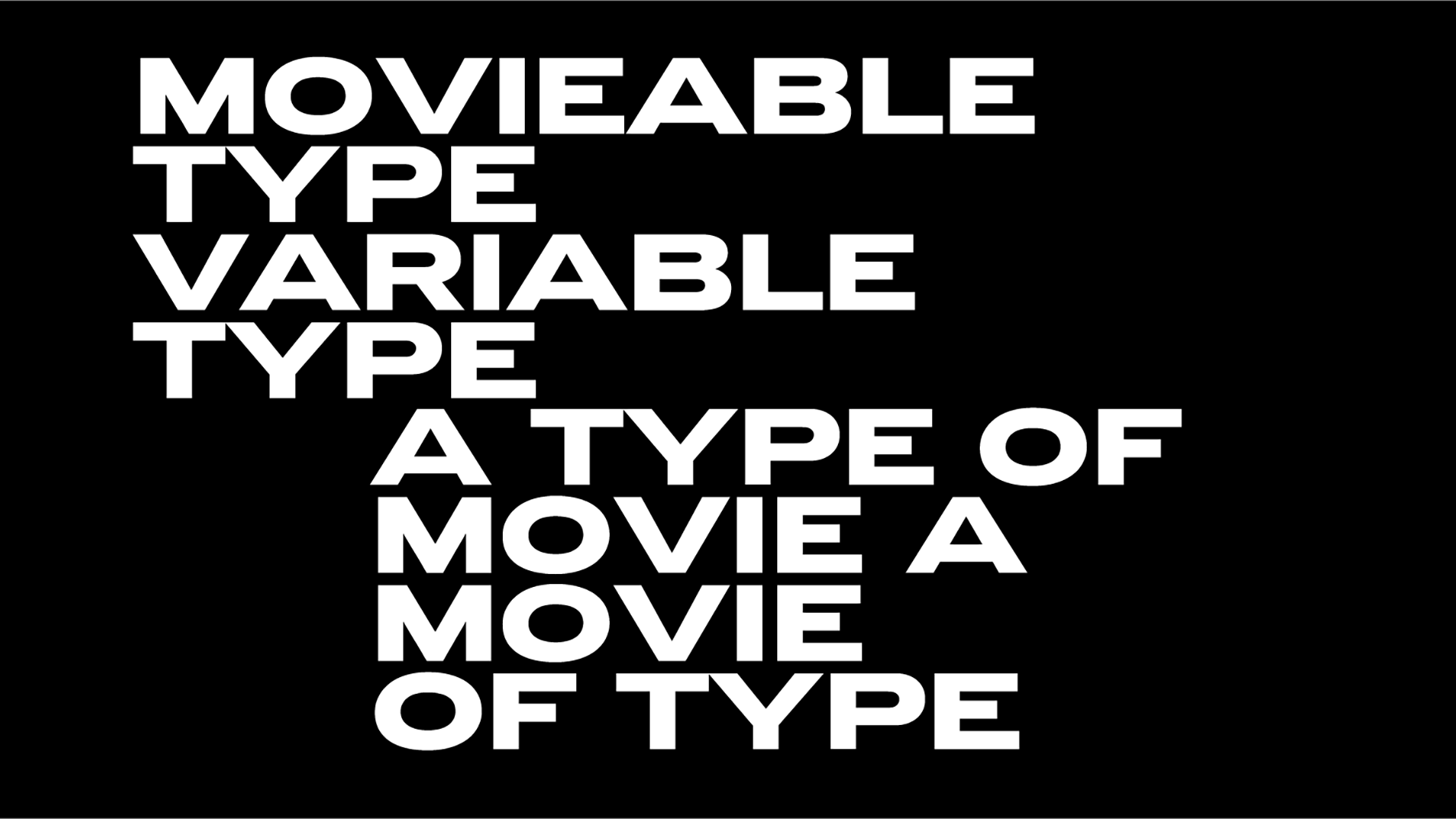
The State of Print is blooming in Fable Studio's exhibition
On view till the 31st of July, The State of Print at Singapore’s National Design Centre Atrium aims to highlight the beauty of print in our screen-saturated times.
“The printed page has always been a portal into another world. There is nothing quite like that moment when you first open a new book or magazine, when you feel its weight, catch that inky smell coming off its pages, and run your fingertips over the paper. Today, the screen has become the more prolific medium for information exchange. Instead of flicking pages, we are spending more time scrolling through screens” note the organizers of the exhibition that believe in the printed material as a canvas of artistry.
“It is not the death knell for print just yet. It can be hard to remember that paper, too, is just another medium. Replacing a physical page with digital screens is just moving from one medium to another” they add.
“The State of Print aims to spark conversations on the place of the printed matter in a digital age. No matter the medium – whether it’s pulp or pixels – our human desire to create, connect and communicate is unceasing.”
Organized by Fable Studio aka the multi-awarded design agency that has worked on regional projects for Google, Rolex, Deloitte, Audemars Piguet and other brands both locally and across the world, SOP22 employs also augmented-reality technology to explore the role of printed matter in a digital age.
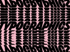
“The State of Print’s black and magenta scenography is a meta intersection between print and digital” reports Irdina Aisyah for the Straits Times. “The State of Print exhibition is perfect for taking Instagram photos and filming TikTok videos. And by using a filter on Instagram specially designed for the exhibition, illustrations of typography tools such as typewriters will pop up and float around on visitors' phone screens. This filter can be accessed only by those who are at the exhibition and is one of many interactive features designed to draw attention to paper as a medium” she notes.
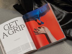
Showcasing local and international projects the team partnered with local bookstore Basheer Graphic Books, Slanted Publishers, and North East to display specially curated books and independent magazines.
First launched back in 2020, SOP evolved to “highlight that the digital realm cannot give you that kind of (tactile) experience, something that is tangible” per Jiahui Tan, 33, curator of the exhibition and founder and creative director of Fable.
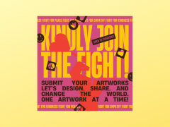
In this second installment of this ongoing adventure, visitors will physically browse the winning works of D&AD Awards, check out the printing heritage of yesterday's Singapore with letterpress studio TypesettingSG, Kin Yiap Press and RJ Paper , explore its challenging future, flip through the contributed posters of more than 40 posters from designers of more than 30 countries as they reacted to the theme of “Is Print Dead?” and more.
To accompany the exhibition, the team collaborated with Jesvin Yeo of Designing Cultures Studio for a limited edition book set in custom typography, A Collection of Singapore’s Fading Traditional Trades and Crafts.
“When we talk about books today, the younger generation will immediately think of e-books, while the older generation will immediately recall machine-made books with perfect bind. Both are correct; both are mass-produced and positively impact the dissemination of knowledge and improved literacy rate. It is this rapid production that allows us to access and obtain information easily. However, the appearance of books has become so similar that one book differs from another only in its content. But in fact, book design, especially physical book design, contains far more components than its content” explains Yeo. ⠀
⠀
“The design of a physical book consists of many factors, which combine to provide readers with a reading experience. Book design is to design a system so that readers can easily navigate through the book. Different systems work for different types of books, and each system has its own functions. For example, a sequential novel will guide readers to read linearly. In contrast, readers adopt a non-linear reading mode for factual or theoretical books and refer to contents page and chapters to get the information they need. On the other hand, artists use books as a medium to present a concept. Uniqueness is usually associated with the artist’s books because they are one-of-the-kind and handmade. Therefore, compared with theory books, such books are more fun to read. The question is, how can we designers make ‘boring’ content more attractive and fun to read?”
The book comes with a limited-edition promotional poster and you can buy it here.
With a variety of contributors (Approx Type, Blok Design, CoType Foundry, Counter-Print, Death of Typography, Kyiv Type Foundry, magCulture, Non Foundry, Studio Feixen, The Brand Identity to name a few) the State Of Print is free for public viewing until July 31 from 9am to 9pm daily at the National Design Centre in Middle Road, Singapore.
Tags/ books, exhibition, posters, magazines, slanted, print, fable studio, signapore

