Want: Experimental Jetset’s typographic apparel we desire
Back in November 2020, Experimental Jetset created a compact graphic language for the then newly-formed Amsterdam-based independent online radio Echobox.
Two years later, the typographic identity -“capsule language” might be an apt description notes Experimental Jetset- has been printed on a Patta X Echobox T-shirt, available via the radio station’s website with all proceeds to go toward the radio station.
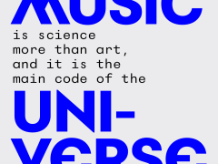
The Patta x Echobox T-Shirt features a Patta Script Logo on the front and the back is adorned with Experimental Jetset’s visual identity — a design that revolves around the typeface Gramatika “with some suggestions for the cutting-up of images” explains Experimental Jetset.
“In late 2018 I was asked to design a custom typeface for Experimental Jetset’s new visual identity of V-A-C Foundation (Moscow/Venice). A paradoxical assignment — to make a new typeface for the design studio, which by popular belief always uses the same one” notes Gornitsky of the modernist sans serif font that was designed by him and in close collaboration with Experimental Jetset and the V-A-C Foundation design team. Gramatika’s Typesetting Manual is available to download in PDF format here.
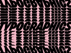
“While designing it, we were mostly thinking about notions such as radio waves and distortion. The record sleeve of Doe Maar’s classic 1981 album ‘Skunk’ might have been a slight inspiration as well” adds the small, independent, Amsterdam-based graphic design studio that was founded in 1997 by (and still consisting of) Marieke Stolk, Erwin Brinkers, and Danny van den Dungen.
“We’re working on a much bigger (and top-secret) project for Patta right NOW – which will be revealed in October. So stay tuned for that” announced Experimental Jetset via Instagram so watch this space.
The Patta X Echobox limited-edition T-shirt is is not the only apparel with Experimental Jetset design on it we drool over.
Back in 1999 Experimental Jetset printed a bold ‘Anti’ for the Japanese T-shirt label 2K/Gingham –a design originally printed on a tee, but also found its way on some hoodies and crewneck sweaters is a beauty.
“We intended ‘Anti’ to function as an abstracted slogan, or as an archetypical protest shirt, turning the wearer into a walking disclaimer. Pure Hegelian negation for the people – something like that” explained Experimental Jetset.
Last but not least is a series of three tees the studio created for Paradiso that revolved around the theme of poster culture.
The tees were screen printed by Superette (Amsterdam), with water-based ink on organic fair-trade Stanley/Stella shirts. Do keep them coming!
Tags/ typography, typeface, branding, experimental jetset, apparel


