Studio Oker X Norsk Etikett: a visual identity unfolds
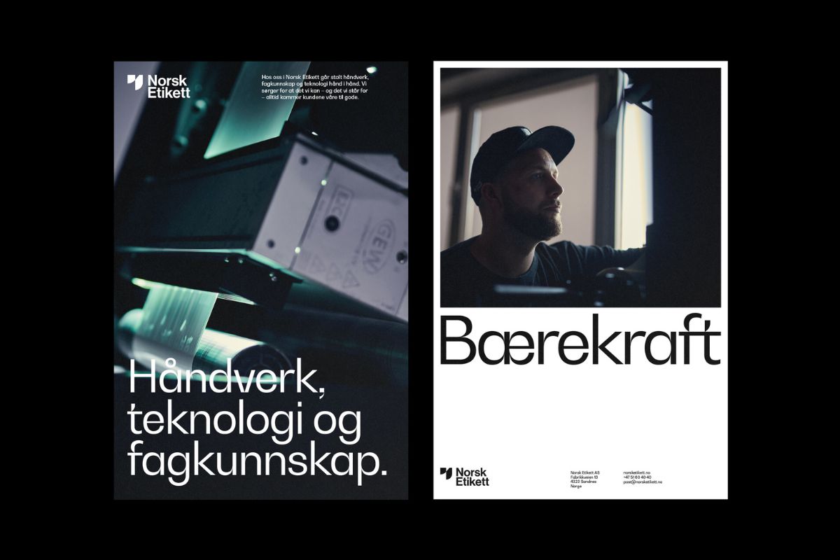
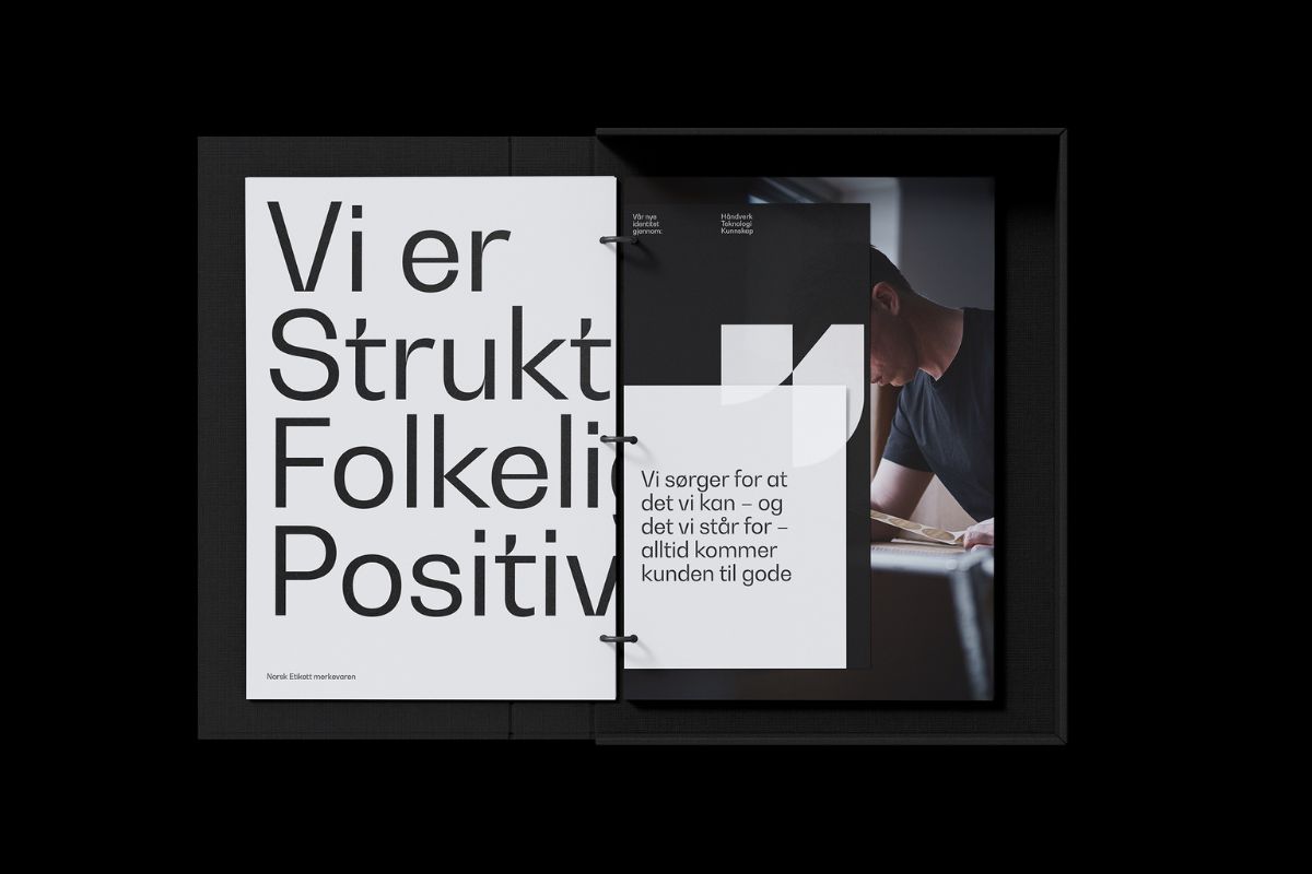
Norsk Etikett aka Norway’s leading supplier of self-adhesive labels wanted “a new visual identity and a website that reflected their position as a specialist printer with an ambition to remain at the top of their business” notes Studio Oker of its latest project that delivered a brand new visual code for the family-owned company.
“They needed a visual expression that underscored their shared dedication to their craft and customers. In close collaboration with the client, a new brand platform was developed. It underlines the importance of sustainability, active social inclusion, gender equality, and workers’ rights.”
To visualize the craftsmanship of making high-quality labels Studio Oker “documented the intricate production process closely through a series of snippets and images.”
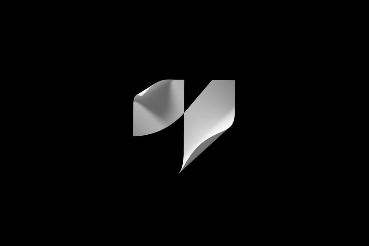
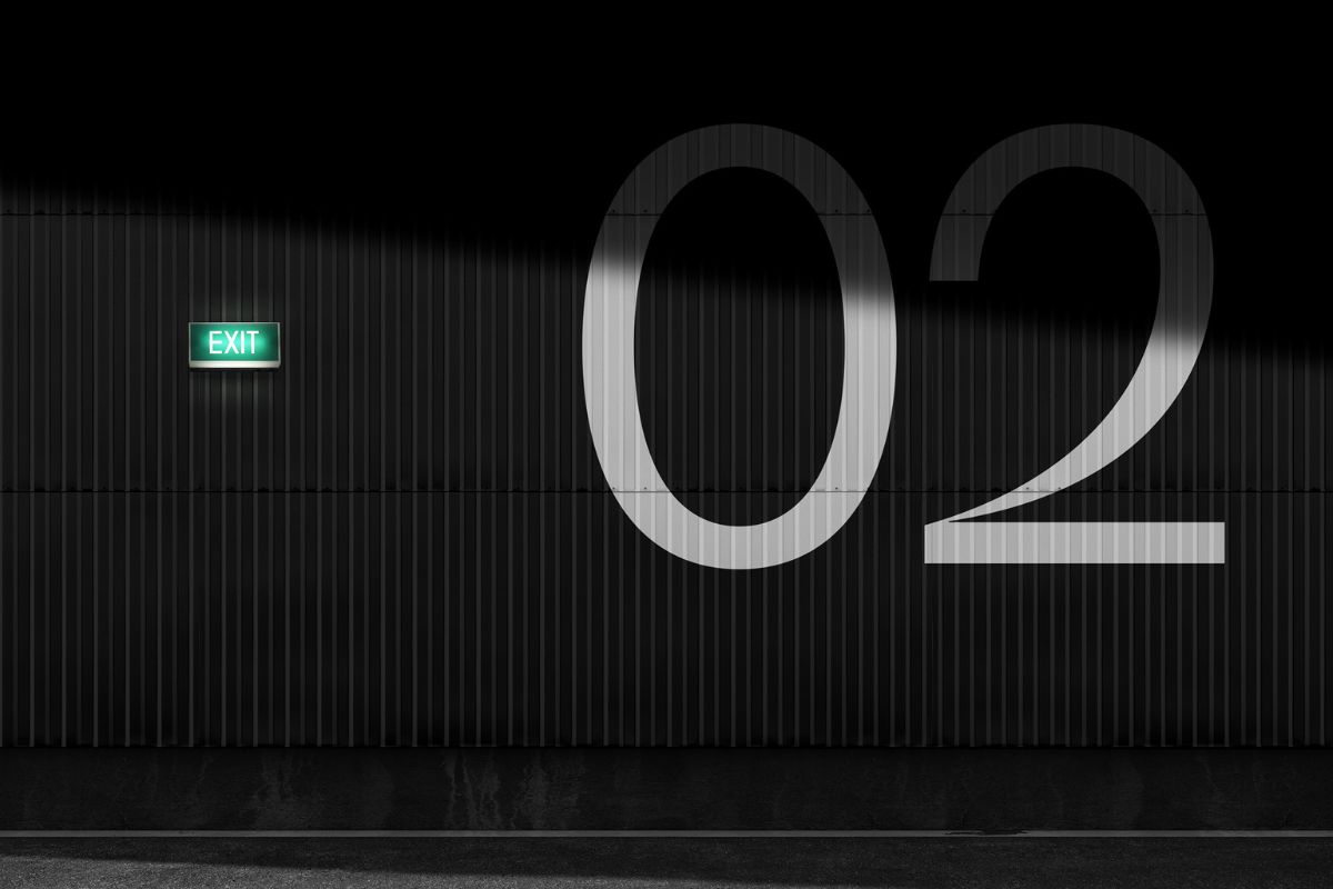
“The visual identity has a timeless expression that draws inspiration from labels in motion –being printed, cut, or pasted on a product” adds Studio Oker.
Grotesk beauty: Shaz Madani Studio X Typology
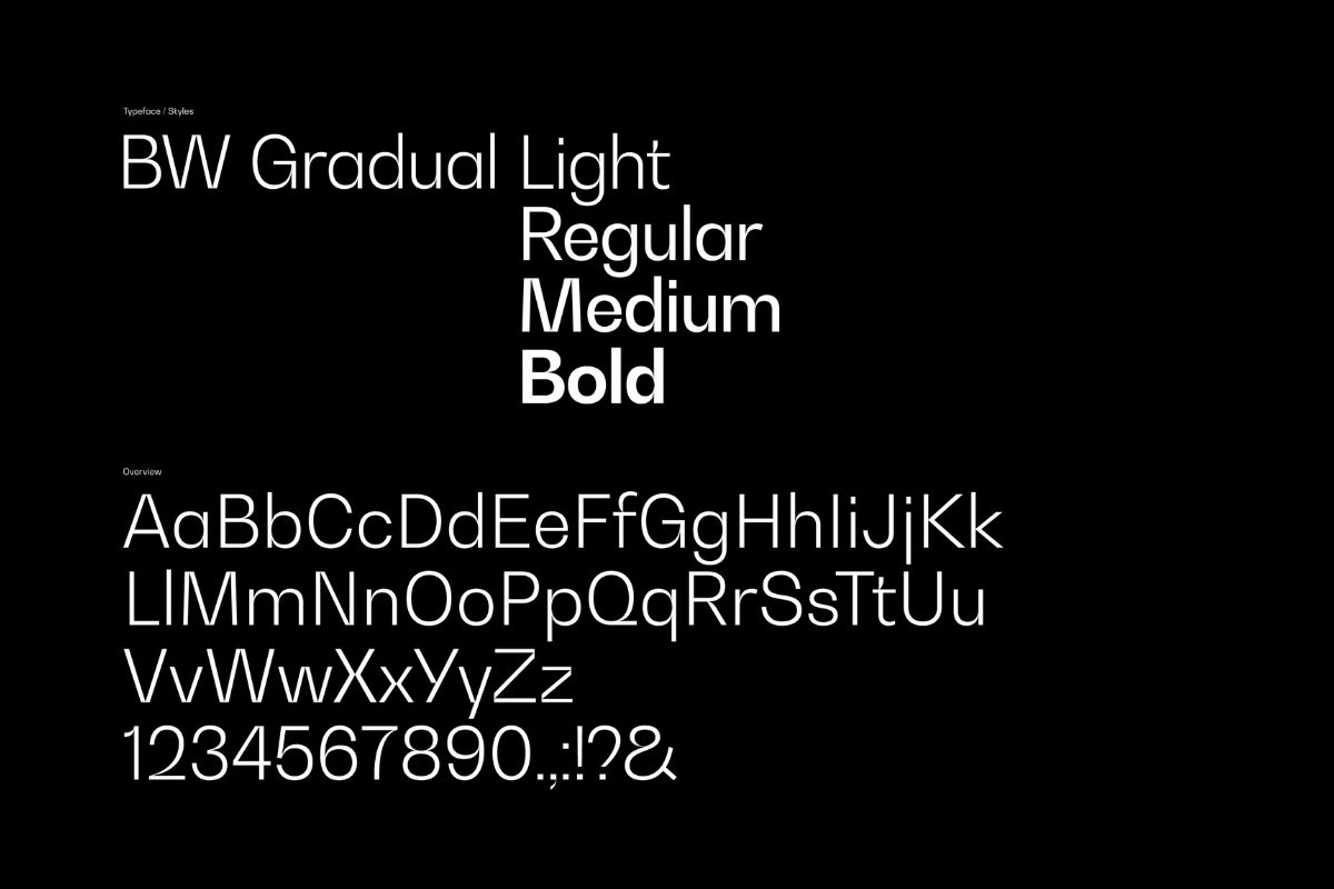
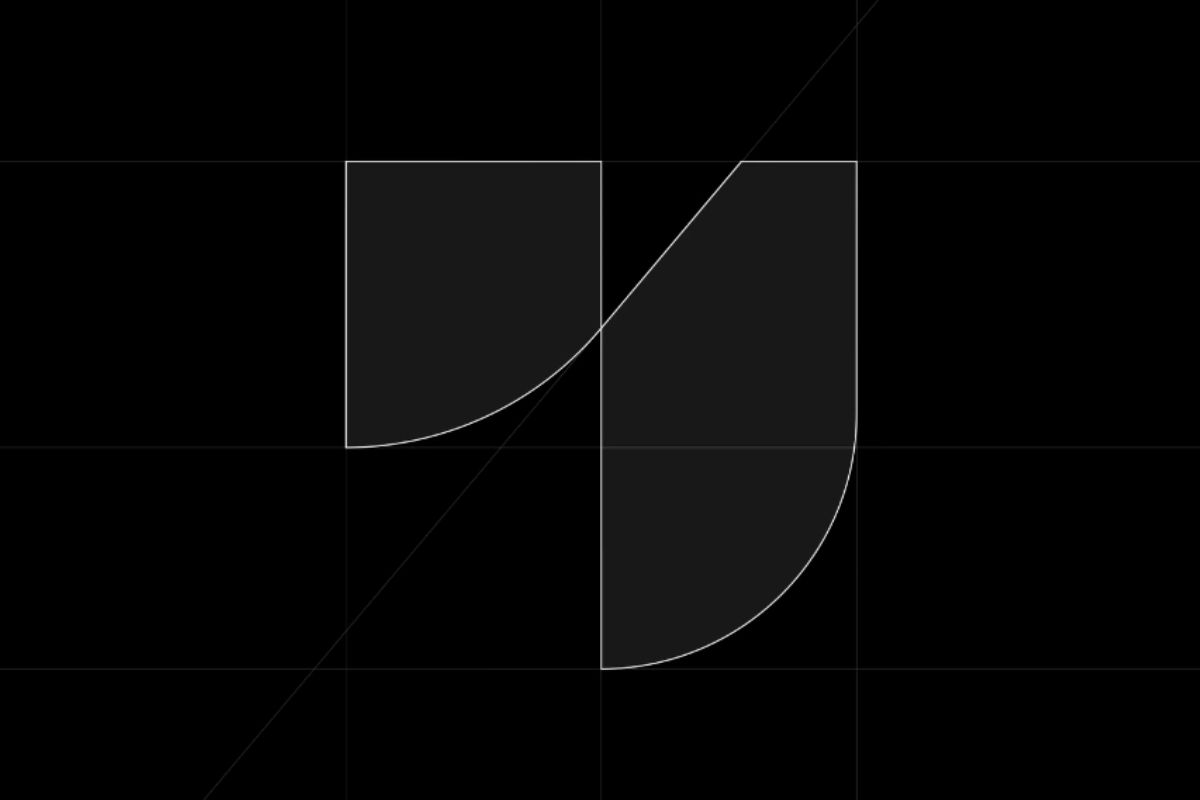
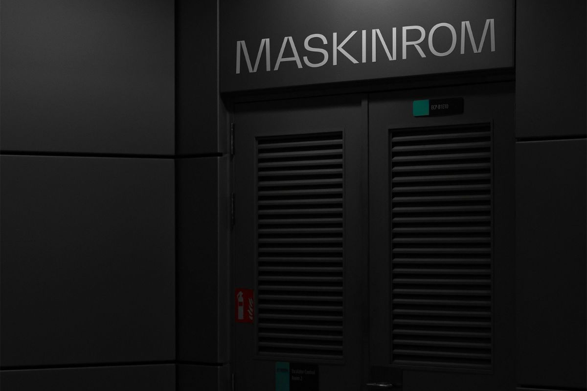
“Both the logo symbol and the selected font, Bw Gradual, show contrasting soft and hard elements, giving the visual identity its distinctive character.”
Faithful to the approach Studio Oker designed the company’s new website that “uses a strict grid and subtle layered details to enhance the qualities of the visual identity. It highlights Norsk Etikett’s people, skills, and core product: the label.”
Established in 2018 in Stavanger, Norway, Studio Oker works with a diverse selection of clients, from start-ups to established companies. “Our clients believe in the power of branding and design. Our clients also want to make an impact – to do better, be better and help install a brighter future for the people around them” notes the team.
Explore more nordic design by Studio Oker here.
Tags/ typography, visual identity, branding, website, nordic, studio oker
