Typography First: From Switzerland to California, Dafi Kühne’s Typographic Printing Program explores letterpress to its limits
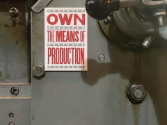
Typographic Printing Program aka Dafi Kühne’s intense design program focusing on typography and letterpress printing initiated and based on the work of the awarded Swiss poster designer and letterpress printer.
Structured in two one-week sessions in Näfels, Switzerland, and Pasadena, CA (in collaboration with Hoffmitz Milken Center for Typography), its goal is to experiment with progressive typography combined with traditional analog tools.
“All experiments and layout exercises will be realized with traditional letterpress printing presses and physical type. Through this very slow but accurate analog process, the participants will learn to put emphasis on concept and micro typography, while exploring new approaches with old technology” notes Kühne, one of the few internationally successful contemporary letterpress poster designers who has organized several workshops at his studio for different schools and university classes in the past nine years.
Typographic Summer Program: a diary of inspiration follows
Dafi Kühne is a poster designer, letterpress printer and design educator. He studied Visual Communications at Zurich University of Arts and holds a Master of Research in Typeface Design from the University of Reading, UK. Since 2009 Dafi Kühne has built up his unique studio and workshop “babyinktwice” in Näfels, straight in the Swiss Alps.
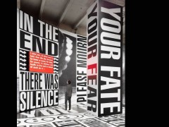
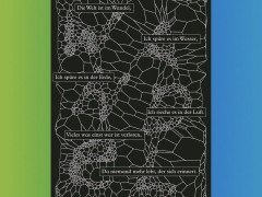
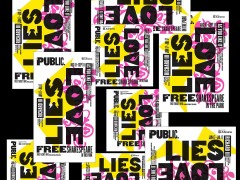
In his work, he specializes in typographic posters for music, art, architecture, theatre, and film projects. Every project he produces gets processed through at least one of his number of printing presses from the 1960s.
Dafi’s posters can be found in different collections in Switzerland and the USA, have been awarded multiple times by the Society of Typographic Arts in Chicago, The Type Directors Club NY and Tokyo and 100 Beste Plakate, and have been shown in many international publications on graphic design and letterpress printing.
Besides his working practice, Dafi has been giving lectures in Europe and the USA and teaching short seminars and full semesters at different universities in Switzerland, Germany and the USA. His educational video series “The Dafi Kühne Printing Show™” has been awarded with a Tokyo TDC award as well as a Swiss Design Award in 2020.
A multitasker and a designer, Kühne is giving also a lecture and a workshop as part of Tipoteca Italiana’s Think&Type sessions.
In his talk “No romantic fetishism. True contemporary design meets traditional printing technology” Kühne will talk about his approach to using old technology and combining it with contemporary graphic design, sharing insights on his processes and conceptual approach and he will explore the potential of using chipboard to make printing forms for letterpress printing in his one-day workshop “Chipboard Experiments.”
Back to his Typographic Printing Program, this is the TPP’s Manifesto.
1. Analog vs. Digital
At Typographic Printing Program, we focus on new typographic approaches while working with old processes. While fully embracing the quality of analog design and production processes, the program never neglects digital processes and tools. Our post-digital approach means that our practice is never “analog vs. digital”—but always “analog and digital.”
2. Typography First
Letterpress printing itself is not a design concept. Therefore, bad design concepts and typography don't improve just because they are printed with labor-intensive manual techniques. This is why we focus intensely on the concepts and details of typography and design before undertaking any physical production. Our goal is to give participants a visual repertoire to help create ideas and work out profiled typographic solutions.
3. Breaking the Rules
Only those who know the rules can understand when they are breaking them—and how to break them. We actively study the rules of typography and “good” printing, visual hierarchies, grids, proportions, printed forms, and white space—then we can reinterpret and break these rules. Typography can be meticulous and precise in some details, yet simultaneously wild and chaotic in other aspects; we welcome it all.
4. De-Romanticizing Print
Typographic Printing Program critically reflects the history of traditional letterpress-printed typography while eschewing the romanticism often evoked by artists using conventional tools. Letterpress printing has shaped our typographic system for more than 500 years; we want to activate that history, modernize it, and make it accessible and attractive to contemporary-thinking designers. Only by experimenting and combining it with modern tools, processes, and progressive conceptualization can we fully bring this old technology to the 21st century and preserve it for the future.
5. Semantics vs. Style
The semantic connections between typographic forms and content are essential to good typography. We don't think in boxes called style, but in typographic colors, smells, sounds, rhythms, volume, tastes, thoughts, and their links to the content. Rather than applying and reapplying given styles and repeating visual ideas, we want to develop sensual connections between content and form and push the quality of printed communication.
6. Research Lab
The program is a typographic research lab. We focus on experimental typography and poster design concepts. Only by pushing boundaries in a safe institutional environment (with fictional tasks) can we re-set the future limits of commercial design projects. New interpretations of old printing technology happen by exploring legibility and expressive typography while creating a playful connection between content and forms. In this way, we can actively examine the future of typographic poster design and letterpress printing.
7. Typographic Posters
Poster design is the ultimate discipline of visual reduction. One loud message visualizing one concept must be enough to capture the attention of viewers. Within the broad field of poster design itself, we choose to work with typography, limiting the use of type and type-related forms to communicate a message. Within these restrictions, we see the challenge to explore the essence of graphic communication, applicable to any visual design field.
8. Equity, Diversity and Inclusion
Typographic Printing Program offers a diverse, equitable, and inclusive learning environment that involves participants from different countries and backgrounds from all around the globe. Our Switzerland sessions from 2016–2021 had participants from twenty countries and five continents, with professional backgrounds ranging from young graphic design students at the start of their career, to very experienced university-level instructors. For each session, we select a diverse group from letters of motivation and CVs—never portfolios. Participants at any level are welcome as long as they are motivated to work intensely and open to new approaches.
Typographic Printing Program is committed to respecting all gender identities, ages, ethnicities, and nationalities. All exercises and theory materials suit every level of experience. We support each other and finish workdays together. While we critically analyze and discuss the output of our work sessions and encourage everyone to engage in rich group discussions, we do not accept any disrespectful behavior; we are committed to providing an environment free of judgment.
As noted “very few spots are available for session III and session IV in Switzerland, but stay tuned as dates for January 2023 in Pasadena are to be published soon” he notes. More here.
Tags/ typography, workshop, printing, letterpress, swiss, poster, tdc, lecture, dafi kühne, tdc tokyo, tipoteca italiana

