Typographics 2022: the talks
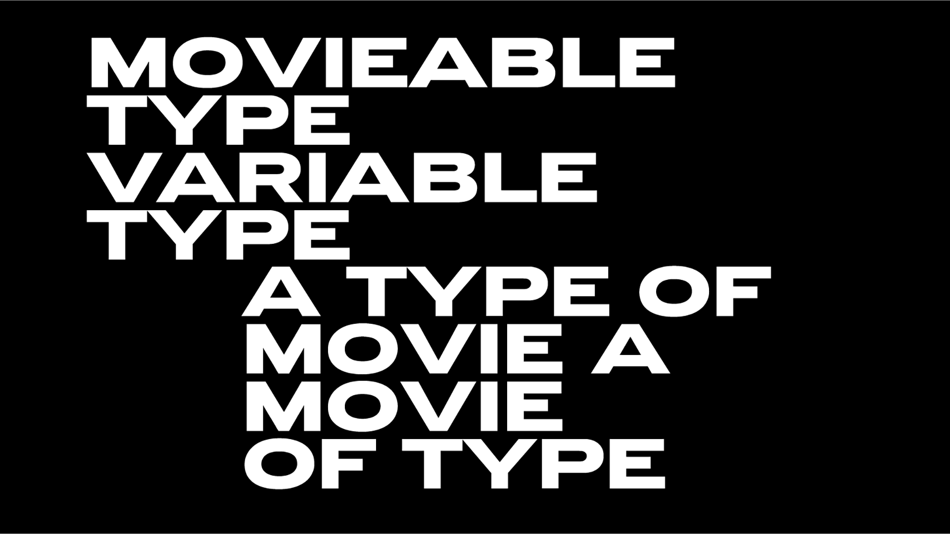
For two days this June, Typographics returns with a massive focus on the contemporary use of type. With its conference series featuring speakers from around the world at its core, the Typographics festival takes place June 17–18 at Cooper Union in New York City for all things type.
The main Typographics conference features an international line-up of designers, with presentations about type and its use in graphic design, web design, publication design, book design, packaging, branding, corporate identities, advertising, motion graphics, and more.
Here we highlight the talks and the people who aim to share insights and knowledge in this creative fest made of letterforms and the people who make them.
-
Faber Stories with Donna Payne
In her talk, Donna Payne, creative director at Faber & Faber discusses how a strong design heritage has influenced contemporary typography at one of the world’s great independent publishing houses.
-
Fonts by Proxy with Abbot Miller
In the realm of visual identity, typography plays an outsized role in expressing a sense of time, place, and culture. This talk considers the expressive and functional dimensions of type, viewing typography as a kind of proxy for the organizations it represents. Illustrated with recent identity, exhibition and environmental graphic projects, Abbott Miller, designer, writer and partner at Pentagram, presents the case for graphic designers as performers who are inspired by the charisma of letterforms.
-
Liberated Pages from Segregated Spaces with Colette Gaiteralk
Connecting specific characteristics of Black liberation’s typographic language for a century and a half illuminates aesthetic, technical, and ideological threads that persist from abolition to #BlackLivesMatter.
Typographic aesthetics in Black publications and activist ephemera were always “designed for liberation.” Starting with the first U.S. Black abolitionist newspaper, “Freedom’s Journal” through a range of Black liberation publications and a closer look at “The Black Panther” newspaper Colette Gaiter, a Professor in the Departments of Africana Studies and Art & Design at the University of Delaware, explores the printed ephemera that revolutionized Black liberation’s visuals and narratives.
-
Kinetic Visual Identity with Rosie Garschina
A look into visual identities that utilize kinetic type systems to resonate and breakthrough. Rosie Garschina, a multi-disciplinary creative director with a 15-year tenure working in brand experience, explores the process behind building brands that utilize signature behaviors as a foundational element. She shows how creative tools can activate brands to embody a unique and memorable personality. Case studies include the recent transformation of Paramount’s BET, the launch of streaming service AMC+, the refresh of Paramount’s TeenNick, and a newly minted kinetic identity for Sesame Street.
-
Asterisk as Troublemaker with Mindu Seu
The asterisk has many lives. From its earliest appearance in Sumerian pictographs 5000 years ago to its current use in editing typos, the function of this “little star” has shifted: to add, to censor, to emphasize. In doing so, it has become a cry for complexity, a provocation that more context is better than less. This talk originated from the asterisk research done by Mindy Seu and Laura Coombs for the “more*” workshop at Southland Institute, as well as Seu and Coomb’s forthcoming visual essay in Meg Miller’s textual essay on the Gender Star for Source Type.
Mindy Seu is a designer and researcher.
-
Graphic Design is Easy with Yotam Hadar
In his talk Yotam Hadar, a graphic designer, typographer and educator, interested in the potential of subtle gestures to create meaning and impact attempts to articulate a design process that rejects overthinking and embraces obvious, lazy, and reductive ideas. It stems from the belief that there might be unique clarity in the first idea that comes to mind in a given situation. Situation=inspiration, Context=content.
-
Photographic Typographic Memory with Shivani Parasnis
Shivani Parasnis, a typographer and graphic designer from Mumbai, India, currently based out of Baltimore, USA explores the idea of type serving as a means of finding joy in designing everyday things, reconnecting with your roots, building a community, and most importantly, having fun. Through a series of personal and commercial imagery, Shivani presents her diary of thoughts + designs (good & bad, new and old) to share how typography has shaped her practice as a designer through the years.
-
From Candies to Caviar, How a Font can Extend its Reach to the Far Corners of a Brand with Matteo Bologna & Sean O’Connor
The newest epicurean destination in Manhattan’s Seaport is a sprawling array of restaurants, markets, and shops called Tin Building by Jean-Georges. As part of the brand development, Mucca produced a custom variable typeface to connect a leviathan array of applications. With letterforms as narrow as a ship’s mast or as wide as a sailor’s swagger, the font defines a design system as monumental as its world-famous chef. Matteo Bologna is the founder and creative director of the branding studio Mucca.
Sean O’Connor is a graphic designer, lettering artist, and typographer who combines an obsession with the minutia of letterforms with a big-picture approach to brand design.
-
Book Report Footnoted with Lorraine Wild
A look at three different books designed by Green Dragon Office (and published in the pandemic) that reflect this design office’s obsessions with history, genre and narrative structure. Lorraine Wild is a graphic designer in Los Angeles. Her design firm, Green Dragon Office, focuses on collaborative work with artists, architects, curators, editors and publishers.
-
Make It with Pablo Delcan
For Pablo Delcan, a designer from Spain, design is about transformation. “I learned this growing up in a house that was also used as a ceramic workshop; you are given a chunk of mud and what you do with it, out of an infinite amount of possibilities, is up to you. This talk is about finding your voice through that process of turning something inside out. Whether you are designing book covers, posters, animations, flower vases, or kites – each piece is a process of transformation that invites you to be absurd, bad, messy, and, most importantly, fun. Designing can be an awfully tedious job if you don’t find a way of letting the process guide the way.”
-
The Living Forest with Vanessa Zúñiga Tinizaray
A typographic specimen dedicated to Nunkui, the powerful spirit of the land. In Vanessa Zúñiga Tinizaray’s talk, we travel through the living territories of the Ecuadorian Amazonian forest. “We will observe the worldview and ceremonies of the Shuar nationality, their coexistence of respect and reciprocity with nature, and acts that reaffirm the connection of the inhabitants of the forest (visible or invisible) with the land, and their struggle to defend the future of humanity” notes Tinizaray, an Ecuadorian designer focused on semiotic research and morphological exploration of the visual signs of the native cultures that inhabited and inhabit Latin America.
-
Beneath the Code: Generative Typography with Lynne Yun
The field of typography is delving into a new realm: generative design. Propelled by recent developments in programming libraries that make coding approachable for creatives and newcomers, typography is becoming kinetic, malleable, and interactive. In this 20-minute talk, Lynne Yun, a type designer and educator, explores the exciting possibilities of generative typography.
-
Meeting the Moment with Type Education with Juan Villanueva
Type design is no longer an obscure art only practiced by European type designers from the 15th century. Today, in theory, anyone with internet access can level up their type and design skills. However, the reality is that there are still many obstacles in the way of getting a quality type education. This talk covers ways to get over those hurdles, customize your type education, and level up your type skills. Juan Villanueva is a Peruvian typeface designer, letterer, and educator as well as a Sr. Type Designer at Monotype and the lead instructor of Type West Online.
-
A of Another Language with Somnath Bhatt
‘A of another language’ is a reading/talk in two parts by designer, artist, and writer Somnath Bhatt. It traces structures of making in his design process and charts how meaning erupts across language, form, and time.
-
Why the Font Not? with Jesse Reed
Why Order decided to start a type foundry, the lessons learned from Standards Manual, and their consistent point of view of brand systems to retail fonts (with some thoughts on why you should start a foundry of your own). All explained by Jesse Reed aka the managing partner of Order, co-founder of Standards Manual and Order Type Foundry.
Typographic 2022 also features talks by designer and creative director Anthony Bryant, art director, designer, writer and editor in chief of Art of the Title Lola Landekić and Chicago-based graphic designer and artist Crystal Zapata.
For updates and announcements, join the Typographics mailing list and follow @TypographicsNYC on Twitter.
Registration for the main Typographics 2022 conference is now open, with options to attend both in-person and virtually online.
Be part of Typographics 2022 here.
Tags/ typography, conference, type design, typographics, cooper union


