Typemedia 2021: time to welcome KABK’s aspiring young type designers
Type and Media is a full-time one-year master program in type design at the Royal Academy of Art in The Hague (KABK), NL.
The first semester familiarizes the students with shaping letters in various media, from stone carving and calligraphy to vector graphics and code. In the second semester, students design and develop their own typeface project.
While Type and Media’s current students are hard at work finishing their projects, last year’s graduates showcase their portfolios.
Inspired by the lettering of old cars, mushrooms, horror & more, these typefaces prove that inspiration comes in all shapes and sizes as long as you are willing to perceive the limitlessness of type design.
So let’s all welcome the aspiring young creatives that aim to explore typography’s many virtues.
-
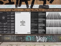
Anguilla by Gajana Aslanjan
“Anguilla is a text to display typeface that embraces the movements of the hand and the tool in combination with the pre-defined structure of the glyphs. This typeface family consists of a regular text, bold, and a display style. They originated from the research on the movement of flat nib writing tools and the search for the tension between static and dynamic.”
-
Chop by Stef Pauwels
“Could extrapolation be a new sketching method, a tool to create unexpected shapes and systems? Chop is a typeface family designed by Stef Pauwels during Type and Media. It is the result of a semester-long experiment with extrapolated letterforms, coming to its full glory in the display style. A strong rhythm of enclosed shapes is being directed with cuts, to transform an almost abstract shape into a letter. The text styles find their strength in a completely different area. Inspired by the same creation methods, they form a steady rhythm to accompany the display in text usage.”
-
Erebus by Oleksandr Parkhomovskyy
“Erebus was inspired by the mystery, horror and suspense genre, but grew to be used in versatile environments. The Display styles are variable, and while losing weight, they also lose the serifs. The Black weight pays homage to the aesthetic of the 70s-era horror and mystery genre with low contrast and small (but not insignificant) serifs, at the same time adding liveliness with italic shapes. Smooth animation between Sans and Serif was important, and so the little serifs turn into chunky stems in the Bold weight, giving it a chiseled appearance, taking many cues from my stone carving lessons. The Narrow Sans takes cues from the Black Serif, with upright Italic shapes and serif-like elements. It’s supposed to have some weight, but since with additional weight comes additional width, the weight is added on the horizontals. It is not a true reversed contrast, the horizontals are emphasized only when needed. To be able to set it with tight leading (e.g. for posters), the extenders are very short. The variable Shatter Axis provides a useful effect for animations and layouts. The workhorse Text (Regular and Italic) styles complete the system.”
-
Furya by Léna Le Pommelet
“Furya is a variable font inspired by the lettering on old cars from the 50s and the Civilité calligraphy model. It contains one axis that affects several parameters at once. Going from 45 to -45 degrees, it is designed with three sources that have several differences in weight, slant, and construction. This variable font is set on a ‘speedometer axis’ and it goes from a bold and back slanted style to an upright lighter style in the middle, and ends up with a slanted and bold style. The speedometer makes every parameter - weight, slant, and construction - change simultaneously.”
-
Mobius by Tanguy Vanlaeys
“Mobius typeface covers basic editorial design needs. After experimenting a wide range of tools, the project started with a basic question in typography. How do you translate/interpret an analog operation - in this case, the rotation of a flat tip - into a digital one? The process was infinite and generated an array of shapes from a Sans to a Display Serif. Finally, through a drawing methodology based on the phenomenon of overlap in calligraphy, the project puts forward a Text Serif that attempts to crystallize a tension between a calligraphic gesture and mechanical construction. An eventually good learning process.”
-
Myzel by Lukas Horn
“This typeface is based on the growing of mushrooms. Or could be based on it. Or on the ocean waves. Or the breathing-in and breathing-out, or lightning of flashing glibber falling from heaven. But maybe it is just something you can move and play with. Letters you can tickle. Maybe the face has two styles: a mild one and a wild one. A mild one for the cautious people, for the cautious use, a wild one that could be used by the brave ones of us. One style to be sure of it all, but a second one that never predicts. That conquers and challenges. It could sink in into our technology – the stylesheets and the browsers we all use – to breathe freely and to live on its own. But that you can play with it and have fun. Like a Mycelium network, that comes out for the game when it rains, to soak in the moist air, to show itself in the wildest forms and shapes that you could imagine, with a unique smell and glory colors.”
-
Peleton by Edward Dżułaj
“Peleton is a typeface supporting Latin and Cyrillic scripts. During my studies at TypeMedia, a Warsaw-based artist, Mateusz Kubiak asked me to design a booklet for his illustrations. I thought it would be a good idea to design a typeface related to his drawings. The typeface has sharp, crispy tension in the line structure. Peleton was designed with an idea for editorial design and display purposes.”
Postgothic by Sander Pedersen
“Postgothic extracts elements and ideas from blackletter into a collection of hybrid typefaces. Sans combines two historical references: the use of roman capitals with blackletter lowercase, and the modernist rationalization of letterforms. The monolinear uppercase is based on geometric shapes, while the lowercase is a blackletter simplified to having no curves or thin strokes. Serif mixes in gothic qualities in a roman text face: broken, angular curves, narrow proportions, sharp details, serifs based on texture terminals, an even rhythm between stems, and dark color of the text. Compressed is built from modular shapes based on a grid, echoing the monotonous black-and-white rhythm of compact blackletter calligraphy. The horizontal strokes are the same weight as the verticals, making them optically slightly thicker. The collection is not intended to be a conventional type family, although the different styles can be set to work together.”
-
Siche by Caterina Santullo
“Siche is a wedge-serif typeface system in which calligraphic conventions and details meet in a rigid and mechanical flavor. The project started as a vast study on abstraction, sizes, and gestures, which influenced it at its roots. The Acuto (‘acute’) Condensed Display for posters, borrows energy, light, and spikiness from all the geometrical discoveries made by observing typefaces in very small sizes. It is followed by a text group, Tronco (‘blunt’), of Regular, Black, and Italic Regular, which explores more the vibrations of blunted solids. Siche’s nomadic and whirlwind background pushes each letter to be greedy and play how much they can with unconventional details. Styles are stealing features from each other. It’s a cheeky and fierce typeface that asks for somebody to play with it. Siche finds its maximum expression in Disgraziato (‘miserable’), a compressed light display typeface, which, grotesquely, abuses unorthodox solutions in the treatment of thicknesses and contrast.”
-
Surround by Ivo Brouwer
“Surround is a chromatic typeface system made for playful typesetting. It consists of 5 unique styles, that can be used both individually and superimposed. Possibilities multiply by varying what style, order and amount of layers you use. For full potential, it is powered by a series of Drawbot scripts. They allow rhythmic typesetting by alternating styles and amounts within sentences or even words. It is tailored especially for analog overprinting printing techniques like Risograph and Stencil.”
Zalfia by Neva Zidić
“Zalfia is a type family inspired by writing and experimenting with a flat brush. The idea was to explore and visualise contrasting personalities and implement their characteristics into letterforms, achieving a range of feelings and emotions that are different, but come from the same tool and belong together. Zalfia has five styles: two opposing displays that keep the cursive construction elements and three text styles, intended to better function in smaller sizes. It offers a group of versatile styles that work well together, but can also be used in different environments and applications. Zalfia was awarded The Certificate of Typographic Excellence from Type Directors Club.”
-
Explore the stories and the process behind the brand new eleven typefacescreated by the KABK’s Class of 2021 here.
Tags/ typography, typefaces, hague, graduates, typedesign, typemedia, kabk

