Design Week Awards 2022: 10 highlights from this year’s shortlist
Design Week has announced its full Awards shortlist.
“Having already undertaken a major overhaul of categories to make them as relevant to your work as possible, this year we adding the Design, Climate, Action award, recognizing work that is making a tangible difference to the health of the planet” said the team.
Featuring its largest-ever panel of independent judges DWA22 aims to promote “design excellence across the entire spectrum of the design industry.”
Here, Typeroom presents you with ten projects that caught our attention be it for their execution, concept, or both.
With judging underway, the 2022 Winners Showcase is to be revealed later this month on the site.
Guardian 200 Years, a Work in Progress, by Oliver, for The Guardian
“The Guardian wanted its in-house team to help launch a new brand campaign, one that highlighted the media brand’s rich progressive history. The Guardian’s 200th birthday was approaching, and the media brand wanted to use this milestone to celebrate its heritage while also looking to the future. The Guardian also wanted to deepen its relationship with existing readers, bring in a new cohort and grow reader revenue.”
“As the Guardian is a news media brand, it wanted to make copy the beating heart of the campaign and power the omni–channel approach used for its messaging. The press, display, social channels, podcasts, film, emails, and DM all had dedicated copy-led executions, crafted to be as bold and provocative as possible. For the art direction, the in-house team delved into archives to rediscover some of The Guardian’s history. This rich vein of lore was used as a reference for typography and design, which has defined the look of the media brand since its founding.”
Fight For Home, by Superunion, for Shelter
“Inspired by the spirit of activism on which the charity was founded in the 1960s, our new brand identity and strapline ‘Home is Everything’ is designed to positively disrupt and represent the fearless and unstoppable determination of Shelter to fight for everyone's right to a safe home. Using the visual language of protest, the logo - visualized by a red arrow and created from red brush strokes - combines the iconic shape of a roof with a positive upwards arrow: an urgent symbol that invites participation and demands change.”
“With this new brand and campaign, Shelter is calling on the public to join its Fight For Home and stand up against the injustice in Britain's housing system. The idea behind the work is to move away from generic charity advertising tropes and to instill a sense of urgency and fight. The campaign's rallying cry, 'Fight for Home', aims to cut through the apathy and get people to come together to fight for a solution. The brand was launched alongside the ‘Fight for Home’ campaign, developed by Independent creative agency Who Wot Why, that centers on a film showing real people impacted by the housing emergency voicing their stories.”
LogoArchive pLAy, by Studio Suther&, for LogoArchive
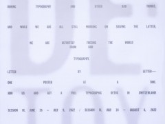
“LogoArchive launches its most pLAyfuL issue to date. Designed by Jim Sutherland, Studio Sutherl&, and featuring a story by poet and creative Director Tom Sharp, this latest LogoArchive Extra Issue presents an enquiry into work and play, and offers a new way to look at old things. Using a unique perforated grid the LogoArchive booklet becomes an involving series of games that seek to evoke in the reader aspects or work (regulated and goal-orientated) and play (intuitive and self-directed). This zine is designed to be deconstructed and played with. If you have an aversion to tearing up print, please get two copies.”
Greene King Modern Beers, by Design Bridge, for Greene King
“As one of the oldest independent breweries in the UK, Greene King wanted to showcase their brewing expertise to a more diverse audience by twisting and adapting traditional flavor profiles and channeling some of Britain’s folklore to create authentic, modern, and exciting beverages. Each of the four beers pays homage to the legends of British history. Our London Studio used playful illustrations inspired by historic woodcuts with vibrant colour combinations and bespoke typographical personalities for each variant, accentuating the quirks of historic typefaces to give them a modern twist.”
“Since its founding, Match has pioneered a land of online dating. Their vision was a seed planted in the vast new expanse of the internet, germinating an entirely new category, opening up a world that ushered in an assortment of new platforms and, in turn, cultures. Every now and then, a brand has to empty out its bag and reorder it for its next adventure. Match was sitting on a treasure trove of experience and knowledge gained over 25 years, ready to be reassembled and reorganized for a new future.”
“By working cross-functionally with Match, the new brand strategy enabled us to amplify the experience of Match while also paving new roads for a more inclusive, ever-changing environment of dating. To feel more elegant, playful, intimate, and inviting. The technology works so the conversation can flow effortlessly forward. Match’s new features, expertise, and standard of service, allow the brand to re-emerge in the universe that they created. From hiring dating experts to new iconography and language that encourages you to be more open to a myriad of possibilities, Match supports you to focus on the good stuff: getting to know someone, well. Evolution is not about discarding the old you. It’s about reamplifying the best traits that are most yours. And it's about using design to craft symbols, stories, and new opportunities that might re-shape hearts and minds for a new future.”
“The brief to rebrand The Circle was not only to unite its audiences of community members, celebrity supporters, partners, and donors around the new focus – to end violence against women and girls and support the economic empowerment of women – but to amplify its impact and the voices behind the name. Since the dawning of time, women have come together to convene, commune, and collectively shape a shared future. And in 2008, one such gathering of women with Annie Lennox at the helm led to the creation of The Circle. From that moment, the organization has provided the space for women to come together and engage in the subtle yet mighty process of change-making – from demanding a living wage for garment workers, to providing resources for women fleeing persecution. But the world has changed since 2008, and so has the feminist movement. ‘Feminism’ is a loaded word, and the new trajectory of The Circle needed to confront the discomfort. It needed to embrace intersectionality, understand its own biases and redress the levers of power.”
“In becoming the brand incarnate of Global Feminism, The Circle’s visual and verbal identity needed to be reflective of the principles it holds: a celebration of diversity, the amplification of underrepresented voices, acknowledgment of where power lies, an expansive understanding of the implications and roles of sex and gender – and inclusion of all those who identify as women in our mission. Leading the visual identity is bold typographic statements – reflecting both the courage and the rallying cry of The Circle, as well as a custom-type setting intended to represent the amplification of women’s voices. A combination of Ayer Poster and Aktiv Grotesk gave The Circle a bold, but accessible visual voice that can be used across both campaign materials and international policy documents alike.”
“Though the brief was to create a brand for The Circle, this brand is intended to be an identity for all Global Feminism. It joins the pussy hat, the power salute, #MeToo, bare nipples and so many more as symbols of our time – icons for us all to own and adopt. To embrace and push forward much-needed change and enter a new era of equality.”
Museum of the Home by Dn&co, for Museum of the Home
“Since launching its brand identity, we’ve teamed up with the Museum of the Home once more to create a stand-out wayfinding system. Working in tandem with Wright & Wright’s new galleries and entrance by Hoxton station, we developed a considered signage system fit for the expanding Grade-I listed building while staying true to the intimacy of its domestic spaces. For the Museum of the Home, it was only right that we replicated the same sense of ease and familiarity we find in domestic spaces. We looked to the museum’s extensive collection of homewares and found our answer in enamel. From mugs and milk pans to lampshades and teapots — enamel has been a staple material in our homes for decades. It’s practical, durable, and weather-proof. Its ubiquitous influence is felt across the city too in London’s tube and street signs. But rarely seen in a museum setting, this material gave us an original, ownable design aesthetic.”
“Similarly chosen for its connection to homes, oak features as a supporting material in our signs. It matches the oak found in the interiors, producing a cohesive design language throughout. Timber battens are used as frames so the enamel plates can be changed if required. Enamel is also magnetic, which allows for temporary signs to be swiftly produced and updated across the museum. The pairing between enamel and oak allows each material to shine feeling right at home among the displays. Making vitreous enamel is a real craft and an almost alchemical process — it involves fusing glass particles to sheet metal by firing it at temperatures in excess of 800°C. Creating the distinctive color was a painstaking process, but this fresh take on the red bricks of the almshouses helps unify the hundreds of signs around the museum. Typography is screen printed and fired with a subtle raise, resulting in a tactile presence and sense of permanence. Completing the signage system is a set of bold and characterful icons that align with the museum’s brand identity, which dn&co also designed.”
Vault49 X Black Lives Matters, by Vault49
“For 6 months our co-founder, John Glasgow has spearheaded a campaign to help shine a light on the injustices and police brutality towards black men and women. He alongside a team of creatives at Vault49 have designed and hand screen printed thousands of powerful statements onto bright-colored stock and handed them out at protests. Alongside helping amplify the message at protest, we have also flypostered onto the walls and boarded up storefronts in Manhattan and Brooklyn to create as much disruption around this topic as possible.”
“This community is on a mission to help people learn about microaggressions without fear of judgment. The Micropedia aims to collect everyday microaggressions and highlight their harmful impact through source-based definitions and real-world examples. We know that our actions and the things we say matter - they have an impact on whether people feel included and respected, and they can sometimes play a role in upholding stereotypes and biases. Each of us has a responsibility to be mindful of how our words and actions impact others. This means addressing microaggressions in our everyday lives. As no two people or experiences are the same, this resource will be ever-evolving. Some may find that many different categories apply to them, and while our categories are not a comprehensive list, they do reflect some of the most common groups experiencing microaggressions. This tool and community will continue to grow in the hopes that anyone can unlearn their bias and continue their journey towards preventing them.”
Thanks in Advance, by Anyways Creative (credit to Dan Powel)
“We seem to have thousands of emails in our inboxes with more landing every minute, right? But every email lives on a physical server that constantly requires energy. Meaning our cluttered inboxes have a real-world impact. And that’s why we decided to create Thanks In Advance, a self-initiated project uncovering the collective environmental cost of our cluttered inboxes. Whilst we appreciate that the carbon cost of a single email inbox is small, the joint effort of changing our digital habits such as deleting emails could make a real change.”
Tags/ posters, campaign, branding, awards, design week, the guardian, black lives matter, sustainability, shortlist, collins

