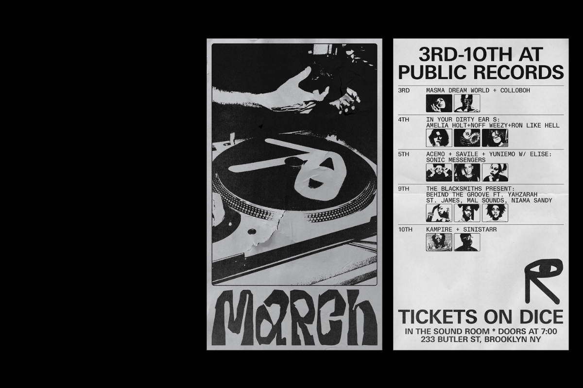
Sometimes Always X Public Records: this bold design system is heavily rooted in sharp typography
Type is the core element in one of our favorite branding projects delivered by Sometimes Always for Public Records.
A multi-faceted music and social space in Brooklyn NY, Public Records features a hi-fi record bar and restaurant, an intimate performance space, and a cafe and record store. Aiming to offer “unique experiences both in music and hospitality” Public Records collaborated with Sometimes Always for its design system, website, and communication.
“For the website, the challenge was to work on a structure and flow that would equally highlight PR's main services: the restaurant and the sound room” notes SA. “The solution is pretty simple, having the homepage as a straightforward menu where you can choose where to go. Once inside a space, you are able to explore it in detail.”
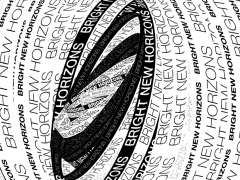
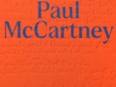
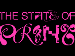
Simple and effective, the heavily based on typography design system sets the content as the main protagonist.
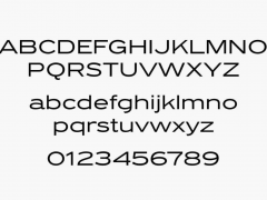
Set in Dinamo’s Diatype warm yet sharp grotesque -the typeface “began its life during Fabian Harb’s student days, as an eager exploration of the Swiss Neo-grotesque genre; its name harks back to the clunky, pre-digital typesetting machines that informed its shapes” notes the type foundry- the Public Records’ visual identity by Sometimes Always is bold and flowing.
Sometimes Always is a graphic design/art direction practice working between São Paulo and Berlin but acting internationally. Founded in 2012 by Gabriel Finotti as an output for creativity and experimentation, the project has evolved into a design studio, a publisher, and a laboratory for creative experimentation.
Explore more here.
Tags/ typography, graphic design, branding, website, grotesque, dinamo, sometimes always, public records

