AIGA’s 50 Books | 50 Covers Competition: the winners
AIGA, the professional association for design, has announced the results of the AIGA 50 Books | 50 Covers of 2021 competition and this year’s winners are fierce.
With 605 book and cover design entries from 29 countries, this year’s competition “recognizes and showcases excellence in book design from around the world.”
“Since its inception in 1923 as the Fifty Books of the Year competition, this annual event highlights AIGA’s continued commitment to uplifting powerful and compelling design in a familiar format we know and love. As book jackets became more prevalent, the competition evolved with the field to acknowledge excellence in cover design. Beginning in 1995, the competition became known as 50 Books | 50 Covers” notes AIGA.
“AIGA’s 50 Books | 50 Covers competition honors the best of book and cover designs, and I am delighted and honored to announce the winners for 2021. I hope everyone is inspired as I am by this year’s winners and the stories told by each book and each cover design,” said AIGA Executive Director, Bennie F. Johnson. “Books inspire us, they give us hope, they are a vehicle for knowledge, and they are vital to all we are as a society.”
“In a challenging year that confronted an ongoing pandemic, the aftershocks of a global reckoning with systemic oppression, high profile international conflict, designer burnout, and economic woes, one wonders how a design competition focused on book and book covers has relevance. As a past judge for the 50 Books | 50 Covers competition, I had a sense of the meticulous, subtle, and nerdy conversations that can go on during such a competition,” said Silas Munro, AIGA 50 Books | 50 Covers Chair.
“At the same time, books hold a kind of value, relevance, and grounding that we need in our current messy moment. In this year's competition, innovative book designs for topics ranging from designing and motherhood, African surf culture, stories of resistance, visual histories of Detroit, Black food traditions, and more all give our jury life, hope, and visible windows into new possible worlds. The covers and books we looked at had a diverse range of visual language and took aesthetic risks. Overall, the thoughtful consideration of material, typography, and image across themes of inspiring culture and social transformations through books and their design brought light into the dark of 2022” he continued.
Selected by this year’s panel of esteemed jurors aka Silas Munro (Jury Chair), Laura Coombs, Brian Johnson, and Kimberly Varella, the 2021 winning selections are part of the AIGA collection at the Rare Book and Manuscript Library at Columbia University’s Butler Library in the city of New York.
Here Typeroom highlights a selection of this year’s AIGA-approved book designs of the year along with the description provided by the creatives. For the full list enter here.
-
Amalgam op. III, published by Amalgam
“Amalgam is an ad hoc publication series that explores the intersection of typography, language, and the visual arts through transdisciplinary projects, critical investigations, and speculative proposals from invited contributors organized around thematic propositions. Tracing contemporary discourses around visual and typographic manifestations of language and identity, Amalgam materializes a vital and dynamic fellowship of diverse designers and artists with shared interests in the mutability of language, the instability of communication, and the prospects for more equitable futures.”
From Tehran to Chicago, Pouya Ahmadi is an adventurer for type
“Amalgam op. III explores tacit language. The phrase “zaban-e bi-zabani” in Farsi refers to a form of tacit language that is associated with silent or indirect response. It is often used to describe the method through which a person expresses their position and challenges. The power of this language, however, lies in its ability to repurpose and subvert the mundane and seemingly insignificant into a critique of the impenetrable, established, and unchangeable set of conditions. Contributors to this issue: Shiraz Gallab / Golnar Adili / Pegah Ahmadi / Somnath Bhatt / Ben Duvall / Nicole Killian / Devin King / Chris Lee / Jacob Lindgren / Yuko Mohri / Elham Namvar / Clifton Ritchie / Fiona Ross / Mindy Seu / Franziska Weitgruber.”
Typefaces: Gig, Nikolai, Roba, Kaligari, Porta, Sanzi (Designed by Franziska Weitgruber)
Book Designer: Pouya Ahmadi
-
1, 10, 100 Years: Form, Typography, and Interaction at Parsons, published by ORO Editions
“1, 10, 100 Years: Form, Typography, and Interaction at Parsons is a retrospective capturing the past year, decade, and century of the Communication Design programs at Parsons through essays, interviews, data, and work. Since the school’s founding in 1896, Parsons has had the unique distinction of establishing the oldest graphic and communication design course of study in the United States. Since that time, the extraordinary growth of Communication Design at Parsons reflects the larger evolution of graphic design as a distinct discipline that plays a vital role in understanding and shaping our visual culture. This book, like all books, is the product of an intricate patchwork of systems. Instead of the traditional tools of production, this book is built on a different set of interconnected technologies: 249 Markdown files managed by a flat-file CMS, 10 HTML templates, and 1,124 lines of CSS. The book lives as a continually updated preview on a server. It was generated as a PDF from the command line in 123.25 seconds on October 21, 2021 at 2:00am.”
Typefaces: Diatype
Book Designer: E Roon Kang, Andrew LeClair
AIGA: these are the 50 stunning book cover designs of 2020
forA Issue #0, published by forA / University of Applied arts Vienna
“forA on the Urban examines the open, unfinished, multi-scaled, interconnected, complex and wild nature of urban manifestations, challenges and situations through an expanded notion of architecture. forA Issue #0 consists of a box, publication, bookmark, poster and puzzle. The 440 page publication is roughly the size of a large smartphone with essays and contributions ordered by time it takes to read, shortest to longest. The entire book is printed in grayscale with a die cut cover.”
Typefaces: Custom Folio
Book Designer: Alex Lin, Tobias Holzmann, Noah Beckwith
-
VkHUTEMAS 100. School of the avant-garde, published by ABCdesign
“This catalogue was published on the occasion of the exhibition “Vkhutemas 100. School of Avant-Garde” at the Museum of Moscow. It is dedicated to the centenary of the experimental school Vkhutemas, which celebrated its 100th anniversary in 2020 – one year after that of the Bauhaus. Vkhutemas and Bauhaus were among the first schools to train professional designers, and both shared the vision of developing new principles for designing the material environment. These principles included, for example, ergonomics, functionalism, objectivity and harmony, which found their implementation in the distinctive pedagogical teaching and the combination of craft traditions with modern technologies involving the arts. The catalogue not only features unique material by avant-garde artists – both teachers and students – that conveys the high cultural significance of the Moscow School in the broader history of art and design, but itself also showcases a design that reflects the aesthetics of the time, experimenting expressively with typography, text-image relationships and even printing processes to achieve a striking, contemporary look.”
Typefaces: Aeroport; Druk Text Wide
Book Designer: Dmitry Mordvintsev, Svetlana Daniluk
-
SPIKE, published by Chronicle Chroma
“Spike Lee is a world-renowned, Academy Award–winning filmmaker, a cultural icon, and one of the most prominent voices on race and racism for more than three decades. His prolific career has included over 35 films, including his directorial debut She’s Gotta Have It (1986), his seminal masterpiece Do the Right Thing (1989), and more recently, his Oscar-winning film BlacKkKlansman (2018). Spike Lee’s provocative feature films, documentaries, commercials, and music videos, have shone the spotlight on significant stories and have made an indelible mark in both cinematic history and in contemporary society.”
Tre Seals' Vocal Type transforms people's voices to letterforms
“This career-spanning monograph titled SPIKE is a visual celebration of his life and career to date. The custom bold, typographic design is inspired by the LOVE/HATE brass rings that Radio Raheem wore in Do the Right Thing and that Spike Lee wore at the 2019 Academy Awards. The gold foil deboss on SPIKE on the vibrant fuchsia front cover is a bold and beautiful, eye-catching design. Featuring hundreds of never-before-seen photographs by David Lee, Spike’s brother and long-time still photographer, SPIKE the book, includes behind-the-scenes, insider images that underscore his creative process and his significant impact on the culture at large.”
Typefaces: Custom Type by Vocal Type: VTC Spike Display, VTC Spike Headline, VTC Spike Text, VTC Spike Italic, VTC Spike Tag
Book Designer: Tré Seals
-
Afrosurf, published by Ten Speed Press
“Afrosurf is the first book to capture and celebrate the surfing culture of Africa. This unprecedented collection is compiled by Mami Wata, a Cape Town surf company that fiercely believes in the power of African surf. Mami Wata brings together its co-founder Selema Masekela and some of Africa's finest photographers, thinkers, writers, and surfers to explore the unique culture of eighteen coastal countries, from Morocco to Somalia, Mozambique, South Africa, and beyond. Packed with over fifty essays, AFROSURF features surfer and skater profiles, thought pieces, poems, photos, illustrations, ephemera, recipes, and a mini comic, all wrapped in an astounding design that captures the diversity and character of Africa. A creative force of good in their continent, Mami Wata sources and manufactures all their wares in Africa and works with communities to strengthen local economies through surf tourism. With this mission in mind, Mami Wata is donating 100% of their proceeds to support two African surf therapy organizations, Waves for Change and Surfers Not Street Children.”
Book Designer: Peet Pienaar
-
So Since I'm Still Here Livin’, published by Domain
“Domain is pleased to present So Since I'm Still Here Livin': A YouTuber Reader, edited by Kelly Xio. This anthology leverages the murky power of the YouTube algorithm and the open source traditions of web publishing to assemble a chorus of voices in a call for social justice and Black liberation. Spanning generations and movements, this collection re-presents infamous and lesser known speeches, conversations and debates that have motivated historical and contemporary struggle. This content is presented in a dynamic and experimental paperback format in which layout and typography are structured through the graphic elements of a video player interface. A circular record button cuts through each page spread, warping and complicating these transcriptions of spoken language. A playlist of video clips and outtakes from the paperback book is featured on the website wwww.sosinceimstillhereliv.in. This project is co-published with Open Forum, Berlin and supported by Wendy’s Subway, New York City.”
Typefaces: Twenty-first Century IDK (custom), OCR IDK (custom)
Book Designer: David Knowles
-
The Overprint Series, published by for&st
“The overprint series aims to demonstrate the outcome of the overprinting techniques on offset printing with different Pantone colours, it serves as printing guide for graphic designers as an effect book to tackle their daily usage. The Rosetta Stone version is specially printed with Double Hitting on Pantone 873c, which the richness and solidness of the metallic ink are visibly enhanced after two times of printing. Besides the extra amount of time input, it requires skillful craftsmanship from the printing smith. We chose the complicated and deformed shape of the stone, with text in 7pt and 0.25 pt hairline, to further showcase the dedication of the craftsmanship, since double hitting has to be perfectly aligned and to control the intensity of metallic ink to avoid exceeding ink to distort the text and image, so there is no tolerance allowed.”
“In QE II versions, we specially picked the coin as a gateway, to demonstrate the difference in metallic texture obtained through hot stamping and metallic printing. The delicate engravement of the badge provided a great source to showcase the outcome on the limitation of hot stamping for the designers as an indicator. To echo the theme of the series - overprinting, the coin is a perfect medium to demonstrate the outcome of different settings on printing techniques, to achieve various metallic textures. Under the same ink printing sequence and printing perimeter, 1st drum with metallic gold and the 2nd with silver, the backside showcased the outcome of both separation and overprint.”
Typefaces: nb international pro
Book Designer: Ming Cheung
-
Vacant Spaces NY, published by Actar
“Vacant Spaces NY begins gathering the incomplete data available and documenting vacant spaces in New York City. Organized from large to small, general to specific, vacancy in the United States to case studies of specific vacancies in Manhattan, Michael Meredith, Hilary Sample, and their architecture studio MOS imagine possibilities for repurposing current vacant spaces in New York City. This project began by walking around our neighborhood noticing empty storefronts. Once we saw them, they were everywhere. They followed us, appearing quietly throughout New York City. Many with no signage, no for rent, no coming soon. Usually empty, sometimes dusty, sometimes with brown paper covering the glass. Now, vacancy has only increased. In the densest city in the United States. During a housing crisis. Throughout a pandemic. The quantity of vacant spaces is anyone’s best guess. It’s only partially documented. They hide in plain sight. One fluorescent color was used throughout the otherwise black and white book. Paper choices were carefully made to reference the everyday throwaway papers used for advertisements and volume mailers.”
Typefaces: Custom Akzidenz
Book Designer: Alex Lin/MOS
-
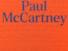
The Lyrics, published by Liveright
“The Lyrics celebrates the creative life and the musical genius of Paul McCartney through 154 of his most meaningful songs. The publication is a two-volume boxed set designed throughout. Our brief was to design a complete package for two separate print editions. The first: a widely available standard edition. The second: a premium signed limited edition. The interiors would be the same, but the exterior designs needed to stand out from each other with two uniquely powerful designs. The standard edition aimed to separate itself in the traditional bookselling marketplace, while the limited edition needed to feel like an unparalleled publication with museum quality attention to detail as there were only 150 of these printed and signed for the US market.”
A book, a day: The Lyrics of Paul McCartney designed by Triboro
“We set out to create a confident, elegant, lively package that honored the bold nature of McCartney’s monumental influence in our culture. In both editions of the book, we used eye-catching colors, custom-designed typography, handwriting from Paul’s personal notebooks, and rich production finishes to achieve the look. We wanted the experience of looking at this package to feel like you were getting deeper into Paul’s mind as you peeled off the layers from the clean typographic exterior to the grungy raw book boards. The spreads are designed to ensure legibility while infusing you with energy and excitement. Each song is beautifully set like poetry and complimented by a wide array of photographs and text paced out to imbue the rhythm to a story that is like no other.”
Book Designer: Triboro
-
Ray Johnson c/o, published by The Art Institute of Chicago
“Ray Johnson (1927–1995) was a renowned maker of meticulous collages whose works influenced movements including Pop Art, Fluxus, and Conceptual Art. Emerging from the interdisciplinary community of artists and poets at Black Mountain College, Johnson was extraordinarily adept at using social interaction as an artistic endeavor and founded a mail art network known as the New York Correspondence School. Drawing on the vast collection of Johnson’s work at the Art Institute of Chicago, this volume gives new shape to our understanding of his artistic practice and features hundreds of pieces that include artist’s books, collages, drawings, mail art, and performance documentation. In keeping with Johnson’s democratic, rhizomatic, and antihierarchical ethos, this indispensable resource on the artist’s oeuvre contains 700 illustrations, many of them never before published, and twenty-one short essays by various contributors that allow readers to dip into and out of the book in a nonlinear manner.”
Typefaces: Cooper Black, CMU Typewriter
Book Designer: Irma Boom
-
Eligible entries for the 2021 competition were open to books published and used in the marketplace in 2021.
Entries for 50 Books | 50 Covers of 2022 will open in December 2022 with a final entry deadline in February 2023.
Tags/ typography, book design, book, aiga, competition, pouya ahmadi, bespoke type, bauhaus, tre seals

