Parker X Prismatic: a kaleidoscopic yet simple typographic branding for the digital era
“The world of cryptocurrency can be synonymous with unstable value, murky processes, and cats with lasers shooting out of their eyes. Prismatic came to Parker looking to shift that perspective” explains the Seattle-based design studio that believes “brands need to understand their place within today's culture, and their impact on our planet's future.”
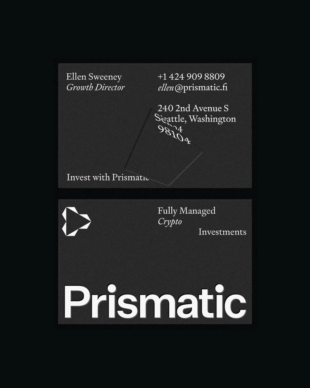
Commissioned with helping Prismatic “articulate the clarity and credibility they bring to their clients” the resulting brand system opts for simplicity “ to speak clearly and to the point.”
“The graphic device, which leverages a prism’s visual effect, emphasizes the company’s clear vision and approach to cryptocurrency and understanding of the market” notes Parker.
The project’s robust use of negative space – or white space, as it’s often called to define the area of the layout that is left empty as a kind of breathing room for all the elements to breathe enabling them to stand out exceptionally – and its selection of typefaces “intended to give the brand a leadership posture. One that feels elegant, refined and one you'd trust to engage with your existing investment portfolio.”
This is the year’s most talked about bespoke Sans so far
Emphasizing Prismatic’s “commitment to transparency in an elevated way” Parker invested in Klim Type Foundry’s type designs.
The company’s wordmark is set in a custom version of the plain, neogrotesk Untitled Sans – a design “validated by the ideas of Jasper Morrison and Naoto Fukasawa’s Super Normal project – alongside Kris Sowersby’s “Brutalist response to 17th century typefaces” aka the serif Signifier.
Straight-forward, highly legible, and trusting, Prismatic’s typographic branding approach is sure of itself.
Explore more here.
Tags/ typography, visual identity, branding, klim type, parker

