Hulse & Durrell X IOC: three custom typefaces contribute to IOC’s first-ever massive visual identity
The Olympic Games – arguably one of the most widely recognized brands in the world that was constructed over a century since the birth of the modern Games, yet with roots that reach back millennia to Ancient Greece – are evolving with a massive visual identity in order to bolster the brand’s core values to life.
The new design system, created by Canadian agency Hulse & Durrell and a team of international artists, typographers – Fabian Harb, Seb McClauchlan (Dinamo); Julien Hébert (Principal)– and designers, features three custom-made typefaces, a series of graphic devices, 17 illustrations and a set of guidelines for how to incorporate the identity. It is a “comprehensive evolution informed by a century of design heritage.”
“The IOC recognized the need to create a comprehensive foundational identity, designed for use across all mediums and channels,” explains the International Olympic Committee in its press release.
“The evolved brand pushes further the Olympic brand identity through a vibrant extended palette based on the Olympic colours, inspirational illustrations and tailor-made typography,” says May Guerraoui, head of brand management at the IOC. “It's about leveraging a new design system to communicate the brand values with emotion.”
“Every element has been designed to reflect the hopeful, universal, inclusive, vibrant and progressive qualities of the Olympic brand, for use across publications, digital, environment design and more,” the IOC release notes.
“Typography is a key element of our brand. It works to maintain consistency, create clarity and provide equity to the brand as a global leader in sport. A family of three exclusive typefaces brings a consistent visual tone to all things Olympic” reads Guerraoui’s statement.
“Olympic Headline for short punchy titles, Olympic Sans for long titles and body copy, and Olympic Serif to bring a touch of tradition and elegance to the system. Inspired by sport and Olympic heritage, the type system was designed to maximise impact across digital and print while being easy to read, ownable and recognizable. Each typeface supports over 200 Latin script languages and has designated non-Latin alternates, as well as a fallback font that should be used only if the Olympic typefaces are not available.”
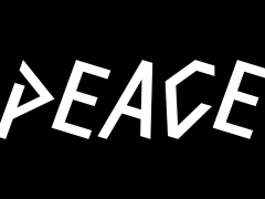
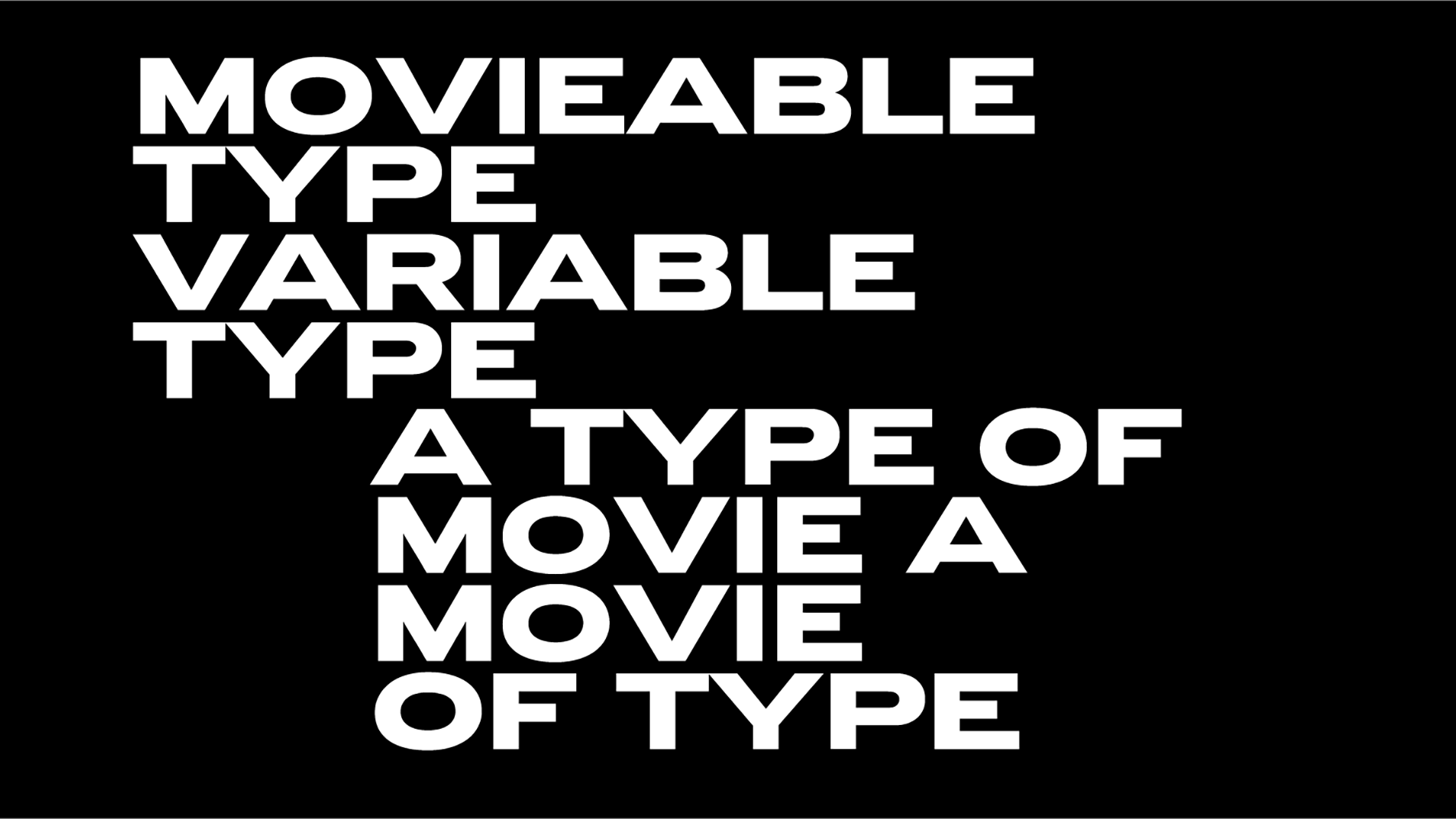
Bold, athletic, and proud Olympic Headline comes in six styles and contains capital letters only. Inspired by typography found throughout Olympic Games history, such as the Tokyo 1964 and Seoul 1988 emblems, Olympic Headline was designed in 2020 by Julien Hébert in Montreal, Canada.
Tokyo 1964: the emblem, the posters, the pictograms & the film that changed the Olympics forever
For professional designers, Olympic Headline is also available as a variable font: a single file that includes all styles. It allows for variations along two axes: width and slant. This format allows the designer to adjust the font to a specific need and is also useful for digital/interactive animations.
Clear, classic and Swiss-inspired, Olympic Sans is IOC’s workhorse typeface. The contemporary interpretation of Akzidenz-Grotesk, a typeface designed in 1896, the same year that the modern Games were born, Olympic Sans was designed in 2020 by Fabian Harb in Basel, Switzerland. Olympic Sans comes in six style and “is the main voice of the Olympic brand.”
Last but not least Olympic Serif “gives the brand a more editorial look and adds finesse where needed.” Traditional, artistic and inspired by IOC’s heritage, Olympic Serif is a contemporary interpretation of Oldstyle Roman type genre, and gives a subtle nod to the ancient Games. Olympic Serif was designed in 2020 by Seb McClauchlan in London, England.
As noted the three bespoke typefaces have “unique OpenType features for advanced typography flexibility and behaviour.”
Cowboy Career: Lance Wyman unearths a lifetime of stunning design on Instagram
IOC’s new design system is currently in use across dozens of internal and external IOC channels and projects, as well as partners’ platforms.
Digital channels such as Olympics.com and the Olympics app are currently undergoing a complete brand overhaul to align with the evolved identity and connect with audiences in new, more impactful ways. Alongside the Olympic Games, all future editions of the Youth Olympic Games will also feature the evolved brand identity.
New brand elements are also expected to be released in the future. In the coming months, a new set of Olympic sports and universal pictograms will be debuted, providing a language-neutral, gender-neutral icon system for the Olympic identity. New illustrations will also progressively be added to enrich and update the current brand assets, while allowing for continuing engagement with artists and creative talent.
The full brand rollout is expected to be completed by the 2024 Paris Olympic Games adds IOC.
Explore the full case study here.
For even further reading explore the official brand guidelines of this massive project here.
Tags/ typography, visual identity, branding, bespoke type, olympics, typedesign, custom type, international olympic committee, ioc


