From static to dynamic: Underware confronts & welcomes the speedy changes in design
One of the thirty-plus design practitioners that will illuminate the virtual stage of Inscript, the must-attend experimental type festival that kicks off this October 12–16, Underware believes with all honesty in the intelligence of typography.
Founded in 1999 by Akiem Helmling, Bas Jacobs and Sami Kortemäki, the independent type foundry based in Amsterdam, Den Haag and Helsinki has gained a devoted following via its designs and its ongoing explorations in the letterforms’ realm.
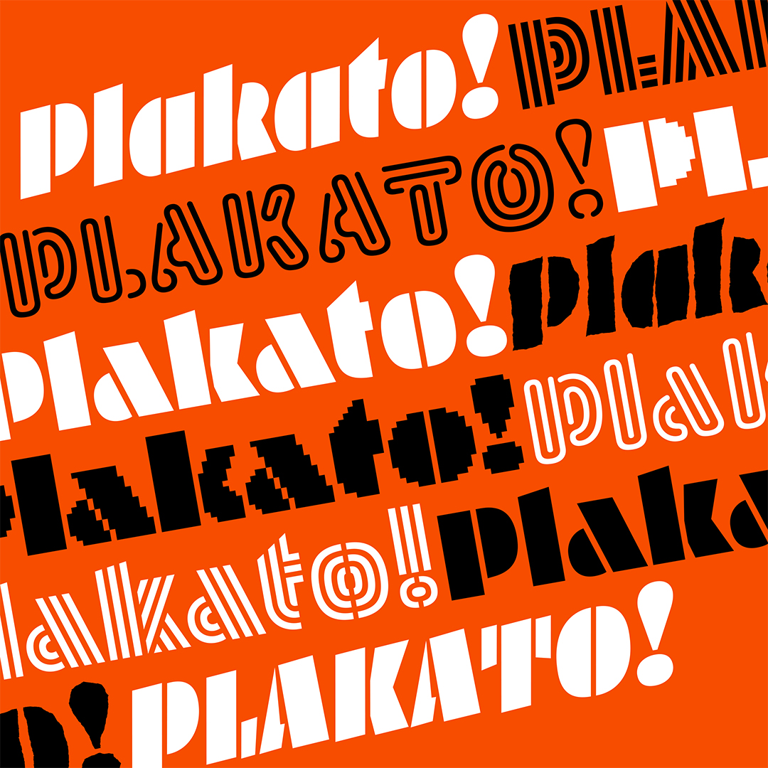
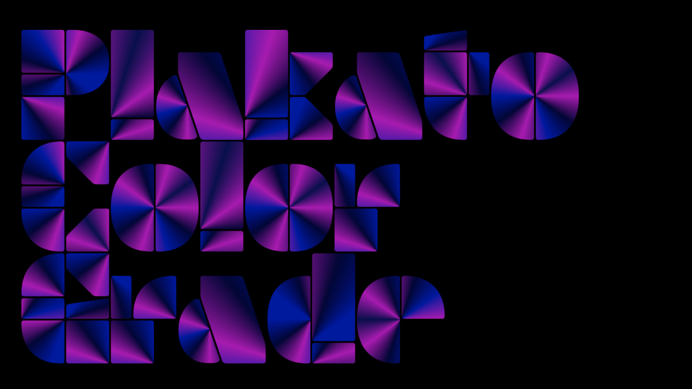
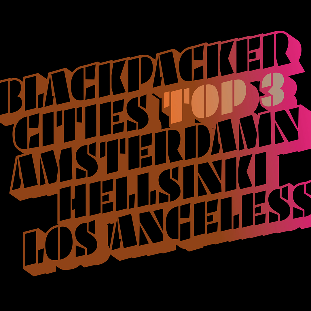
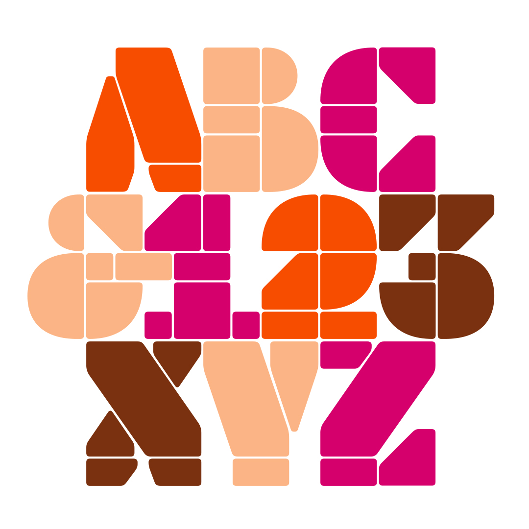
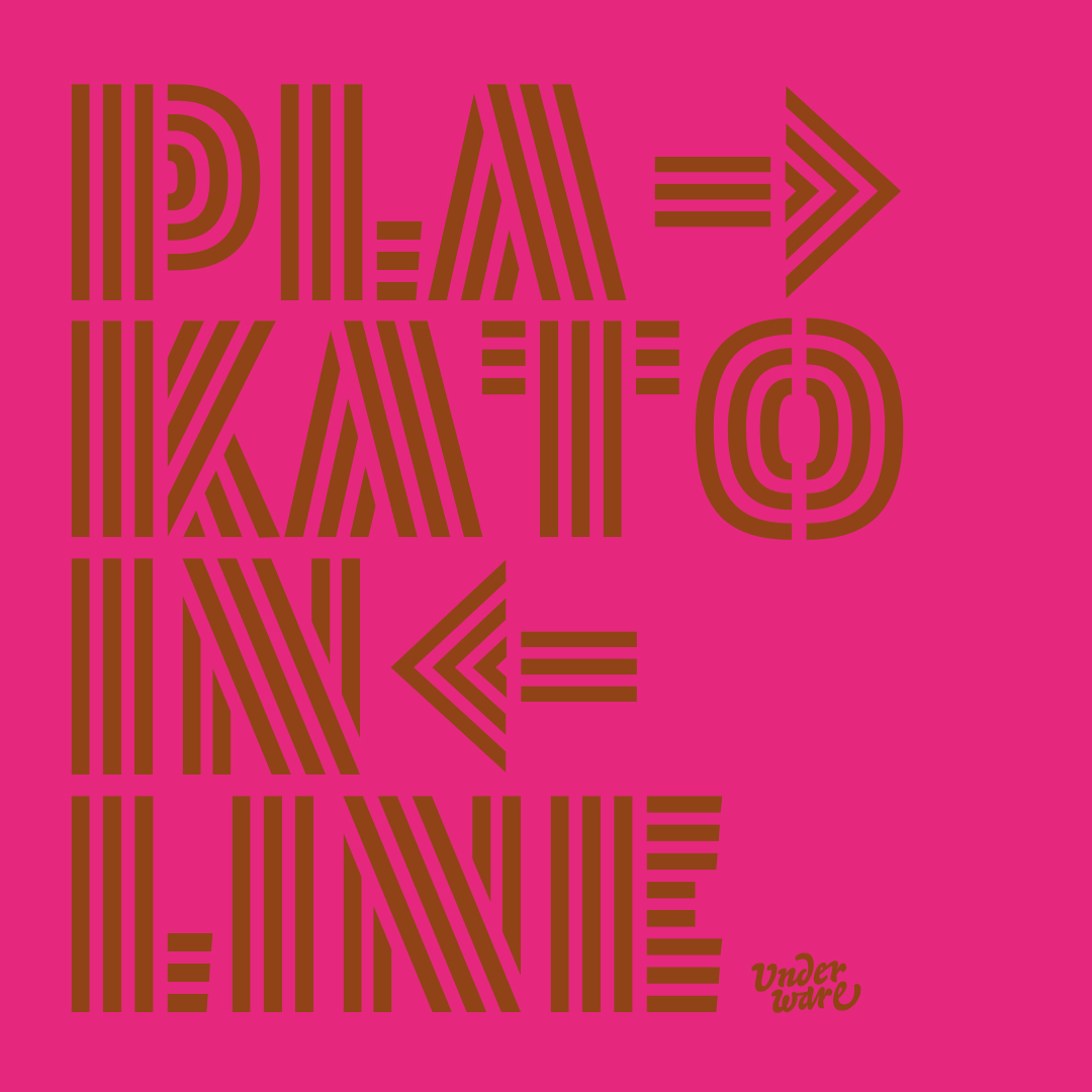
On the occasion of their collaboration with the Inscript Collective, we highlight some of their insights and thoughts about the massive “dynamification of typography,” an element that propels their body of work and is evident in their products - enter the Plakato typefamily, a design as diverse as its multiple origins.
Inscript Experimental Type Festival: the moment to join a revolution dawns online
“The dynamification isn’t limited to graphic design. Actually, with the introduction of the internet, information itself became dynamic. The consequences of this change are meanwhile clearly visible. The static world we used to know, with only books in a library and printed flyers to announce the latest gig, belongs to history for good. It belongs to a previous millennium. So the introduction of the internet has made information dynamic, and text unstable” reads Underware’s article.
“But not only text is unstable, today the most elementary part of the text, a letter, has also become dynamic. We communicate by means of dynamic texts, which are represented by dynamic letters, thus changing our society. The speed of communication, the method of interaction, mouthpieces, and platforms are all undergoing the transition from static to dynamic, and all shape the information society. The information society is principally a dynamic information society, with not only technological but also economical consequences. And, returning to the topic, consequently also resulting in a different graphic design process.”
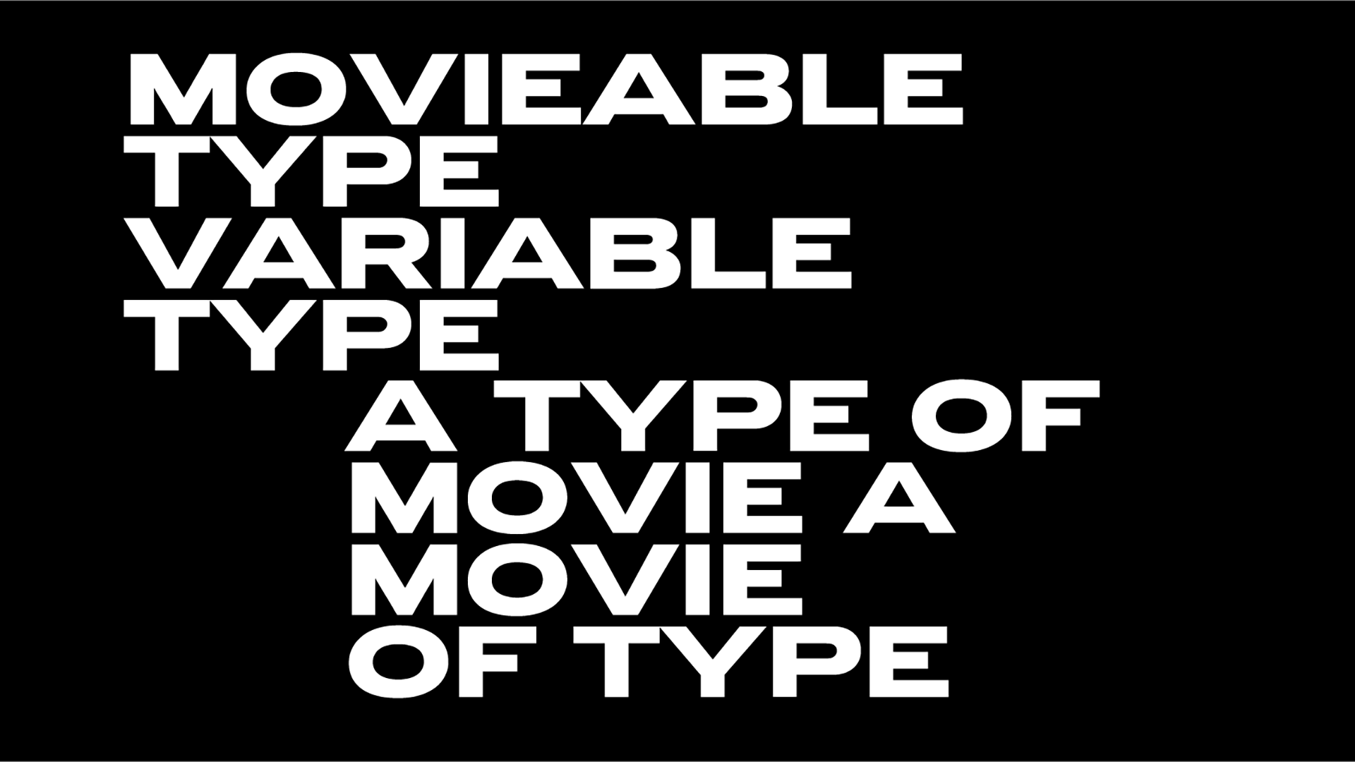
“The variable font format, introduced in 2016, allows type designers to specify the dynamics of letters within the digital font file. In the same way, as the design process has changed for graphic designers in the past decades, it might develop for type designers in the future. Why wouldn’t the dynamics of a letter be as essential as its visual, static shape? Why would a type designer leave an intrinsic value (motion) of its design (a letter) up to somebody else? Of course, type designers can ignore the fact that dynamics can be designed and included in a font, and just leave it up to the users of a font to design its motion, but it can be questioned if this is the right decision” argues Underware.
“A positive and important aspect is that the dynamics are an added value to the font file, and don’t decrease the functionality of a font compared to a ‘traditional’, static font. These dynamic fonts behave like any other static font: they can have the same extensive language support, all OpenType-dingdong, all different styles, etc. But on top of this, they have the possibility to move, animate, rotate, morph, or whatever motion fits a certain design. Because this motion can be included in the font file, this animated text is still text and not a movie. That is an important difference.”
“Currently type designers usually base the design of their font family on interpolation, mostly ending up in a weight and width axis. This interpolation is actually often the starting point at the beginning of the design process. This practice, which can be considered conventional meanwhile, wasn’t standard some decades ago. Although it was technically possible to base an entire font family on interpolation in let’s say 1990, this procedure wasn’t as self-evident back then as it is today. The same goes for designing dynamic letters. Although technically it’s possible today to make dynamic versions of static designs (and hey, this is again based on interpolation), history tells that it probably requires some time for the dynamics to become the point of departure while designing a typeface.”
Underware’s full article is available here.
The type in the machine: Gianpaolo Tucci on his AI-powered experimental typography
Featuring presentations and interaction with an impressive line-up of speakers enter Underware Foundry, Kelli Anderson, Tina Touli, Tátil Design, Kiel Mutschelknaus, Yehwan Song, Andreas Gysin, Sanchit Sawaria, Richard The, Vincent Wagner, Vera van de Seyp, Dennis Hoelscher, André Burnier, Talia Cotton, Basile Fournier, Laura Hilbert, Faris Kassim & My Kim Buim, Thomas Wilder, Eino Korkala & Daniel Coull, Tabitha Swanson, Daniel Wenzel, Dev Valladares, Rob Stenson, Anatoly Grashchenko, Yehang Yin, Jen Wong and Gianpaolo Tucci – a creative who explores the many typographic variations via Midjourney and machine learning as explained in Typeroom here – and can read Typeroom, the Inscript Experimental Type Festival is a five-day event not to be missed.
Brough to all by The Inscript Collective with the support of ATypI, Contemporary Type, TDC, TYPE01, Pangram Pangram® Foundry, and Typeroom, Inscript is a showcase of all things type with an uncompromising, daring, attitude.
Register for the future here.
Explore Underware’s portfolio of typographic explorations that push the envelope forward here.
Tags/ typography, graphic design, typeface, festival, type foundry, variable fonts, typedesign, experimental type, motion design, underware, inscript
