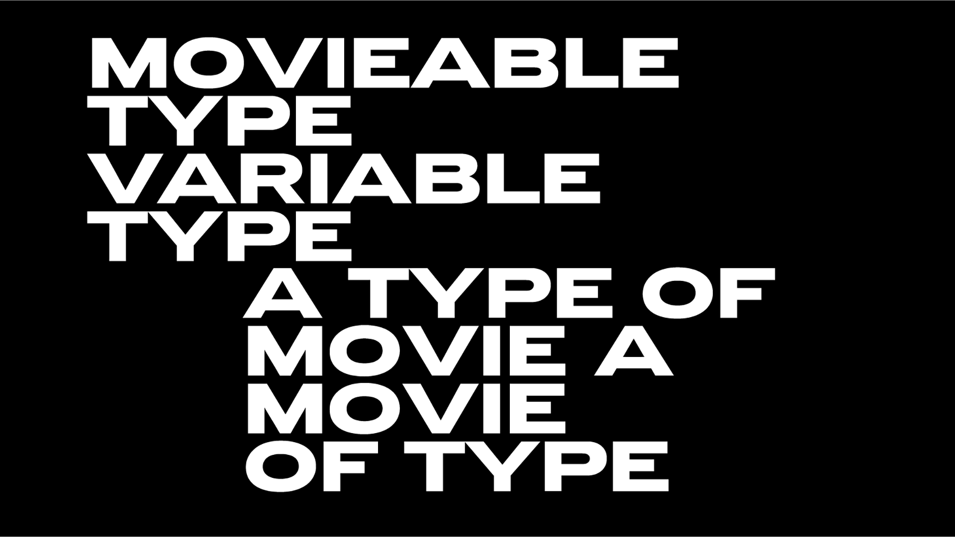
Gretel NYC X RISD: two custom typefaces & more ingredients of a massive new identity framework that embraces Rhode Island School of Design's diverse creative agenda
In late September 2022, Rhode Island School of Design, arguably one of the leading art and design schools in the world launched its new identity framework, the first in decades of this 145-year-old institution.
Created by a team of designers and professionals with independent branding, strategy, and design studio Gretel in charge of the massive year-long project, this new visual identity for RISD deserves a big shout-out.
Founded in Providence back in 1877 and known for its cross-disciplinary approach to art and design pedagogy RISD has an impressive iconic legacy “always attracting students who are interested in making while critically engaging with culture and producing ideas that impact the future.”
“In recent years the school entered a transformation that involved deeper, structural commitments to evolve and open up—to a wider range of creative voices and practices, to the decolonization of histories and knowledge, and to new applications of design disciplines and technologies that would attract the next generation of aspiring creative minds” explains the practice.
“Our strategic aim was to capture the ambition of the school’s artists, designers and scholars to create a more just, fair and sustainable society” adds the team. “An art and design education is never complete. Designers, artists and scholars make the invisible visible through a constant iterative dialogue with their peers and with culture at large. A dynamic, constantly evolving process of learning, interrogating, making, critiquing, and starting again. The core visual concept of ‘Complete / Incomplete’ translates into a set of open, flexible tools and frameworks for the talented RISD community to use and evolve. Layouts are layered and modular – hinting at what’s just off the screen or the page and keeping the focus on the content. This concept is most evident, however, in the custom typography.” Enter a former RISD graduate, the independent typeface designer and graphic designer Ryan Bugden –and also one of the 25 young creatives that made the cut at this year’s TDC Global Ascenders 3 Competition.
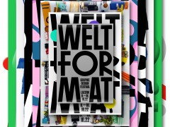
“The typeface development was a deeply iterative process, in search of a dynamic typographic voice that could express the philosophies underlying RISD’s pedagogy” Bugden notes. “The new RISD type system consists of two parts: RISD Serif, a headline typeface which ranges from complete to incomplete, and the utilitarian RISD Sans, which serves as the system’s straightforward, neutral backbone.”
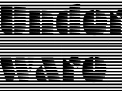
RISD Serif is a headline typeface that “ranges from complete to incomplete, carrying the core visual concept of the new identity. The typeface provides RISD with the ability to communicate with a range of resolution, from functional to evocative. As the typeface moves between styles, the content does not shift” explains the designer. The curves of Complete are contrasted by rectangular serifs and terminals, preparing Incomplete to bridge the typographic and graphic realms, allowing the RISD team to deconstruct and remix as it sees fit. These squared-off details also refer to the seal’s refreshed diamond separators.”
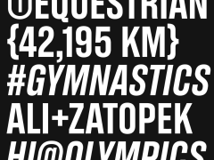
Meanwhile RISD Sans is “its utilitarian counterpart. Together, they equip RISD with a robust typographic palette of 54 static styles and a set of variable fonts. The entire sketching process was an intense and exciting period during which I made over 100 prototype fonts with limited glyphsets” notes Bugden.
In addition to creating the type system, Bugden redrew the RISD seal “in an effort to simplify features, optimize for small sizes, and bring to life some of the hand-crafted quality of John Howard Benson’s original sketches.” To breathe new life into the RISD seal – a visual mark with rich history, rooted in craft, and a timeless piece of design that was drawn in 1951 by sculptor, stone carver, calligrapher, and late RISD faculty member John Howard Benson making it a cornerstone of the identity – the team “delved into its history to look for any details that had been lost in its traversal through different media over the years.”
Nicholas Benson’s 17 things you should know about stone carving
Eventually, the seal was redrawn by “Bugden in consultation with the Benson family to perform better at small sizes by lessening its density, improving the clarity of letterforms, and reviving the calligraphic details that had been lost over the decades.” Bugden looked closely at the symbol’s analog past in order to evolve it for the future.
“In reference to an early John Howard Benson sketch: bullet-points and colons became diamonds; softness was sharpened; swashes were smoothed; letters were respaced” explains Bugden. “As far as preserving the humanist finish of a letter-carver, it was invaluable to have feedback from Nick Benson throughout the process. One of the many fascinating things about the Benson family’s work on this seal was how every letter in the outside medallion was specially made to set comfortably on a circle. As such, the letters are generally wider on the top than they are on the bottom, something you only notice when the letters are out of context. To preserve and refine this feature, I built a tool that provides dynamic distorted vertical guidelines when drawing” he adds.
“This project lasted over a year, and contains so many layers. As a quick primer—three things mark the identity framework” writes Gretel’s creative director A.A. Trabucco Campos. “We developed this openly with the RISD community, sharing every step on a microsite we built, and through open forums where we would present to the community and have open discussions about the work. A RISD education revolves around the power of questioning, doing so in ways in which leads to creating, and then questioning again. It’s a continuous cycle, which moves from incomplete to complete and back again. This led us to develop a custom typeface that captures all the states of completion, and which felt both future-facing, while at home in Providence’s rich history. Finally, this is an identity built for a community of makers who are visionaries, talented artists, designers and scholars, therefore it is made as a set of participatory tools which will evolve with the school and all its entities over time. It gives both structure and space to amplify voices within and make it their own.”
A project that deserves appreciation, RISD’s new identity framework came to fruition opting for a fair future in creativity.
Explore more here.
Tags/ typography, typeface, nicholas benson, ryan bugden, tdc, typedesign, rhode island school of design, bespoke typography, risd, custom type, gretel

