Peter Saville X Ferragamo: hailing a new era, fashion’s latest rebranding is rooted in stone inscriptions
Change is in the air. During the latest Milan fashion week, the Italian house Salvatore Ferragamo debuted a triad of “new”: new creative director, collection, and a logo, a pattern that has become the mode de rigeur of announcing a fresh and forward-thinking direction for the industry.
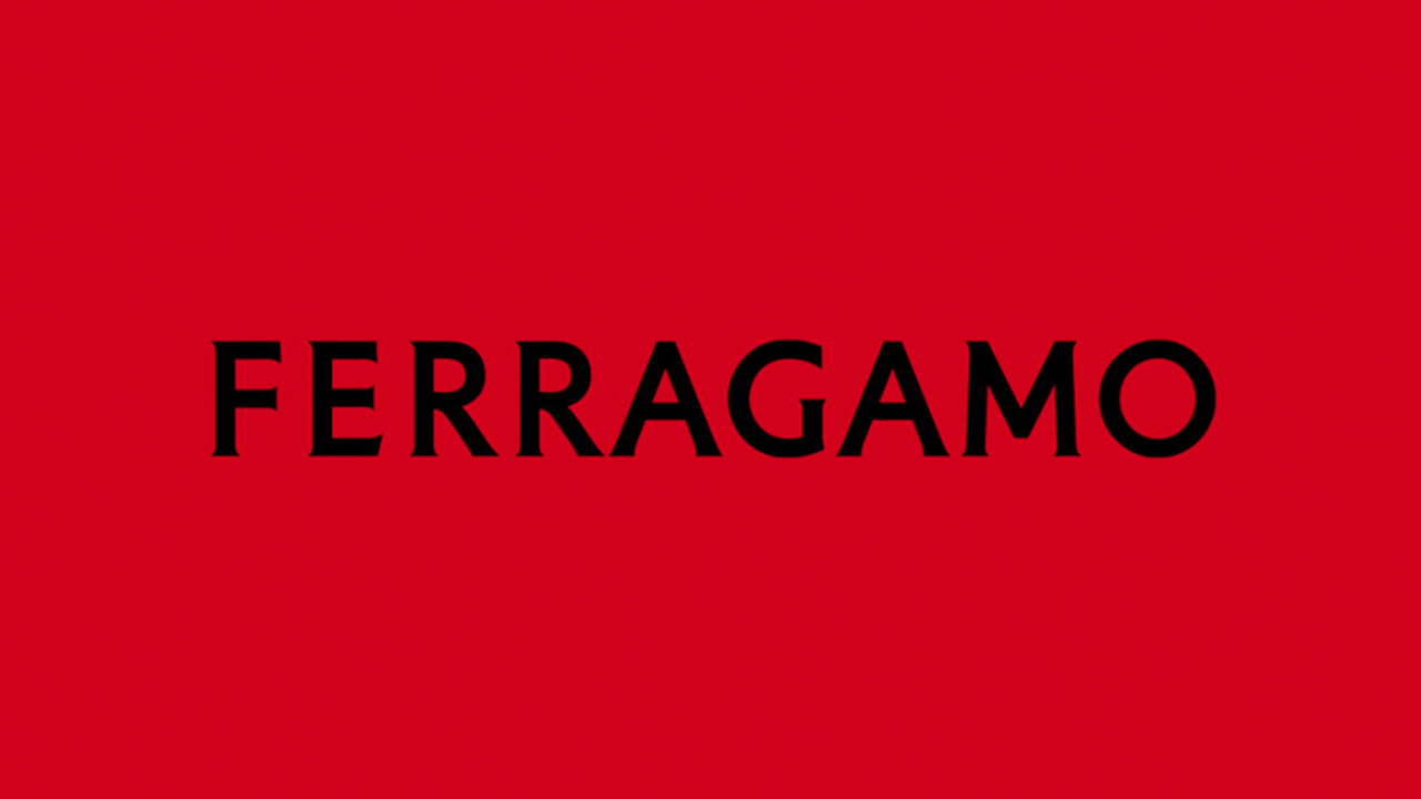
With minimalism going strong in branding, the new logo is created by the legendary Factory Records designer Peter Saville and is rooted in Italy’s typographic heritage. Set in custom type the all-caps-and-no-Salvatore design introduces a visual rebranding that obviously aims to lure the Millennial and Gen Z consumers.
“[Peter Saville] conceived a modernist take on a classic font, recalling the classical stone inscriptions that inspired Renaissance artists” explained the house. “The founder’s handwriting is translated into a serif font that is impactful, refined, affirmative as evidence, in taut tension between classicism and modernity.”
“The equity of Florence is in the culture of the company: that led me to the choice of a classic font,” noted Saville. “The vision is exacting and modern. Thereafter, the font is reduced and becomes modernist. Then there is the craft that is quintessentially Ferragamo, which is condensed in the idea of an inscription set in stone,” he continued. “Within this tension lies the new logotype and the complex balance it expresses.”
The house’s new identity was revealed ahead of creative director Maximilian Davis, the fashion designer who debuted his collection during the recent Milan Fashion Week.
The Italian fashion house’s previous handwritten logo that featured a cursive hand-written look was the face of the brand for 40 years (1982 to 2022).
As the new logo and font make its way to the fashion realm, many took to the internet to share their thoughts. A number of users weren’t taken with the new font and rebranding. “Following the crowd like YSL without Yves and HUGO BOSS with Boss…. For an Italian brand a big mistake with a fall of such heritage” reads an Instagram comment. “At least it's not ARIAL font as SAINT LAURENT, BALMAIN, BALENCIAGA...” another user noted, focusing on the ongoing trend of the simplification in fashion branding although FERRAGAMO avoided the sans serif hype.
FENTY for the win: how Commission Studio branded Rihanna’s urban luxe label
Back in 2018, Peter Saville worked with the then British fashion house’s chief creative officer Riccardo Tisci on the rebranding of fashion brand Burberry. The outcome was a new logo, and a monogram that spells out TB – after the founder of the brand Thomas Burberry.
Saville replaced the brand’s Burberry Equestrian Knight logo that used the bespoke font Bodoni, which had been by the brand used since 1901, with a sans serif type.
In 2017 Saville collaborated with the then Calvin Klein’s creative director Raf Simons on an updated all-caps logo for the American fashion label. They also moved the letters closer to one another, to “create a subtle but recognisable difference.”
Saville rose to fame creating album cover graphics (his seminal design for Joy Division’s Unknown Pleasures is rather iconic) and posters for Manchester nightclub Hacienda in the 1970s and 1980s.
He is no stranger to the fashion industry, listing brands Lacoste, Y-3 and Adidas among his collaborators.
Tags/ typography, fashion, visual identity, logo, rebranding, bespoke type, custom type, stone inscription
